
As user experience (UX) practitioners, we use studies and principles from psychology, social psychology, and human computer interaction to help understand why users think and act the way they do. If we understand the why, then we can predict how they will interact with our interfaces in the future.
While there are many such principles that can be applied to UX, three that I find particularly useful in our line of work are:
- The Hick-Hyman Law
- Principle of Least Effort
- Fitts’s Law
1. The Hick-Hyman Law
The more options, the better, right? The Hick-Hyman Law, also commonly referred to as Hick’s Law, says the more options, the longer.
The Hick-Hyman Law predicts that the time it takes a user to make a decision is increased by the number of choices that user has.
In other words, the more options you have, the longer it will take you to make a decision. Let’s look at a practical example. Here’s the navigation from a Zion & Zion client’s old website. Pretend you get to this site and you want to order pizza. Go ahead and find where you would click to do so.

Chances are this took you a few full seconds to decide where to click. That’s because there are 14 navigational items (19, if you include social icons) that you have to scan and potentially comprehend before you decide where to click. Now, look at the navigation for the new site that we developed for them, and decide where you would click to order pizza.

That probably took you a fraction of a second. The time it took you to make your decision was significantly shorter in part because of the reduced number of choices you have. That’s the Hick-Hyman Law.
In UX, we want our users to find the information they are looking for as fast as possible. So, do yourself a favor and remember the Hick-Hyman Law next time you’re tempted to give your users as many options as possible.
2. Principle of Least Effort
This is a simple principle, but also a very valuable one.
The principle states that when there are several ways to achieve the same goal, we will choose the course that requires the least amount of effort.
Or in other words, we’re all lazy. As UX practitioners, we should take this into consideration when designing interfaces. Our goal on every website is to allow the user to accomplish their task in the easiest way possible.
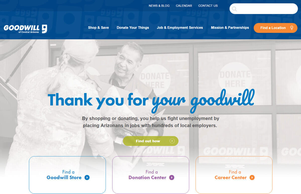
Here’s a simple example. We built the new website for Goodwill. In our research, we found that users fell into three distinct user groups: shoppers, donors, or job seekers, and each of these user groups had very distinct goals. These insights drove the information architecture of the new site. You can see in the homepage screenshot below, the navigation, as well as the three buttons on the homepage were broken out by the three main goals of the different user groups. We wanted it to be as easy as possible for each user (no matter their user group) to achieve their goal.
I know this may seem straight-forward, but there are countless websites out there that don’t put their users’ needs first. If a user can’t find what they want on your website, they are going to move on to your competitor’s site who does put their needs first—taking the path of the least effort.
3. Fitts’s Law
Last but not least, Fitts’s Law.
Fitts’s Law states the time it takes to move to a target can be calculated by the distance to the target and the size of the target.
In other words, the farther away and the smaller the target is, the longer it will take the user to get to the target.
Let’s look at a real example. One wireframing tool we use at Zion & Zion is Mockflow. Mockflow is an online wireframing tool that allows you to quickly build wireframes, share the link with others, and collaborate. We love Mockflow, but there’s one element of the software that could be improved by referring to Fitts’s Law.
In the screenshot below, I’m editing the button elements toward the bottom of the page. These are grouped together, so I need to use the “group edit” function to edit the buttons. You can see that everything else except the two buttons is greyed out. Once I’m done editing the buttons, what do I need to do?
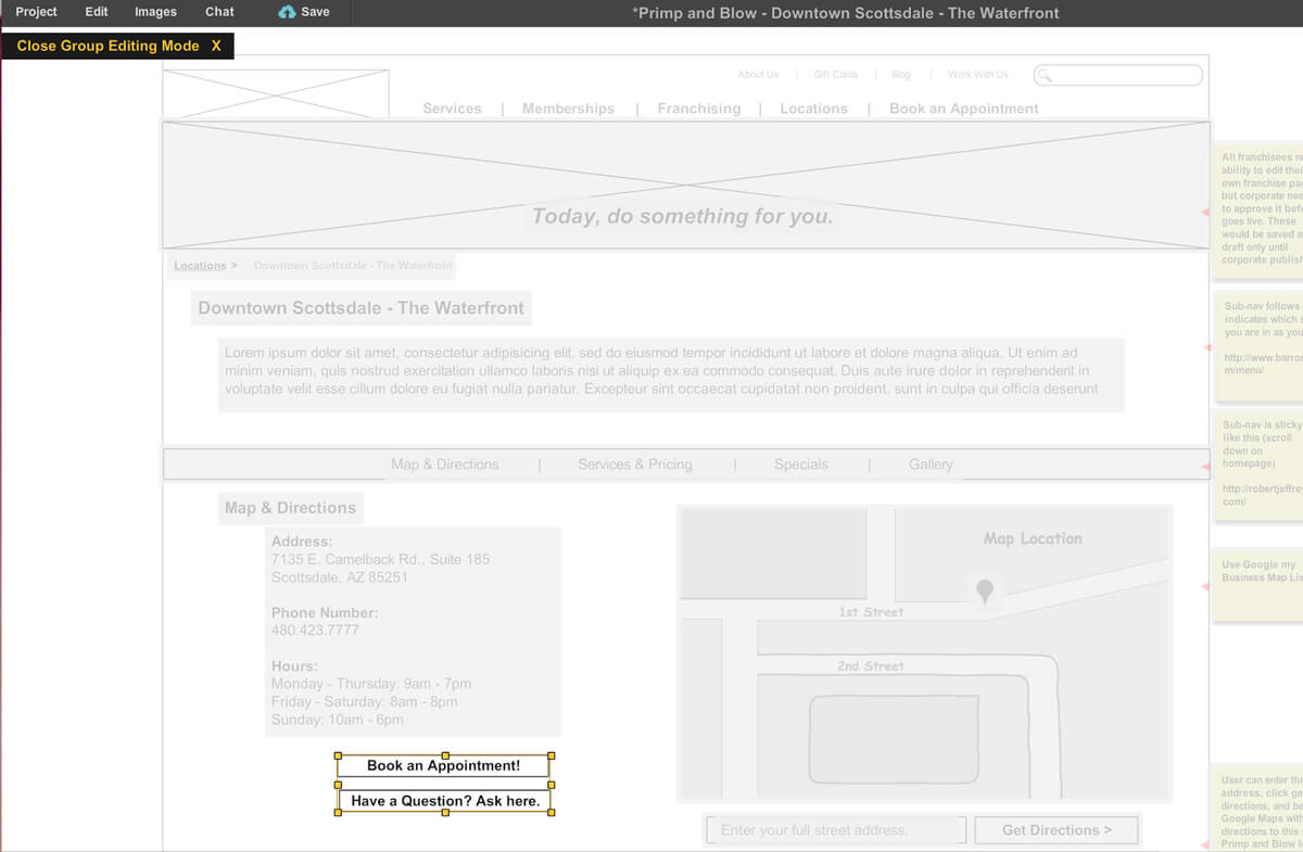
I need to go up to the top left of the screen to hit “close group editing mode.” This is all fine, but when I’m quickly wireframing, I have to carefully move my mouse all the way up away from where I’m working to close out of group editing mode. Not only is the button far away from what I’m editing, it isn’t very large either, and I often find myself accidentally clicking the toolbar above instead. It’s pretty frustrating.
I did a quick mockup of how this experience could be improved using Fitts’s Law. It’s such a small adjustment but would save me time as I’m wireframing.
Warning: This was done in PowerPoint to quickly make a point—so no judgement on the design.
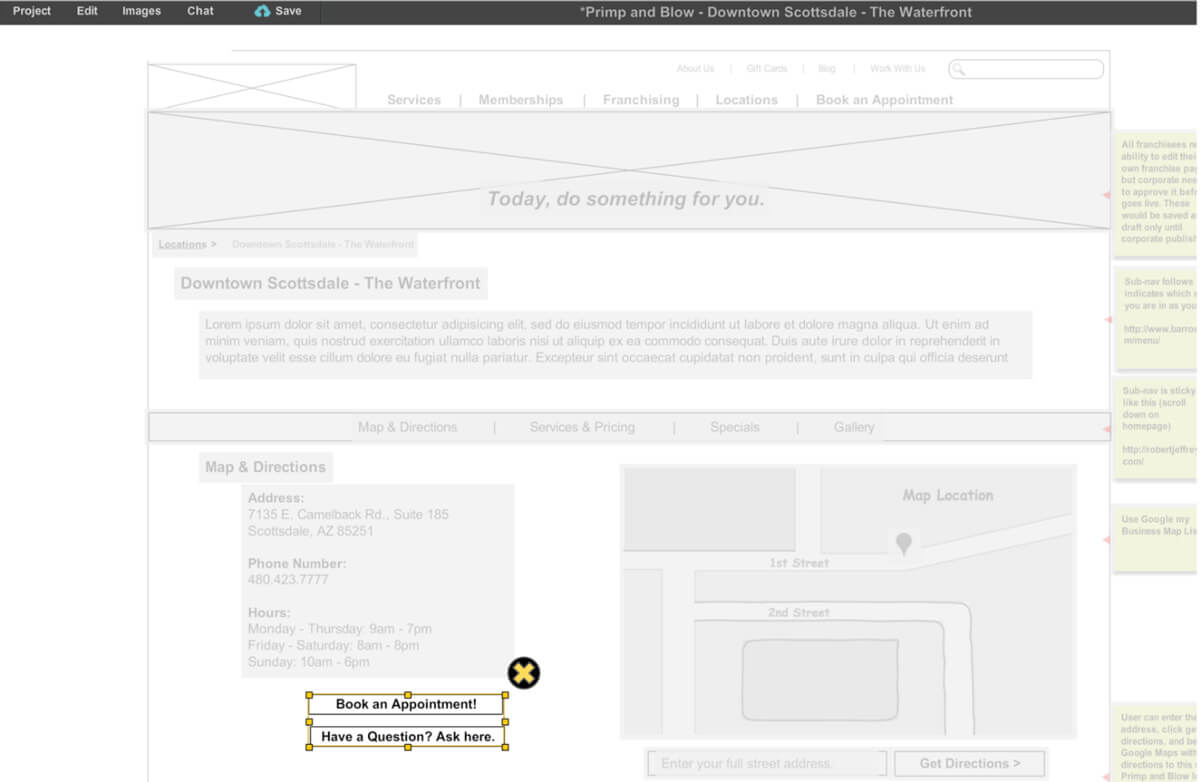
You can see that by putting the X close to what you’re actually editing, and by making it big enough not to miss, it would take you less time to exit out. You could add a tooltip on hover that would say “close group editing mode” in case the user was new to the program and didn’t know what the icon meant.
I know that a simple change like this would save me a lot of time and give me a better user experience, all thanks to Fitts’s Law.
Update: Mockflow has since changed their interface, so although this is a dated example, it still shows Fitts’s Law in action.
Putting It Into Action
By using these tried-and-true principles, you can ensure a better experience for your users and more success for both you and your company.