As a UX/IA strategist, it’s my job to understand and execute a well-crafted user experience for both websites and mobile devices. Part of this job description is understanding what users are drawn to and what they prefer during different stages of their customer journey. However, on the other hand, I’m also responsible for understanding what users hate; what frustrates them throughout their journey. Understating both ends of this spectrum allows me to develop a new and improved experience for all users.
Over the years, I’ve seen users respond, both positively and negatively, to various web elements. Based on this feedback, I’ve compiled a list of some of the worst human interaction experiences on the web. If you’re looking to create a good experience for your users, avoid these tactics at all costs.
1. Pop-Ups
It should be no surprise that pop-ups made it to the top of this list. Pop-ups of any kind are all around frustrating. They catch users by surprise, and worse, distract them from their current (and likely more important) task at hand.
Most of the time, users close pop-ups before the modal has fully rendered. Nielsen Norman Group classifies this act as pop-up purges. They found that, more times than less, users viciously exit out of pop-ups without giving it a second thought, or an opportunity to fully load.
I’ve personally seen users become frustrated with pop-ups time and time again. Pop-ups interrupt the user’s task at hand, and unfortunately, often lead to site abandonment. Take this recent scenario I observed in a user test for example:
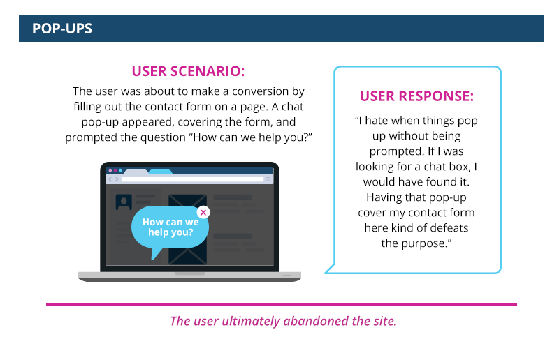
The frustration surrounding pop-ups has become so common, that unfortunately, “exit=intent pop-up” is becoming inescapable. As marketers, learn from this growing trend and lose the pop-ups. If the information is important enough to be housed in a pop-up, it should be important enough to live on your site elsewhere. Look for other logical areas to host this content. Depending on its importance, you may consider the footer, navigation, or homepage.
2. Confirm Shaming
Confirm shaming goes hand and hand with sign up forms. Instead of offering an appropriate “no thank you” opt-out option, some sites use confirm shaming to shame users into feeling like they have no other option but to sign up. Here are a few examples of sites who utilize this tactic:

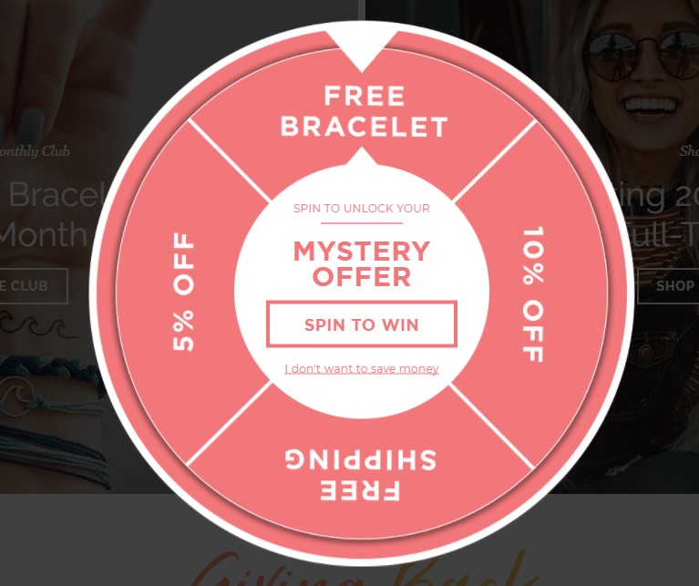

Between “No thanks, I’d rather pay full price,” “I don’t want to save money,” and “I don’t read,” a user can feel guilted into opting in. Guilt is an experientially bad feeling—so why bring that into the experience you’re providing on your website or mobile application?
When you think about it, confirm shaming is no better than buying followers on social media. What’s the purpose of having a subscriber or follower if that individual isn’t actually interested in your product, service, or business? The answer should be obvious.
3. Auto Playing Videos
One design trend that’s recently been on the rise is auto playing videos. These videos tend to live on the homepage of sites and automatically play upon load, without having the user interact with the video first. While these videos can give users a high-level insight into your product or allow you to show your company’s creative side, they ultimately do more harm than good.
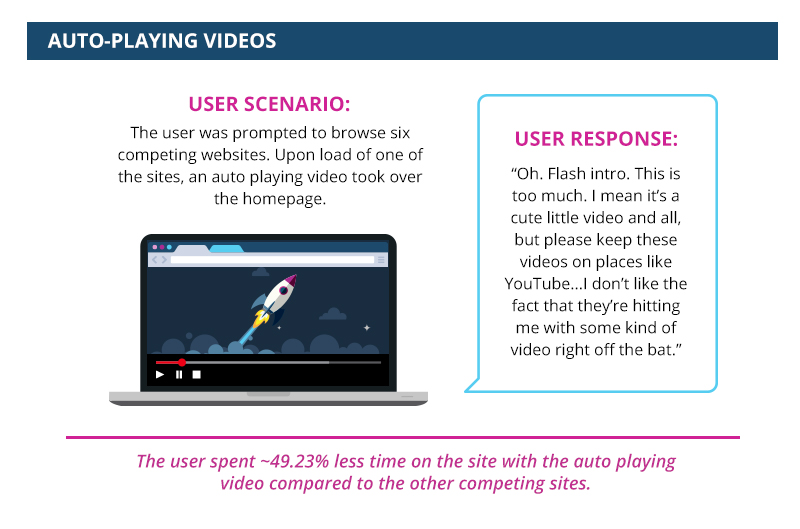
I’ve seen countless users respond negatively to auto playing videos. Some assume the video will slow down the rest of their experience, others think the video is too much too soon, and almost all react negatively when some sort of volume or sound is involved with the auto playing as well.
These frustrations can lead to less engagement on your site. Take this user scenario for example:
In my opinion, it’s best to avoid auto playing videos. But, this doesn’t mean you must (or should) avoid videos altogether—just remember to consider how you’re serving the video to the user. Instead of having your video automatically play, give users the power. Let them decide if they’d like to play the video or if they’d simply wish to keep on scrolling. At the end of the day, it’s important to always remember that it’s best to let users make their own decisions.
4. Quick Scrolling Carousels
Imagine landing on a website’s homepage and seeing a shining display, showing that your favorite restaurant is having a grand opening event near you—yes! Oh, nope. It just changed to a coupon that can be applied to their catering options. Now it just flashed to an announcement about their new mobile app. Then to directions to the new location and wait…what’d that say? Hold on, it scrolled too fast. Opp, now it’s back to the grand opening display.
Well isn’t that confusing? If your nodding your head yes, then you agree with this statement: like auto playing videos, auto playing carousels, or sliders, can just as easily frustrate users. This is especially true if the messaging changes quickly throughout the carousel.
Carousels are hard to follow. Many don’t give users enough time to digest the information on each image, and on the other hand, some take entirely too much time to scroll through, ultimately losing the user’s attention. However, even more than that, carousels have been proven—time and time again—to have an extremely low click through rate. /Useful Usability recently conducted research on this. They audited hundreds of websites with carousels and found that, of those websites, the click through rate for sliding galleries is below .1%. Consider this number when deciding whether a rotating carousel is right for your website.
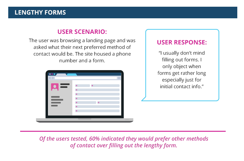
5. Long (or Demanding) Forms
/The average user’s attention span is shorter than that of a goldfish. Users’ attention spans are ~8 seconds, whereas a goldfish is ~9 seconds. That statistic alone should have you rethinking what and how much you expect out of your sites’ visitors.
Long or demanding forms are a user experience no-no. Keeping user’s short attention span in mind, it’s important to only ask what’s completely necessary. Asking more than what’s needed can cause users to avoid the form, or worse, abandon your site altogether.
Take the following scenario as an example:
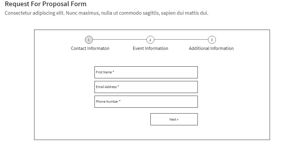
If you’re struggling to eliminate the number of fields featured on your form, try breaking the form up into smaller, micro steps. As shown in the wireframe example below, that’s exactly what our team proposed for one of our clients. The client couldn’t bear to lose fields within the form, so we simply broke it up into three, easy-to-follow (and labeled) steps. With help from the progress bar displayed above the fields, we were able to take a lengthy form and make it feel significantly less demanding.
6. Unresponsive Sites
/Today, mobile usage surpasses desktop and tablet usage on a global scale. And with this trend, comes a demand for responsive design. Responsive design is a fluid way for designing a website, where the user gets a similar experience on a desktop, tablet, or mobile device. As the screen size changes, various elements on the page stack on top of one another, increase or decrease, and more—creating one universal experience for users. In user experience, responsive design is always preferred.
If sites aren’t built with responsive design in mind, there are implications. Users respond negatively to sites that have a separate mobile site, or worse, sites that make you download an application to access their content. Oftentimes, separate mobile sites create unnecessary steps in the users’ journey and require them to spend more time on a page to find where their desired content is located.
Don’t make users work harder (and longer) on certain devices. Build your site responsively to ensure you’re getting the most of your users’ experience.
Conclusion
Of course, there are situations and circumstances where these elements won’t hinder the user experience. Not every pop-up will result in site abandonment and some lengthy forms can lead to a conversion.
The point is to train yourself to take a step back and rethink some of the elements you chose to feature on your site. When working on a UX project, ask yourself “Is this a functional and necessary element, or is it doing more harm than good?” If you can’t answer that question yourself or if you feel you’re too close to the project, leave it to your users to decide and conduct user research. Thinking strategically about each element and considering the impact they have on your site’s user experience is a great first step in the right direction.
Wonder if there’s anything that’s frustrating users on your website or mobile application? We can help. Contact us today for more information.