User experience (UX) is the experience a person has when interacting with any touch point of a brand. For this article, I’ll be talking primarily in terms of websites and mobile applications, but know that UX can truly be applied to anything a person interacts with—an ATM, drive-thru carwash, etc. How easily you can accomplish your task(s) depends on the UX.
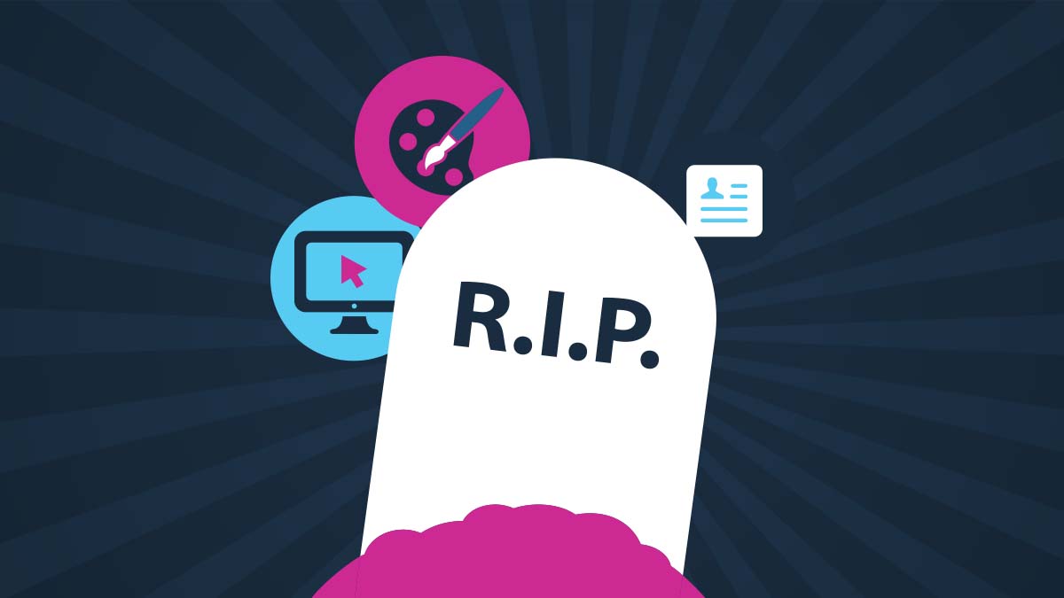
Often when something new comes along, people try to understand it and in the process of doing so, myths are born. The longer something has been around, the more time people have to learn about and understand it, which ultimately leads to myths being debunked. Unfortunately, UX is one industry that still has many myths needing to be debunked. I’m here to debunk some of the most common myths I, and my colleagues, hear on a regular basis.
1. UX is common sense—anyone can do it.
This is a tough one to hear, and unfortunately it’s something we in the industry hear quite often. The truth of the matter is, if UX were common sense and anyone could do it, how would we explain the countless websites, apps, and products out there with horrible user experiences?
User experience is so much more than common sense. It’s researching, testing, and analyzing. It’s planning, thinking strategically, and balancing countless needs. It’s truly understanding the myriad users of a website (or application, product, etc.) and building a strategic solution that allows all users to easily accomplish their goals.
2. It’s easy, you just make assumptions based on the users.
Not exactly. As a UX strategist, my job is to perform research and make educated decisions based on user testing, social psychological principles, web analytics and data, and other forms of research. Making assumptions is the exact opposite of what any prideful UX strategist should be doing. If you have an assumption, then test it to see if you’re right. One wrong assumption can quickly lead you down the wrong path.
Take the McDonalds website for example.
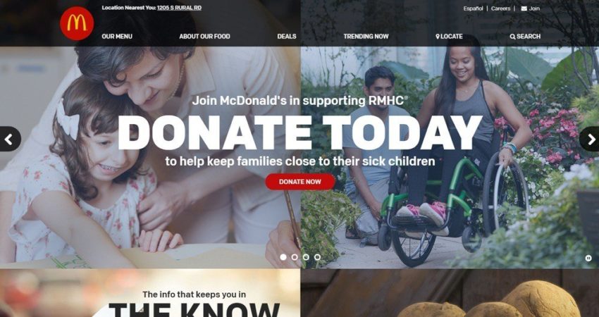
Pretend you’re looking for the nutritional information for an order of Chicken Nuggets, a common task amongst their users. Users are given the following options in the main navigation:
- Our Menu
- About Our Food
- Deals
- Trending Now
- Locate
- Search
Of those options, you have two valid choices, ‘Our Menu’ and ‘About Our Food.’ If you click the latter, you’ll find what you’re looking for relatively quickly, however if you choose ‘Our Menu’, which is a common place to go to find this type of information, it’ll take you four clicks to find how many calories are in McDonald’s Chicken Nuggets.
This may be the result of someone at McDonald’s assuming users looking for nutritional information will click on ‘About Our Food’ and not ‘Our Menu’ even though ‘Our Menu’ comes first in the navigation. A simple fix would be to add a Nutritional Information callout under the ‘Our Menu’ nav item, just as it is under the ‘About our Food’ nav item.
3. If it’s a good design, it must be a good UX.
This is another common misconception in UX. Many people think that just because something is a good design automatically makes it a good UX. This isn’t always the case. Sure, good designs can be good UX, that is what we all strive to create. However, oftentimes, when a website or app skips the UX phase and goes straight into design, you end up with a beautiful design that isn’t the easiest to use.
Take Nighshift’s website, a company that specializes in digital content creation, for example.

The site displays beautiful imagery and video clips, but requires the user to ‘Scroll Down’ (as noted by the necessary instructions in the bottom right corner) to learn more and to find the main navigation. Many would say this site’s simplistic, yet dramatic approach is beautiful from a design perspective, but from a UX perspective, it’s not ideal. A few key fixes would go a long way:
- Display the main navigation by default.
- Decrease the height of the large hero image/video to allow users to see a portion of the next section. This will eliminate the false floor and reduce the need for users to rely 100% on the ‘Scroll Down’ instructions.
All designers and web developers here at Zion & Zion are also trained and certified in UX. This helps streamline the process and ensure everyone is on the same page during each phase of a project.
4. UX strategists don’t care what the visual design looks like.
There’s a myth out there that UX strategists don’t care what the final design looks like, so long as the structure follows the wireframe. The truth is, we care a great deal about the final design—design elements such as colors, fonts, and shapes can all greatly affect a site, app, or product’s usability.
Have you ever been on a website looking for a ‘submit’ button, only to later realize that you were staring at it the whole time? That’s a UX issue that is rooted in the design of the final product. Clickable elements need to be designed in a way that makes it obvious they’re clickable. While just one of the hundreds of examples out there, this demonstrates the significance of design in UX.
Take the Trek Bikes website for example.
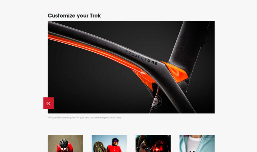
The red call-to-action (CTA) button located on the left has a few design issues that impact the UX. First, its placement goes against the norm of CTAs being on the right-hand side of the screen. This obscure location makes the button easy to miss.
It also doesn’t have a label. Users have no idea where they’re going if they click this button. Are they going to browse customizable bikes, create a custom bike, or learn more about custom bikes? It’s difficult to tell. A few quick fixes would be to redesign this button, add a label (e.g. “Learn About Our Custom Bikes”), and move the button from the left to the right. By making these adjustments, users would be more inclined to click the button to engage further.
Finally, this button strongly resembles the Pinterest share button. For those unfamiliar, the Pinterest share button is a button many websites add to their images. The button allows users to easily share, or ‘pin,’ images to their Pinterest boards. Not only does Trek Bike’s CTA look like the Pinterest share button at first glance, but it’s also located (and overlapping) on the left-hand side of a large image. This is a very common placement that social media share buttons often follow. That alone is sure to cause confusion.
As you can see, design can have a big impact on a site’s usability—this means anyone who cares about user experience also cares about the visual design because the two go hand in hand.
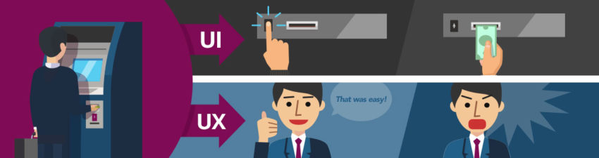
5. UX and UI are the same thing.
UX stands for user experience; UI stands for user interface. As defined above, user experience (UX) is “the experience a person has when interacting with any touch point of a brand.” User interface (UI) however, is defined as “the space where interactions between humans and machines occur.”
Let’s stick with the ATM example from earlier. The elements you interact with, such as the touch screen, buttons, and card reader make up the UI. The experience you have while interacting with the ATM is your experience, your user experience. If you’re able to easily and successfully accomplish your task(s), then it’s likely that the ATM has a good UX and a good UI. However, a poor UI can result in a poor UX.
6. Good UX results in boring websites.
The final myth is that if a site has good UX, then it must be boring and visually unappealing. Sure, there are a lot of websites out there that are lackluster at best from a design perspective; and sure, some of those may have good UX. But this does not need to be, nor should it be, the norm.
At Zion & Zion, we work hard to ensure we build websites with great UX, which means balancing design, development, brand, user, and SEO needs. It doesn’t need to be either/or.
A lot of agencies focus on designing websites that you’ve “never seen before.” This is great if your only goal is to win design awards. But remember, if it’s something your users have “never seen before,” they probably won’t know how to use it either.
Don’t create something new just for the sake of being different. If creating something new is what’s best for your business and your users, then do so. But if you do, make sure you’re also doing the following:
- Use as many familiar elements as possible
- Stay consistent
- Make the interface simple, clear, and intuitive
- Provide helper text when/if necessary
- Guide users through what you want/need them to do
Conclusion
There are still plenty of myths that need debunking, but hopefully this article helped clear the air around some of the most common myths out there.