
When it comes to branding, tone is the combination of several different visual and verbal components that all work together to give a certain impression or feeling. All too often, people think of tone as being solely written, however we’re going to explain (and show) how both written and visual elements must work together to create a brand’s tone.
A brand embodies a certain look and feel by defining its personality traits and voice, while also taking into consideration who their audience may be and what is appropriate for their subject matter. Once the personality traits and voice have been defined, the visuals can come to life through the brand’s look and feel, which gives even more life to the brand through visuals including things like, interaction design, collateral design, the incorporation of video and animation, and the ways in which the brand takes advantage of its messaging opportunities.
Defining a Brand’s Personality
A brand’s personality is the foundation for how the company behaves and acts. How casual or serious a brand is, is commonly rooted in the nature of its business, but is also often a direct result of the stakeholders within the company and what image they are comfortable portraying.
A successful brand lives and breathes its personality as an organization, both internally and externally. Personality traits are adjectives that describe the brand as if it were a person. They are often determined in the very beginning stages of a company’s existence, whether they are documented formally or not. Descriptors such as sincere, friendly, quirky, inviting, rugged, and sophisticated can all be used to define a brand and set the organization apart within its industry.
Typically, a combination of 3–5 personality traits help define a solid brand. While honing it down to a single word may work for some brands, it can be very limiting in its execution. Even describing a person in one word only shows a piece of who they are, not the full range of their personality. The same approach should be taken with a brand.
Defining a Brand’s Voice and Style
In addition to personality, another important aspect of a brand’s tone is the style of its voice. A brand’s voice takes those personality traits and works through how a person like that would sound when they speak. Are they enthusiastic or mellow? Formal or casual? The visuals for a brand are just as important and impactful as the messaging. It’s crucial for both the messaging and visuals of a brand to be aligned. When these two are not aligned, customers (and potential customers) can be confused, unimpressed, and unsure of what the brand is all about.
When considering how a brand should sound, the first and most obvious step should be understanding whom the audience is for the brand. For example, charities and non-profits who deal in delicate situations may want a voice that is comforting, empathetic, but not comical or goofy to risk coming off as insincere. Another example would be a jeweler. First, they might look at their price point and the demographics of consumers likely to buy their product. If the company is selling expensive and extremely high-end products, then they might want to maintain a voice that is elegant and sophisticated. If instead, their products are more moderately priced, they can get away with a tone that is casual, laid-back, or even playful. The appropriateness of the tone for a brand’s audience and subject matter is as important as the execution of the visuals and voice for the brand to be successful.
Ways in Which Tone is Expressed
The tone of a brand’s website is expressed through a combination of its:
- Visual design
- Images and photography
- Video and animation
- Interaction design
- Messaging and voice
While a single element conveys a particular tone on its own, it’s how all these pieces work together on the website that paints the full picture.
Visual Design
The design elements, color palette, and layout are all pieces that make up the visual design of a brand. Here are some examples of how visual design can be applied.
Enthusiasm
Color combinations that are bright and saturated give off a sense of energy and enthusiasm, working well for brands that are upbeat, positive, friendly, and welcoming. They might also utilize illustrations and sans serif typography to maintain that vibe throughout the whole brand.
Drama
Brands looking for more drama will typically use black as a primary color in their palette, with an accent color or two used sparingly. These brands will typically capitalize on dark or moody photography styles and will let that be the main focus of the look and feel. This approach works well for athletic companies, luxury cars, and brands with an edge.
Modern
A softer palette that uses a lot of white with pops of saturated colors comes off as modern and sleek, often seen in the technology and software industries. Within those industries, you will also see a lot of sleek thin lines and very simple iconography.
Feminine
More feminine brands, such as bridal resources (e.g. wedding boutiques), will use a lot of white with softer pastels or earth tones. They’ll also use organic lines and shapes with a variety of mature typeface styles such as scripts, modern serifs, and thin san serifs with open letter spacing and counterforms.
Examples of Visual Design
Even though there are similarities between like brands, there is plenty of room for each to express themselves in their own way by building on the other elements that play into their overall tone. Here are two recent branded websites that we did here at Zion & Zion.
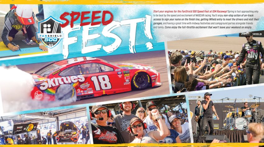
For ISM Raceway, one of our high-impact sports clients, we wanted to convey their exciting vibe through the use of a bold and attention-grabbing photography and graphics, including the use of typography.
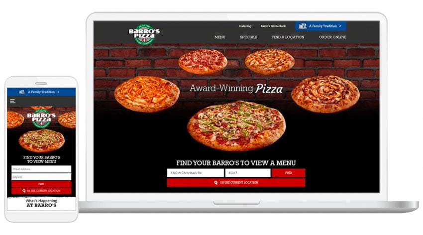
With the Barro’s website, a fun, valley-wide pizza brand, we wanted to take advantage of delicious food photography, but also play up the brand through the use of interesting design elements and typography.
Images and Photography
Whether it’s product images in a virtual empty space, a lifestyle shot of a happy group of people, or a photo of someone interacting with a product, one of the biggest impacts on a brand’s tone is the photography. The subject matter helps to drive the nature of the image, but it’s the execution of that subject that determines the tone for the brand.
Lifestyle images that want to feel warm and almost dreamlike will take advantage of sunlight glares and will have a warm temperature to the image. Images that want to come off as futuristic and high tech will have a lot of contrast and will typically have a cooler, or slightly bluish/grey temperature.
You can see in these two examples that both images are about the lifestyle aspect of owning a car, but the tone of the color and the execution of the shoot allows for two dramatically different feelings to be conveyed.

One of the more recent trends in web design, thanks in part to compression abilities and faster internet speeds, is the incorporation of more video as part of the interactive experience. Sometimes this feature is used as an animated background for a section of the site, which helps give the page life and depth. In rarer cases, the video makes up a majority of the website where, through code, the user is actually able to control the animation with their mouse. This lends itself to a very rich interactive experience.
In addition to incorporating video, a lot of websites trying to stay on trend will incorporate animation. There are many ways to do this, one of the most popular being to initiate animation as the user scrolls. This technique can work for a variety of brands. It gives off the impression that a brand is forward-thinking, current with trends, and committed to maximizing their online experience.
At Zion & Zion, we are always looking for ways to deepen engagement with our users. Often, based on the brand and the tone we are trying to convey, incorporating video and animation is a way to do so.
Interaction Design
One of the most important pieces of an online brand is the interaction design of the website itself. Interaction design is often an area that is pushed aside (due to lack of time) and decided upon last minute. In reality, it’s an element that is just as important as the visual design, photography, and messaging. The interactions throughout a website can range from simple and straightforward for more corporate clients, all the way to completely unique and game-like for those brands that are willing to take a chance with entertaining their users.
Interaction design includes everything from completely interactive web pages that allow the user to control what they see all the way down to what happens when you hover over a clickable button.
We had the opportunity, for our client TruckWorks, to tell the story of their unique, and highly sophisticated process for engineering and manufacturing truck-mounted fluid tanks. Rather than talking about it, we opted for a substantially more interactive approach. For this page of the website, we decided to make it slightly game-like, where the user could control their experience through the virtual space. As a user scrolls, they come across each step of the process, allowing them to go in and out of rooms to gather more information. Here is a video of what interacting with the page is like for a user.
TruckWorks is a brand defined by both the ruggedness that is the truck industry, and the sophistication that comes with top-of-the-line engineering capabilities and solutions. This allowed for a visual brand that balanced both aspects (ruggedness and sophistication) beautifully, and was a brand we knew could benefit from this type of functionality to further define the tone of their website in a way that made sense for them.
Messaging and Voice
The final element to defining the tone of a brand comes down to the copy: the headlines, navigation elements, callouts, subheads, buttons, and body copy. There is so much opportunity for truly customizing the user experience beyond the visuals.
The navigation can be one place to add in some character. However, special care should be taken to make sure the navigational labels are clear so the user understands what information they will be getting when they click. For example, a link that says “Careers” is perfect for more corporate companies, while an informal setting can get away with being a little more conversational by saying something like “Work with us.” Both labels clearly mean the same thing to the user, but the second option shows how a subtle change allows the brand to add in pops of their personality.
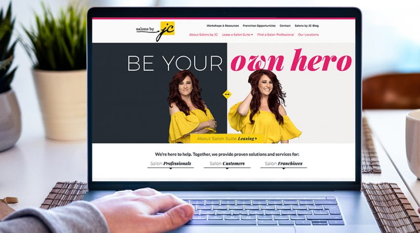
For our client Salons by JC, we took advantage of their header images to bring additional brand messaging into the website that gave emphasis to their professional, yet trendy, and fun tone.
Conclusion
The tone of a brand as portrayed through a website is what helps make all websites so different from one another. Without that personalization, all website experiences would be exactly the same and therefore, forgettable.
In the last decade, brands have come a long way, understanding that there are so many opportunities within a website to speak to a captive audience, since this is often the first impression a user will have of the company. As the interactive space constantly evolves, we can expect to see brands push themselves further to create a unique experience through their website that will create valuable, loyal customers for life.