Improving Mobile Calendar Usability

Summary

We conducted user testing on various parts of the new website that we were building for the client. We found usability issues with 14.3% of users (90% confidence interval of 0% to 29%). The testing led our UX team to implement a solution to provide a fluid experience for 100% of users.

Our Role

  • User Experience
  • Web Research
  • Web Development
  • Digital Media
  • Design

The Problem

As Agency of Record for Goodwill of Central Arizona and Northern, we work on wide variety of projects for this client, including all digital marketing, UX and web development.

During the design phase of the new site that we were building for Goodwill, we identified a variety of potential usability issues. This case study focuses on one particular issue: usability of the events calendar feed on mobile devices.

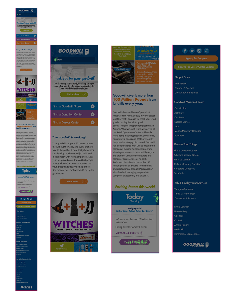
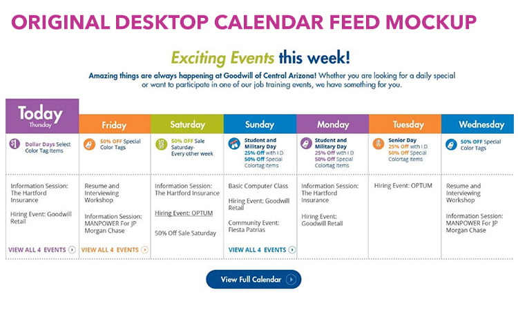
To give you some background, the events calendar, which was to live on the homepage and many internal pages, shows the events happening this week at Goodwill. The key phrase to focus on here is “this week.” Unlike some calendars that allow you to scroll endlessly, we’ve limited the calendar to the current week, with a button underneath the calendar feed to view the full calendar. The mockup below shows how the feed was to look on desktops, laptops, and larger screen sizes. You can see that it clearly states that the calendar only shows events for seven days, i.e. “this week.”

Desktop Calendar

Possible Confusion on Mobile

Once our UX team and interactive designers got into the mobile mockups, we came to the realization (after many conversations, differing opinions, and the constant need to continuously push each other further) that there was reason to be concerned with the idea that some mobile users could be confused by the calendar feed functionality.

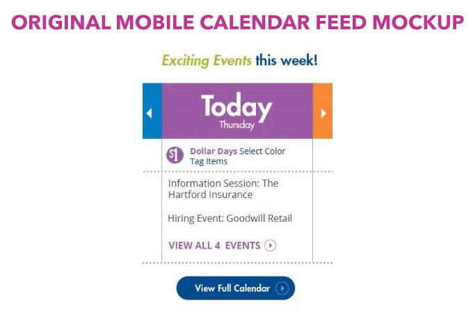
As you can see in the mobile mockup, because we’re working with so much less space, there is the possibility that our users could overlook the “this week” copy in the headline or never see the “View Full Calendar” button underneath the feed, depending on how far they scroll down on mobile or whether they even see it because it is located a distance away from the left and right arrows on either side of the word “Today.” Part of our concern was driven by the concept of “residual fixation.” In UX, residual fixation refers to the idea that related information should occur in close proximity to where a person’s eyes are already focused.

The Differences Between Desktop and Mobile

The major difference between the calendar on desktop and the calendar on mobile is that on desktop, users can easily see all seven days of the week without requiring further action. On mobile, due to limited space, we only showing one day at a time. To provide our mobile users with the same information as desktop users, we added in functionality allowing them to scroll through the feed (by clicking the arrow(s), or swiping on their touch screen) to see the entire week day by day as they click/swipe. Because we only show one day at a time, there is the possibility that our users would overlook the “this week!” copy and the “View Full Calendar” button and simply assume the feed shows an endless number of days. Due to the difference in functionality on mobile and desktop, we run into the possibility of users trying to endlessly scroll through the feed on mobile looking for events scheduled a few weeks out. The problem here is that the users would never find what they were looking for because the feed would continue to rotate through the same seven days on the calendar, never showing them anything farther out than the current week. Or alternatively, the user wouldn’t even want to try to use the calendar because they might think that the only way to get to something 27 days away for example was to click/swipe 27 times.

Instead of ignoring this problem and “hoping for the best” or “waiting to see what happens,” our instinct was to test it and see if our concerns were even valid.

The Test

To test, we ran a click test through with 21 participants that fit into the target demo. And before you ask, yes, our results were statistically significant. More on that later.

During this click test, we gave users the following instructions:

Instructions: This is a mockup for a mobile homepage. Please note that because this is a mobile design, the page is very long. You are able to scroll up and down. Pretend that today is a Tuesday, and you’re looking for an event that you know will be taking place two weeks from this coming Saturday. Where would you click to find more information on that event?

Users were then guided to click on the mockup according to our instructions.

After a few days, we had our results. In the image, you can see there is a green dot for every place a user clicked. For this test, users were only allowed to click once.

The Results

After a few days, we had our results. In the image, you can see there is a green dot for every place a user clicked. For this test, users were only allowed to click once.

Mobile Homepage Mockup with Click Test Heatmap Results

Goodwill Case Study Click Map

Out of our 21 participants, one participant clicked the main menu at the top of the page. Clicking here would open the menu and allow users to navigate to the full calendar, so in our eyes, this was a successful click. Three participants clicked on the calendar feed, which would never get them to the right place. The other 17 participants clicked on the “View Full Calendar” button, which is what we expected.

At first glance, one might think that the result should make one feel all warm and fuzzy inside—most of the participants did what we hoped that they’d do, right? But in reality, 14.3% of our users didn’t do what we wanted, or expected, them to do. Running a confidence interval on the proportion of 14.3% and the sample size of n=21, highlighted the fact that this was a serious concern, as the 90% confidence interval ran from 0% to 29%.

While 85.7% of our users clicked somewhere on the page that would successfully take them to the correct information, we couldn’t get past the 14.3% that didn’t. We put our heads together and came to a solution that would allow all 100% of the actions performed in the click test to result in a success.

The Solution

Our solution was to add a “View Full Calendar” slide to the end of the feed instead of simply looping back through the seven days again and again. Doing this, we can be sure that any users attempting to view a date farther than a week out through the feed will still be able to do so. Sure, it’ll take them a few more clicks or swipes than those that use the main navigation menu at the top of the page, or the “View Full Calendar” button underneath the feed, but it’s a compromise that gives all of our users, no matter their mindset(s), a way to achieve the same goal and with frustration for the 14.3% significantly reduced.

You may be asking why we didn’t simply move the “View Full Calendar” button above the feed. The answer is simple—we didn’t want to run the risk of our users completely overlooking the feed by jumping straight to the full calendar. Remember that on a mobile device, engaging the full calendar is not an unstressful task for a user given the amount of information that it contains. Managing user stress is another key UX principle, not be taken lightly. We know the majority of our users are looking for timely sales occurring throughout Goodwill stores, so taking them straight to the full calendar could potentially be doing them a disservice.

Moving Forward

While this may be a small victory, it’s times like this that prove our constant questioning, internal conversations, and continual teamwork really do help us make better decisions for our clients and their users.

Top