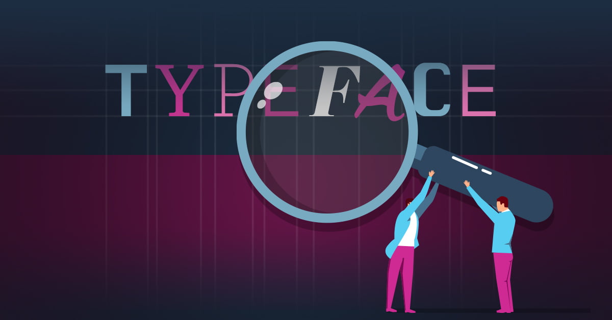
There are thousands upon thousands of typefaces to choose from. Whether you’re trying to choose a solid typeface to use consistently in your branding or a fun and unique stylized typeface for an ad, the one you choose will help you portray who your brand is, reinforcing an underlying visual story. In this article, I will cover different kinds of typefaces, what they communicate, and lay out some examples.
Get to Know your Typeface’s Personality
Typography has the ability to communicate beyond written words. Just like when you’re having a conversation with someone, the words they say are reinforced by facial expressions, hand gestures, and overall body language. Typefaces have the ability to portray your brand as sophisticated, rugged, quirky, modern, fun, and everything in between. Below are the main categories of typefaces and what they portray.
Serif Typefaces
Serif typefaces are characterized by the small bracketed feet at the end of each letter, highlighted in pink in the image below. Those little brackets are called serifs! The letterforms also have varying stroke widths, as you can see highlighted in blue.
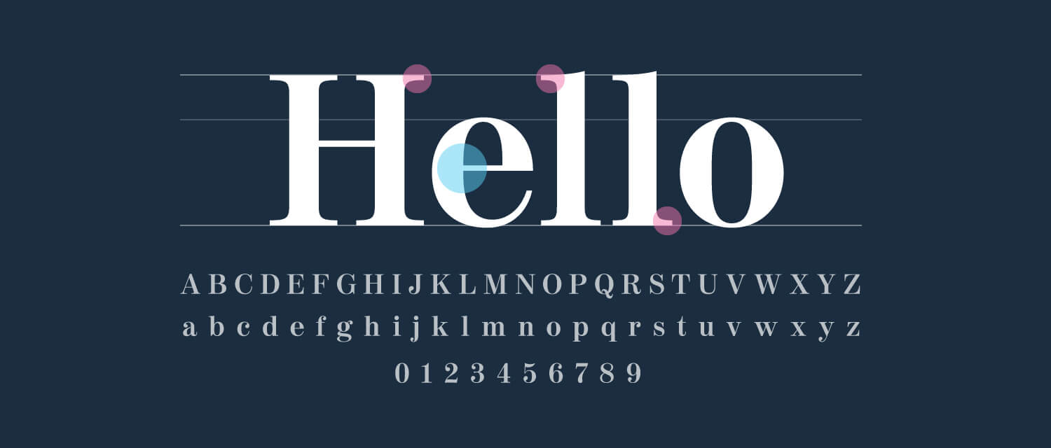
Serif typefaces portray a brand as refined, trustworthy, and even high-end. They are the oldest typeface style and because of this, we perceive them as being dependable and professional. Some brands that use serif typefaces in their logos are Tiffany and Co., Time Magazine, Rolex, and T-Mobile, just to name a few. It’s typical for magazines, insurance companies, universities, and high-end luxury brands to use these professional-looking style typefaces.
Serifs in Action
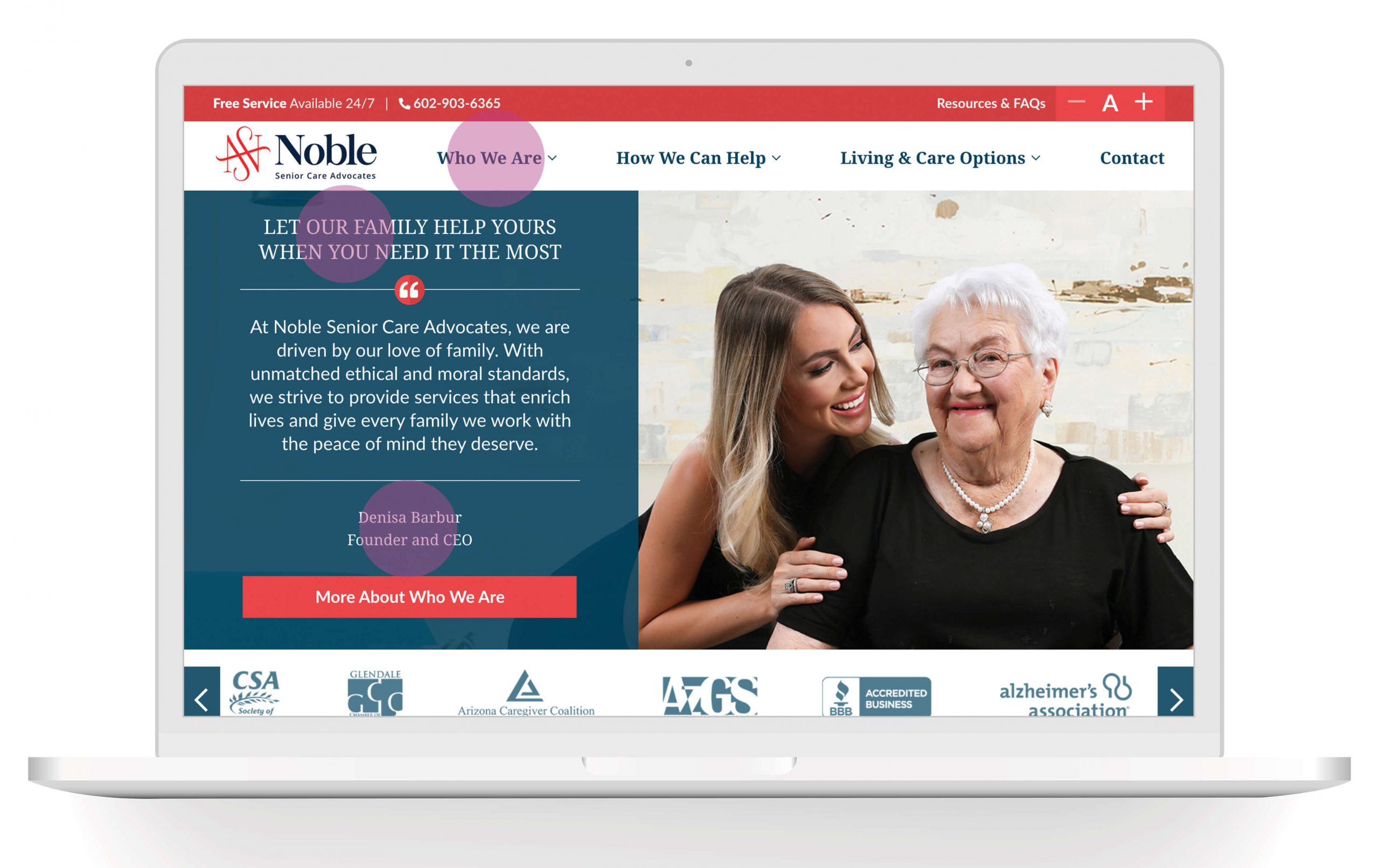
Noble Senior Care Advocates is a company that specializes in helping families choose senior living and care for their loved ones. When developing this brand, we needed a typeface that would portray their professionalism and trustworthiness to their audience. Choosing a serif typeface reinforces that they’re a dependable brand that families can trust. You can see the serif typeface highlighted in pink below.
Slab-Serif Typefaces
Deriving from serif typefaces, slab-serif typefaces are characterized by the same brackets at the end of letterforms, but these brackets are larger and blockier. Horizontal and vertical strokes are typically uniform weights.
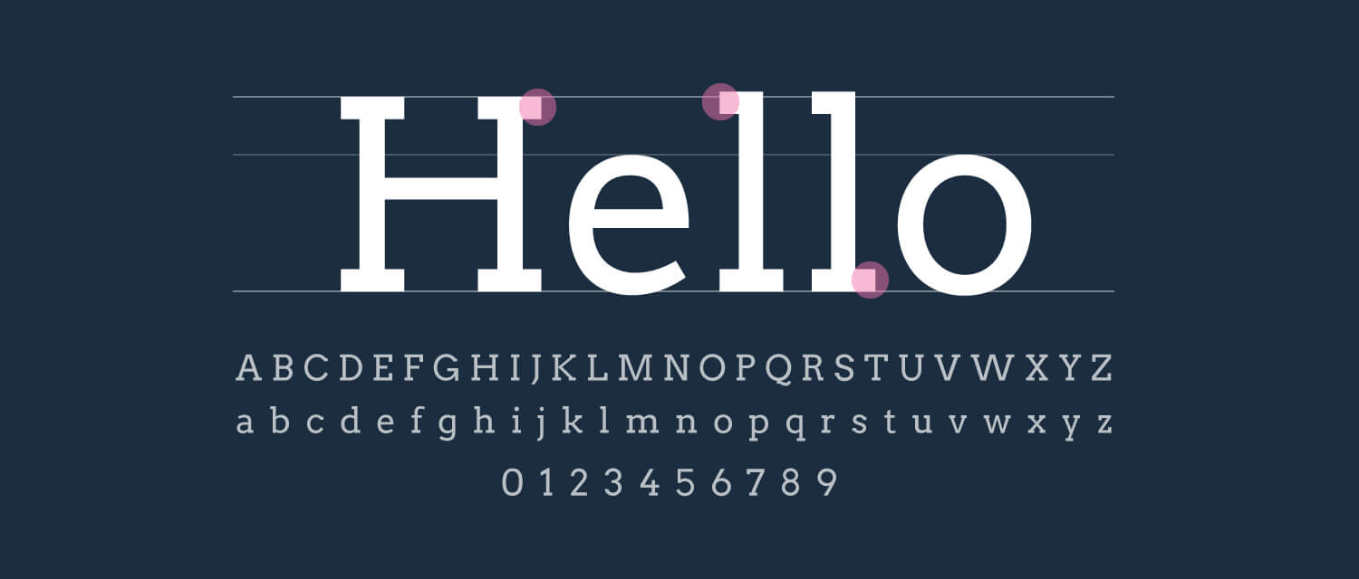
This creates a face that is bolder with a pinch of quirkiness, making the brand feel more approachable and playful. Along with portraying the feeling of being bold and quirky, this typeface can feel rugged and has a big impact. Some brands that use slab-serif typefaces are Volvo, Sony, and Honda.
Slab-Serifs in Action
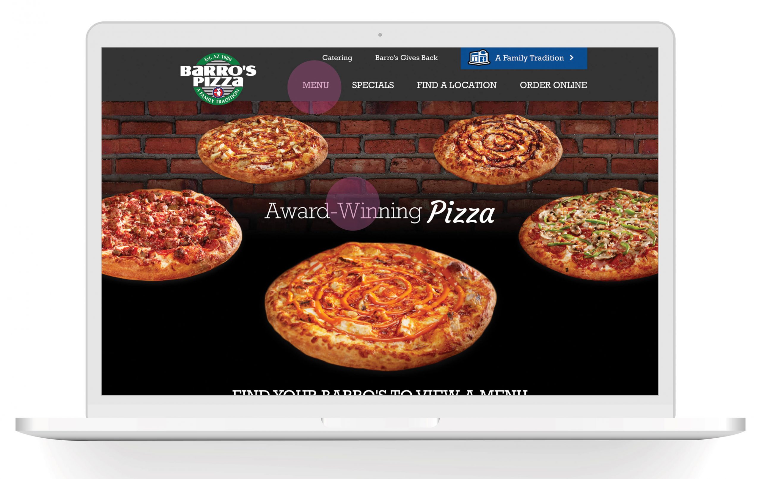
Barro’s Pizza is a great example of a client that Zion & Zion works with that uses a slab serif typeface in their branding. Barro’s Pizza is a local, family-owned chain of restaurants, so this fun typeface portrays tham as approachable and family friendly.
Sans-Serif Typefaces
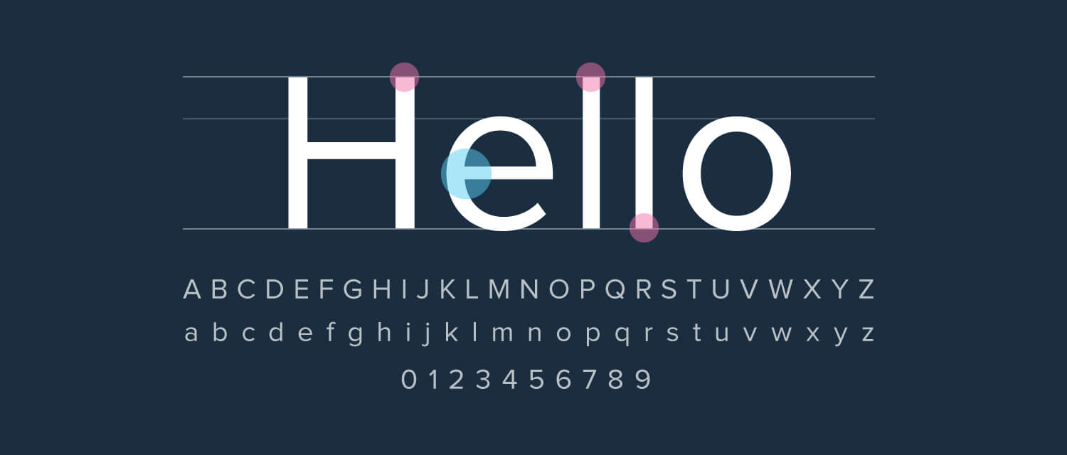
Sans-serif typefaces do not have the small bracketed feet at the end of each letter. It’s in the name; sans, meaning without, serifs. Sans-serif typefaces typically have a uniform weight across vertical and horizontal strokes, as you can see highlighted in blue.
Sans-serif typefaces portray a brand as casual, approachable, modern, and fresh. A lot of start-up companies are using sans-serif typefaces in their logos and throughout their branding. Some large companies that use sans-serif typography in their logos are FedEx, Amazon, Hulu, and Facebook, to name a few. Sans-serif typefaces feel clean and minimalistic and are easy to read.
Sans-serif typefaces have become increasingly popular over the past few years, many large brands opting for a logo refresh. A notable example of this is the Google logo redesign pictures below. In contrast to the old, the new logo feels much more approachable and playful while not being a huge departure from their existing branding. As an added bonus, the new logo is more scalable, as well as versatile enough to incorporate motion graphics used throughout their brand that feel symmetrical/systematic and playful.
Sans-Serifs in Action
Cubex is an inventory-management and security system used by veterinary professionals. Their brand is very clean and modern, so using a sans-serif typeface was appropriate for their branding.

Script Typefaces
Script typefaces are characterized by fluid lines and are designed to emulate cursive handwriting.
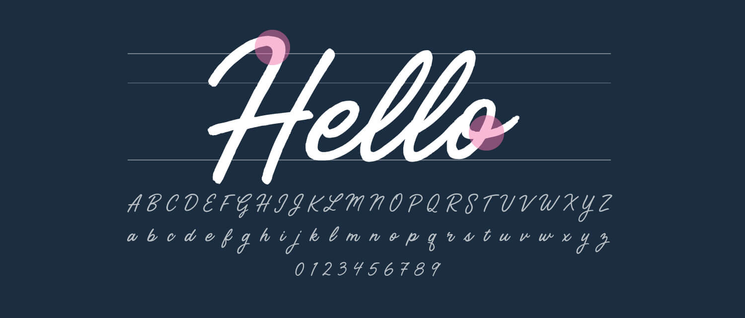
There are many different styles and types of script typefaces, but they generally portray a brand as elegant and unique, adding a human touch to a brand. Hand-lettered script typefaces have blown up in popularity over the past five years, so it’s important to choose a high-quality, solid script typeface if you’re incorporating one into your brand. Many of these types of faces are light in stroke weight so they should never be used for body copy, as they are typically hard to read when scaled down. Some brands that use a cursive typeface in their logotypes are Pinterest, Instagram, Johnson and Johnson, and Coca-Cola.
Script in Action
Sun Health is a non-profit organization that is committed to bringing health and wellbeing to the West Valley of Phoenix through patient care, research initiatives, and wellness programs. When developing the branding for Sun Health Foundation, we wanted to portray them as warm and inviting, adding a human touch through a script typeface.

Handwritten Typefaces
Handwritten typefaces are meant to look and feel as if someone wrote them by hand. There are also many different types and variations of these typefaces.
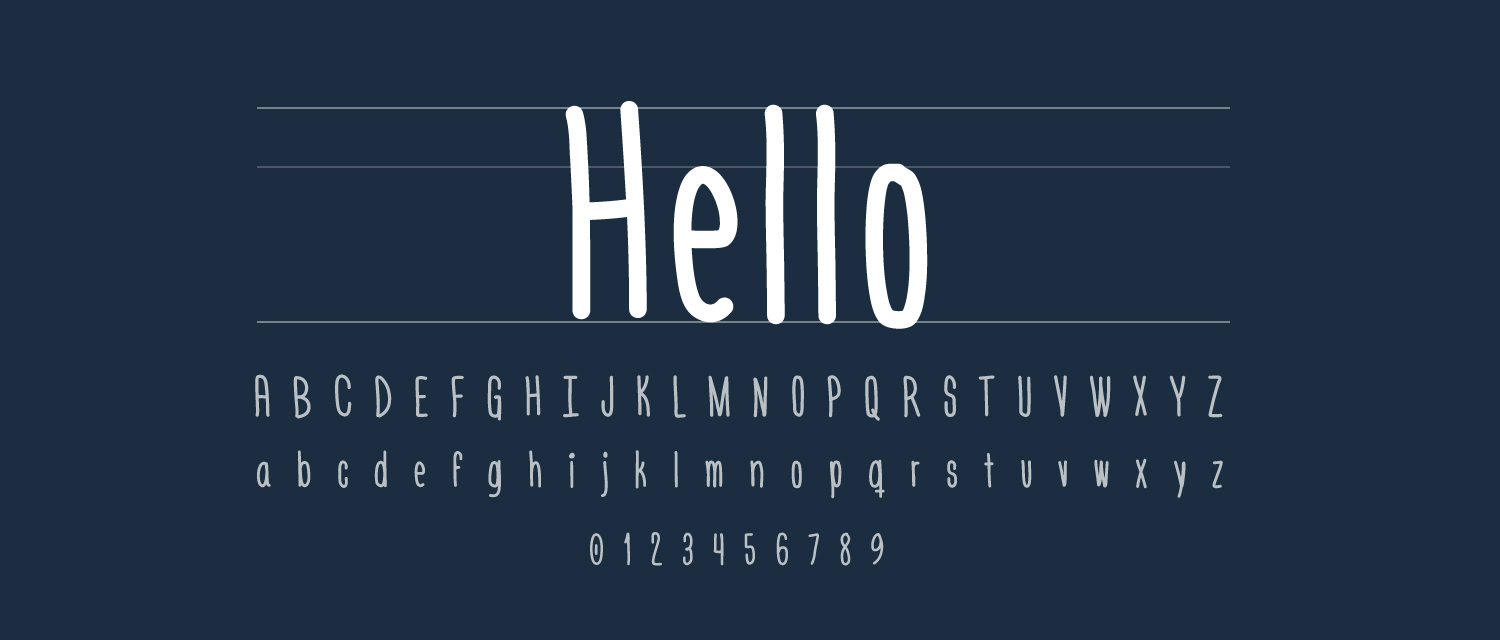
Handwritten typefaces are the most playful and approachable of all of these typefaces and add humanity to your brand with their imperfect forms. These faces are completely informal, artistic, and are used to portray hand-made or artisan. It’s important to also note not to use handwritten type for body copy, as it’s busy and hard to read large bodies of copy. Some brand that use handwritten typefaces are Disney, Olive & Ivy (Fox Restaurants Concepts), and MTV.
Handwritten in Action
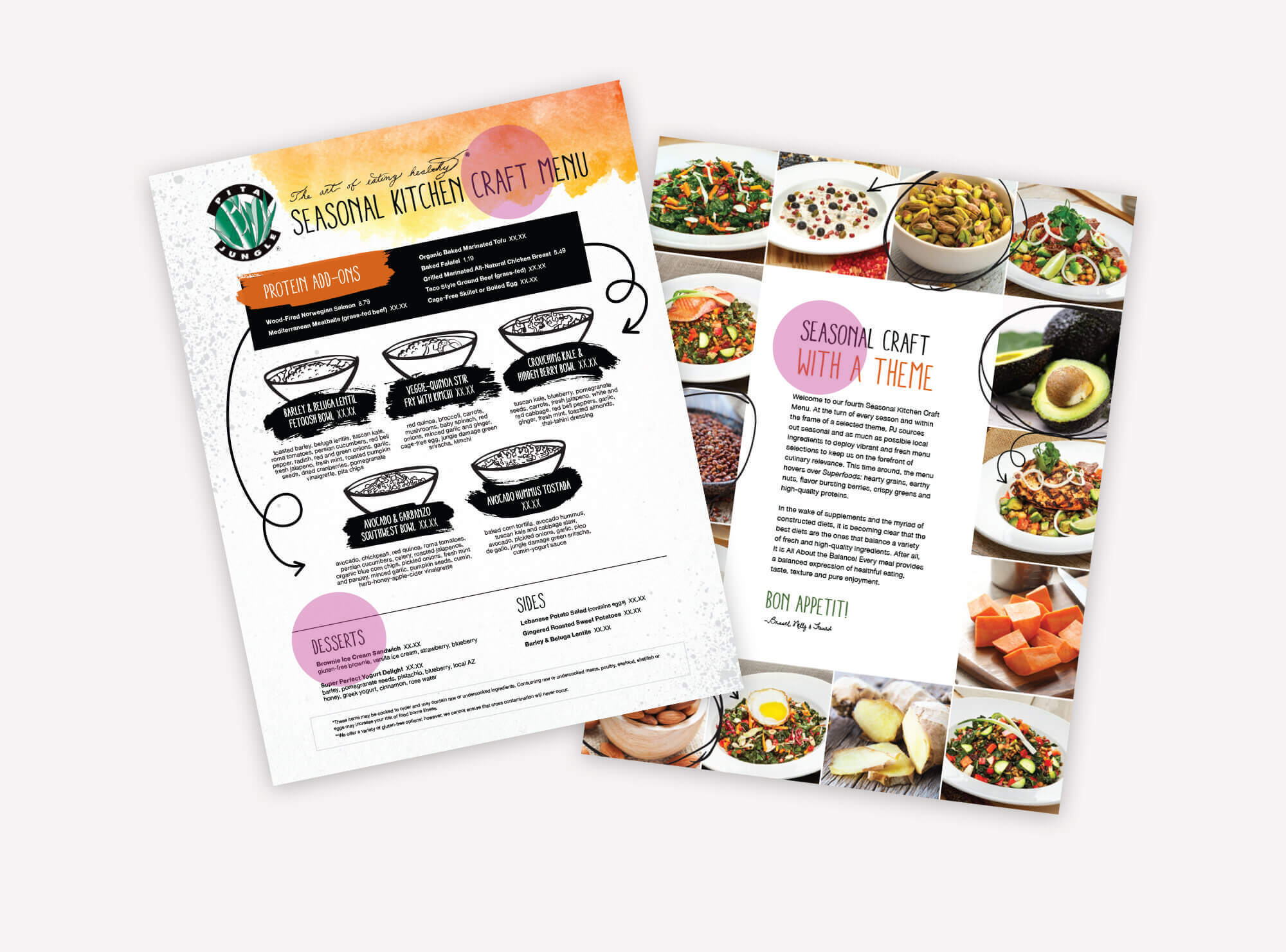
Pita Jungle is a great example of a brand that is artistic, fun, and informal. Their branding includes custom illustrated artwork supported by their hand-written typeface. You can see an example below on one of their seasonal menus.
Conclusion
There are many different typefaces out there. Choosing the correct one for your brand is just as important as choosing color, photography style, and graphic elements in order to tell a visual story and portray who you are to your audience.