When you think about accessibility in your day-to-day life, you might think of elevators, ramps, hand rails. I think about curb cuts. A curb cut is that sloped portion of the sidewalk that allows people to enter and exit the street without stepping up or down. These were originally created for people with mobility issues but it has created a safer and easier accessible walkway for everyone; from people with strollers, pushing carts with groceries, kids with scooters. When you design for disabilities, you make things better for everyone in the process, promoting greater web accessibility.
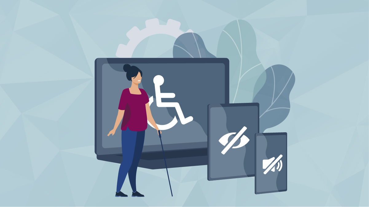
Something we don’t think about is accessibility in the virtual world. Even when you do, what comes to mind? Larger text? Maybe some alternative color options? But what about accessibility you can’t see, like screen readers, and how they can be the only window to the online world for some people? Studies have shown that Americans with disabilities are 3 times less likely to go online than those without a disability. Many do not own a computer, laptop, and, even less likely, a smartphone.
Accessibility is usability. Allowing everyone the same access to things should not be a second thought. Instead of accessibility being seen as something you add onto your design or into your development at the end, the necessary accommodations should be something ingrained in the process from the beginning.
Designing can be difficult when certain colors are necessary for brand standards, but understanding how and when to use colors is important not only for aesthetics, but also for accessibility. Color contrast is important not only for emphasis on certain items, but also for users with poor eyesight, color blindness, or other eye conditions. Headers set in order from h1 to h6 are also important for screen readers, but it also helps users visually see the hierarchy of the page.
Development has many additions that help with accessibility. Alt text for instance can give sight impaired users a description of what an image is displaying, but it is also useful for users with slow or interrupted internet. Describing an image well is important, and adding as much detail gives all users the same information. On the other side, images which are purely decorative should be ignored by screen readers, and instead given an aria-hidden attribute.
Some easy additions to your website include the following:
- Image Alt Text: Written copy that appears in place of an image on a webpage if the image fails to load on a user’s screen. This text helps screen-reading tools describe images to visually impaired readers and allows search engines to better crawl and rank your website.
- Header Hierarchy: The relationship between main headings and subheadings. The hierarchical structure shows users how topics fit together. A clear and logical heading hierarchy shows readers where to find information and how important it is.
- Link Descriptions: The link text alone should convey the function and purpose of the link. Link text should also be unique and easy to speak out loud. Avoid link text like “Click Here,” “More,” and “Read More.”
- Color Contrast: Brand colors are very important, but understanding contrast will help users see everything you’re trying to say. Black text on a white background has a 21:1 contrast, which is the best you’ll see. Check out this contrast checker that helps to illustrate the importance of contrast.
Creating accessible content online is easy and allows for the internet to become a more meaningful and thoughtful place for everyone. Whether buying a custom website or a ready made template, being aware of the accessibility standards within are paramount. Giving users an easier way to access information online is the minimum. Allowing all users to interact with your content easily is the goal.
Recently there have been accessibility overlays which claim to easily make any website accessible. Unfortunately, such overlays may impede screen readers and make the website more hostile to disabled users. There have been many different overlays presented, but there is no simple solution that can be slapped onto a website to make it more accessible. Again, accessibility needs to be part of the initial design and development process, not something added to the end as an afterthought.
In the end accessibility should be part of the process as the online world continues to grow. The internet has unlimited information and it’s crucial that we as developers need to start taking the steps necessary to create an inclusive space that anyone can access. Incorporate into your current process, work with disabled people, and be open to the new, and make changes for good.