Designing based on user testing and research findings.
It’s a common misconception that a graphic designer’s job is to just make things pretty, when really, that’s the exact opposite of the true definition of the word design. In short, design means “to plan.” The purpose of graphic design is to not only create something visually appealing, but to create something that’s also strategic and purposeful.
So, how do we, as designers, do that? Intuition, yes. But we can also use research and data to drive the design and back up our gut reactions and design instincts.
How designers get data.
At Zion & Zion, before a project starts the visual design phase, we have research and UX teams dedicated to gathering information. It’s important for designers to be included in the initial research to fully understand where the data comes from and why the research is important. This stage also helps designers make connections and communicate those connections when explaining design choices.
The following are a few of the tools and resources we use to perform this research:
- Google Analytics
- User testing
- Preference testing
- Click testing
- Heat maps
- A/B testing
- Probability testing
Read on to determine how you can use these tools to influence and leverage your design choices.
Google Analytics
Designers can use this tool to see things like bounce rate (how fast the user leaves the site), which can indicate to a designer if the viewer is engaged in the design; average pages per visit, which can give a designer information on whether the design is confusing and needs to be updated; average time the user spent on the site, which can indicate if users found the content interesting, or if they left quickly, maybe the navigation needs to be revisited. All of these Google Analytics reports, and more, can provide insights into how well your site is performing.
User testing
In user testing, you have the opportunity to ask recruited users to give specific feedback about a client’s current website or competitor sites. To find users tailored to your client’s specific demographics, you can adjust specifications like income, geographic location, age, and gender.
During your user test, try to ask task-related questions. You want to make sure that you’re doing your best to replicate what an actual customer would do on each site. During the time they’re performing these tasks, users tend to share things like, “That was difficult to use,” “I really enjoyed this element,” or “This confused me.” After the test, you can then ask follow-up questions like, “How did this make you feel?” or “Did anything about this particular section frustrate you?” Once these questions have been answered, you can interpret and adapt a design based on the user’s feedback.
For tips on how to run a successful user test, take a look at my colleague’s blog post, 11 Ways to Make Sure You Run a Successful User Test.
Preference testing
Preference tests can be used for choosing between variations of color schemes, layouts, copy, icons, or interfaces. You can ask users to choose based on specifics. For instance, if you’re working on a new restaurant brand, you might ask them, “Which photo looks more appetizing?” or if you want a more general response, “Which design do you prefer?”
Click testing
Click testing can be done on anything from a wireframe to a mockup, or even a screenshot of a live site. We recruit users and ask them where they would click to perform a designated task. This can reveal if a designer could adjust contrast and color to make something more or less bold.
Heat maps
A heat map is defined by Wikipedia as “a graphical representation of data where the individual values contained in a matrix are represented as colors.” Some of the following tests show collected data in heat map format:
Hover maps
Using a heat map, hover maps show where users hover with their mouse, indicating where they are looking. Results of this test can help a designer place a CTA (call-to-action) or navigation, based on the goals of the interaction.
Click maps
Click maps also use heat maps to shows where users click. Similar to hover maps, these maps can help designers lay out a page.
Scroll maps
Using heat maps, this type of map shows how far users scroll down on a page and where they tend to drop off. This can give designers insight on where they might consider adding a graphic or some sort of indication that there’s more information further down the page.
A/B testing
A/B tests use two or more variants that are shown at random, and the data is used to determine which version has a better conversion rate. For example, a designer could test two designs, one that had a photo on the left side against the same design, but this one the same photo on the right. The results can help a designer decide whether to put that photo on the left or right side of the layout depending on which resulted in a better conversion rate.
So, how does a designer translate all this data to an actual design?
Designers can take all this information and apply it to design ideas. By using a combination of tests, research findings, and data, designers can successfully create a company’s brand, logo, and website, and have data to back it up.
To backup and prove the designs, a designer will need to start with data about their potential users. They can then translate that into what the design elements for those results might be.
At Zion & Zion, one way we translate data to design is by using a design matrix tailored to our process, in order to create a bridge from our strategy, test results and research findings to design elements that could potentially represent a brand.
Design matrix
We create our design matrix by going through the following steps:
- Narrow down ~five personality traits of a company based on research and test results.
- Use those personality traits as the first column of the matrix.
- Add design elements, like photography style, typography, and colors to the top row of the matrix.
- Establish the best design element representation for each brand personality trait.
- Fill in the matrix with the corresponding design elements. For example, you may match the color yellow to a happy personality trait.
- Finally, start on your moodboard, mockup, or logo design. These elements should reference the design matrix along the way.
We typically don’t use everything in the design matrix. Rather, we use our experience, education, and intuition to make choices based on the research, data and design matrix that bring everything together in a cohesive design.
A real-world example
Our client Modesto Dairy Solutions was a project we applied this process to. We were able to develop new branding, logo, and website using a design matrix, all of which was based on research and strategy.
Modesto Dairy Solutions builds and remodels dairy farms, making them modern and more efficient. With this particular project, it was very important to do a lot of research for two reasons:
- No one on our team had any experience with dairy farming, let alone the equipment used when building dairy farms.
- The client did not have a current website that we could reference.
So, we toured their facilities, talked to their customers, and performed industry research and analyses. What we found drove how we came to the personality traits, and that influenced the outcome of possible design elements to use in the design of their logo, branding, and website. Below is our final design matrix for Modesto Dairy Solutions.
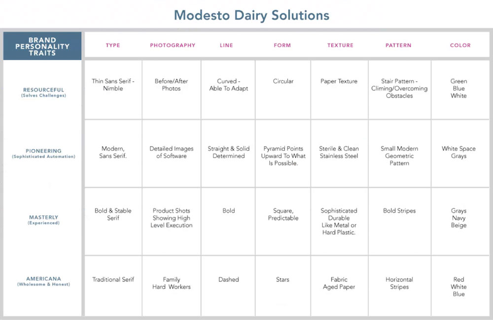
As you can see, by using our matrix, we were able to come to design conclusions. For example, for the brand personality trait “Resourceful” we determined that the photography that would best represent that trait would look like before and after photos of their remodels (which we used on their new website).
We also saw that the color blue continued to appear over and over in the matrix. You’ll see on our moodboard how different shades of blue were used. But, as you can also see, some of the other colors found in the matrix were green and red, which are not used in the branding because they didn’t make sense when we actually started laying out the design. This is where a designer’s experience and intuition comes into play.
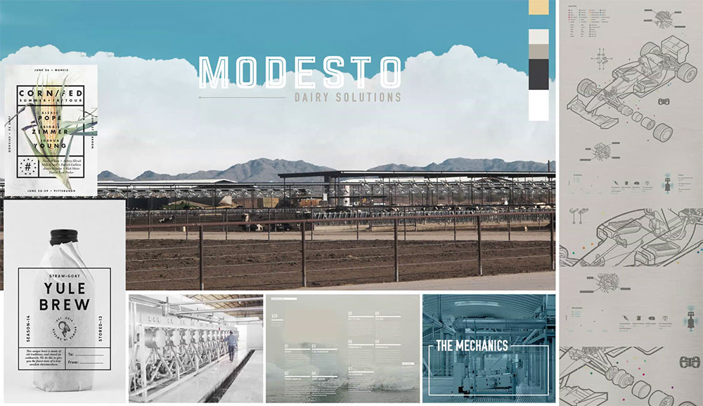
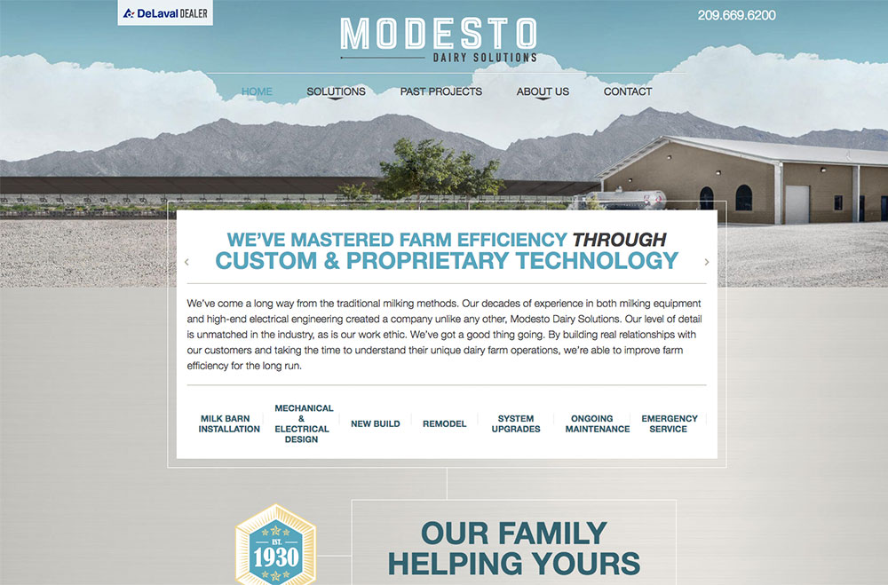
Below is the logo and moodboard that was eventually crafted. Again, a lot of blues, modern, serif typography, and textures like brushed steel. All of these elements are found in the client’s matrix. On the internal pages of the website, we have photos of their team members, which speaks to their “Americana” brand personality trait. There are also shots of their technical equipment, speaking to their brand trait “Masterly.”
We used the matrix as a reference, but didn’t necessarily put everything from it into the design. In the end, we were able to go from data to matrix to design pretty seamleassly. Because we (the graphic designers on the project) were included in the research phase, we were also able to explain to the client how we got where we did.
Try using data in your next project and see the results for yourself.
Because we use research and data to guide and back up our design process, it’s much easier to present our recommendations, and it’s much easier for a client to understand how (and why) we got to the conclusions we did.
Design is not about arbitrarily picking and choosing elements just because they look pretty, rather it’s about thoughtful planning, using real data, and resources. Backing designs up with data results in a more confident designer and more comfortable and trusting clients.