Before we can dive into the future of HTML emails, we need to look at emails of past and present. Unfortunately, HTML emails are leagues behind modern web development. Your fancy HTML5 and CSS3 are not available when coding an email. We’re going to code like it’s 1999.
We’ll cover these email basics:
- HTML Tables
- Inline CSS
- Images
Before you roll your eyes in disgust over such archaic techniques, let me explain why emails have not made the same advancements as modern web development. Every email client, like Gmail and Outlook, uses their own preprocessors and rendering engines to process the HTML.
These preprocessors and rendering engines remove what they determine to be harmful: unrecognized tags, external style sheets, and JavaScript files. This means that your email may not contain the same elements or styles as what you originally coded.
An example of an email client that produces unexpected results is Outlook 2007. Outlook 2007 uses Microsoft Word to process its HTML. As you can imagine, Word has poor support for HTML and CSS. So we must code for the lowest common denominator, which requires table layouts and inline styles. Better safe than sorry.
HTML Tables: Tables on Tables on Tables
When constructing an email, you’ll be tempted to use divs, articles, and sections much like you would for a web-based project. Don’t. These elements are not universally supported, so proceed with extreme caution when using them, especially if they are your structural foundation.
Tables are universally supported and considered the standard for HTML emails. You’ve probably been told a million times that tables are used only for tabular data, which they are. But you’re going to break that rule for emails by using a table-based layout.
Even if you’ve interacted with tables before, there are some common attributes used in emails that you may be unfamiliar with. These attributes allow you to style your table without ever having to write a line of CSS.
These attributes include:
- align
- valign
- bgcolor
- cellpadding
- cellspacing
- border
<table width="600" cellpadding="0" cellspacing="0" border="0" bgcolor="#ffffff">
   <tbody>
      <tr>
         <td width="600" align="left" valign="middle"</td>
      </tr>
   </tbody>
</table>
Some best practices to keep in mind for your HTML:
- An ideal width for your email is 600px. This is because most email clients’ preview windows are that size by default. On desktop, this also has the advantage of allowing your user to view your email, without ever actually having to open it. The maximum width your email should be is 800px. If your email is larger than this, it will appear as though your content is cut off in the preview window, and require the user to scroll horizontally to view all your content.
- Nest your tables. Nested tables give you more control over your table. You should have a minimum of two tables. One of these tables will be immediately placed after your opening <body>. This will serve as the body in case that tag gets stripped during rendering.
Inline Styles: Say Goodbye to Separation of Structure and Style
External style sheets and <style></style> within the head are not reliable ways of including styles for your email. External style sheets are often blocked and elements like the head, which can contain <style></style>, are often stripped from the HTML. That leaves us with one option for styling: inline styles. Inline styles are considered the standard for styling your email.
Don’t:
<link rel=”stylesheet” type=”text/css” href=”styles.css”>
Don’t:
<style type="text/css">
body {
   -webkit-text-size-adjust: none;
   -ms-text-size-adjust: none;
   -moz-text-size-adjust: none;
}

body {
   margin: 0;
   padding: 0;
}

table td { border-collapse: collapse; }

p {
   margin: 0;
   padding: 0;
   margin-bottom: 0;
}

h1, h2, h3, h4, h5, h6 { line-height: 1; }

a { border: none; }

</style>
Do:
<span style="font-family: sans-serif; color:#030303; font-size:28px; line-height:1.5; text-transform: uppercase;">
Just because we can use inline styles does not mean that all styles are available to use. Support varies for CSS across email clients. For questions about CSS support, I suggest Campaign Monitor’s Ultimate Guide for CSS. It’s a comprehensive guide that details which CSS is supported in the 10 most popular mobile, web, and desktop email clients.
Don’t let the varying CSS support discourage you too much. While some CSS is not fully supported, it doesn’t mean that you can’t include it. It simply means you need to have backup measures in place where it is not supported.
An example of this would be including a web font. When including a web font, make sure you also include generic fonts, like Arial and Times, in your font stack.
Here is the font-family CSS we use for one of our email clients:
<span style="font-family: 'Josefin Sans', Helvetica, sans-serif;”>
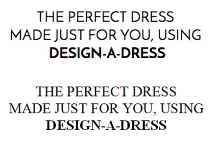
Below are examples of how the font gets rendered across different email clients. Apple Mail, on the top, supports web fonts while Outlook, on the bottom, does not.
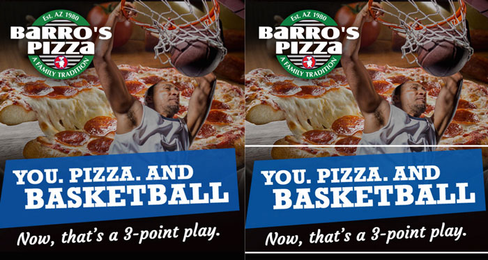
The same applies for background images. Wherever background images aren’t supported, make sure you have a background color in place. Here is an example of an email I recently received from Code School. You can see that they provided a background color for email clients that don’t support background images.
On the left is Apple Mail 7 and on the right is Outlook 7.

Pro tip: to save yourself some development time, code your styles in the head using the <style></style>. When you are finishing coding, run your HTML through an inliner, like /Mailchimp’s Inliner or /Foundation’s Inliner. This allows you to experience a normal web development workflow that styles elements based on elements, classes and ids.
Think of all the time you’ll save by not writing out each style for every element. Some email marketing products will even do this for you before an email send, like Mailchimp.
Images: GIFs, JPEGS, and PNGs—Oh My!
GIFs, JPEGs, and PNGs are the most popular image file types for email. However, it comes as no surprise that there are support issues for these common file types. GIFs and JPEGs are fully supported by all email clients.
One downside to GIFs is that certain email clients will not display the GIF in its entirety, instead only showing the first frame. This means that the first frame of the GIF should be designed with that fact in mind. In the past, PNGs were not fully supported by web browser email clients. PNGs would be disabled in the email. Now, there appears to be better support, but always err on the side of caution and test extensively before sending!
Speaking of disabled images, some email clients will disable all images, leaving only the alternative text to appear. This is why every image should be given an alt text. Alt text is also important in situations where the image path is incorrect. The alternative text will provide the user insight into the content that is missing.
Here are some best practices when using images in your emails:
- File size matters. Be sure to compress your images to the smallest file size possible. Remember: file size directly impacts load time, and this can be crucial. An email that takes forever to load is an email that’s likely to be skipped over. Litmus suggests keeping your load time under 2 seconds.
- When using images, you might notice a small gap between images. It is a best practice to add display:block to all your images to avoid any of these rendering discrepancies.
Responsive Emails: The Future of HTML Email
With more people using their mobile devices to access their emails, emails are moving towards being responsive.
Like web development, responsive emails use media queries. Media queries allow you to deliver different CSS depending on the screen size. You can use several media queries to target different screen sizes, like max-width:600px or min-width:480px, and even orientation, like landscape and portrait.
@media (max-width: 600px) {
   table { width: 100% !important; }

   }
}
While tables scale automatically, your content or images might be more difficult to read on smaller screens. At the simplest, your responsive email should increase your font size. Ever looked at an email on your phone and thought, “wow, I can’t read this”? Well, some simple, responsive CSS could have helped. This small change will also help users more easily click links in any body copy.
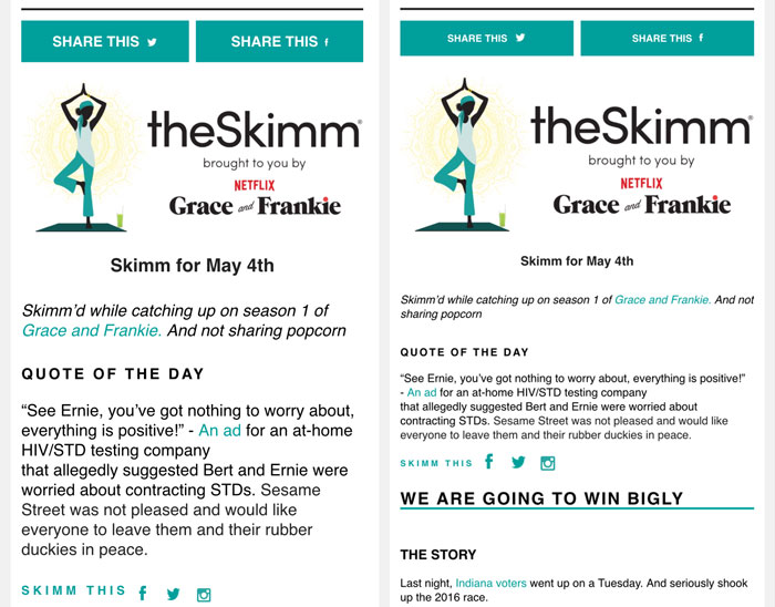
/TheSkimm does exactly this. On the left is the mobile version, and on the right is the desktop version.
An example of responsive email design is Uber’s footer, which contains their social media buttons. You can see they stack the button on mobile. On smaller devices, the original side by side layout might be difficult to click due to the buttons’ close proximity.
By stacking the buttons on mobile, they ensure their user will not accidentally click the wrong social media button.


As with email, not all email clients support responsive CSS the same. In fact, some email clients do not support it at all.
To Wrap Things Up
Above all: test, test, and test your email some more!
There are paid services that allow you to see your email on every email client, like Litmus. An alternative would be to sign up for free email clients and download their applications, like Gmail, Yahoo, and Hotmail. It is so important to test to make sure your email is displaying correctly across all email clients. At its extreme, a broken email can contribute to unsubscribes—and nobody wants that!
These simple tips and tricks should help you create an email that will render consistently across all email clients.