Hand-Lettering Around the Zion & Zion Office
Over the past year I’ve had numerous and wonderful opportunities to create lettering for a wide variety of things around our Tempe, AZ based Zion & Zion office. From signage, to t-shirts, to everyday inspiration, there’s a little bit of lettering scattered all across the agency. Below is a list of the many pieces I’ve created, how/why they were made, and where they live in our office to this day. Enjoy!
Chalkboard-Lettering
The giant Zion chalkboard lives on the third floor of the Zion & Zion office. It’s nearly 200sq. ft. and can be viewed right when you step foot inside the office. Many lettering pieces have been drawn on this chalkboard—most of which take anywhere from 5-15 hours to complete. There are always new chalkboard pieces in the works. From our agency mantra and bits of inspiration to season’s greetings welcoming in clients and guests, the chalkboard is always filled with something custom, relevant, and personal. Here is a look at some of the previous works:
Where Business Meets Creative
February 17, 2014

The very first piece I completed on the chalkboard was the Zion & Zion mantra, “Where Business Meets Creative.” During the first couple of months that our new office was open (beginning January 2014), we had numerous visits from clients, friends and family that wanted to see the new space. It was the perfect time to fill the board with something those visitors could enjoy and remember. As with most of my lettering pieces, they all start with a simple sketch on paper. After refining the composition, weights, overall color, etc. the final piece was approved and ready to go up on the large chalkboard. Adding the pink and blue was a nice touch to emphasize the new Z&Z branding we launched with the opening of our new office.
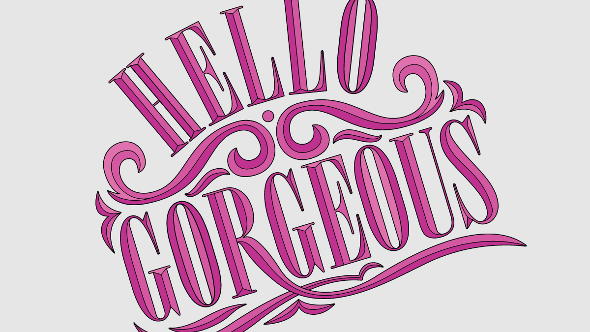
If You’re Not Having Fun, Then You’re Doing it Wrong
September 12, 2014

The second piece I drew on the chalkboard was a fun phrase to instill some motivation and inspiration. I drew multiple variations on paper before selecting the composition that you see in the image. For this piece, I wanted a simple yet playful nature to the typography and accompanying illustrations.
Making Spirits Bright
November 24, 2014

The third lettering piece I completed on the chalkboard was drawn specifically for the holiday season to spread some holiday cheer around the office. With this holiday lettering, I wanted to incorporate some illustrations of wreaths and snowflakes to really add to the winter and holiday theme. Containing the phrase inside a shape helped differentiate this lettering a bit more from my previous pieces. After all, I want to create something new and different every time, rather than simply using the same style and look.
Stack ‘Em Up Artwork
February 26, 2014

This piece was completed for the foldable wall that divides the game room and the War room. Multiple sketches were completed before creating the final piece in vector format for printing purposes. My interests in embellishments and flourishing solely determined the look and feel of this piece. I wanted to incorporate some of these embellishments with the typography.
Bathroom Signage
March 26, 2014

As with the “Stack ‘Em Up” artwork, these bathroom signs were created in the similar style to keep a consistency throughout the office. As for the phrases, we wanted to keep things a little different and change things up from the “standard” bathroom signage. The color choices of the lettering and wording of the bathroom signage certainly helped dictate which was the “Men’s” and which was the “Women’s” restrooms.
Work Hard Play Hard Mural
April 2, 2014

As for the last piece in the office, this mural was a ton of work! The words “Work Hard, Play Hard” is something our office likes to live by. I sketched out many, many versions of lettering before proceeding to draw the final piece on the wall of the second floor. The process was a bit different for this piece. I used a projector to project the sketch on the wall to trace at a larger scale. Then, I painted the lettering with some standard house paint from Home Depot. After about 25 hours of painting, it was complete!
Lake Day 2013 T-Shirt Design
July 29, 2013

Last but not least, I drew up a design for our annual Lake Day getaway. Once a year in the summer, the whole office closes down to spend a day relaxing and hanging out on the lake. For this special occasion, we create a new t-shirt every year for the employees to wear during the event. For our 2013 Lake Day shirt, I wanted to bring a Pirate vibe to the lettering and imagery. Of course, a skull and crossbones is the way to go.