
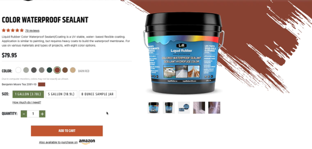
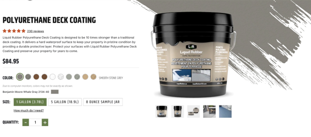
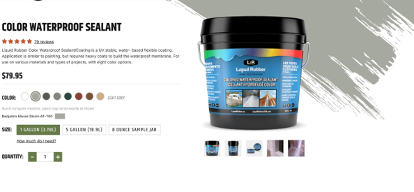
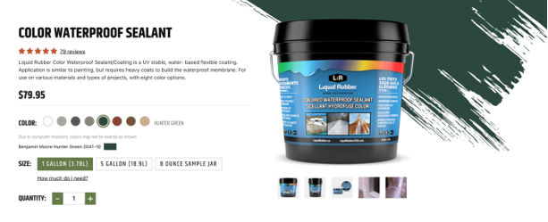
A recent project of ours was the development of a new ecommerce site for a client that is a manufacturer and seller of waterproof sealants. On the product pages, each product features color swatches. Our design team elevated the normal ecommerce experience with a brush stroke animation to reinforce the color selection and provide the user a large-scale color swatch.
When jumping into tackling the animation, there were a few initial considerations to make:
- Need to accommodate for several colors
- Need to accommodate for several textures, smooth vs textured
- Need to make an exception when white, either textured or non-textured, is selected
- Need animation mimicking a brush stroke effect
1. Accommodating Several Colors
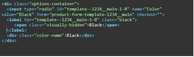
The products contained several colors, so we needed to make sure when an option was selected, the color was reflected on the SVG. Using a combination of JavaScript and CSS, this color change is accomplished. When a user selects a color option, the color class is grabbed from the input label and applied to the SVG.
Color Option Structure
Simple Javascript to grab color and apply to SVG
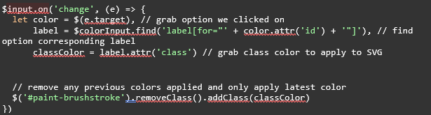
This Javascript needs to run on page load as well, not just when the user interacts with the color options, so the default color is applied to the SVG.
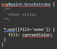
For the CSS portion, all child elements of the SVG need to have this color applied. When I originally built out this solution, I was under the impression I could use the inherit value on the fill property. Inherit is not an accepted value for the fill property, but the currentColor value functions similarly. Note this is not applied to any paths where no fill is applied to preserve that whitespace space.
2. Accommodating Several Textures
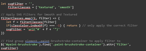
With the colors in place, the color and textures need to be combined into the SVG. Two textures need to be supported – smooth and textured – and the SVG filters are used to accomplish this.
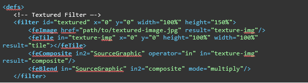
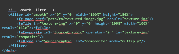
For each filter, an ID is applied to correspond with the filter type, textured and smooth. This is how the filter is applied to the SVG via JavaScript. Here is a review of each filter and its purpose:
- FeImage – This filter declares the image will be applied to the SVG.
- FeTile – This filter has the image above repeat like you would with the CSS background property. I did not have luck properly tiling the background image so I scaled up my image to cover the entirety of the SVG.
- FeComposite – This filters tells how to overlay the image onto the SVG.
- FeBlend – This filter applies blending like in Photoshop.
A small thing to note is that you can see on both filters, I have the height attribute set to 150%. With the initial value of 100%, I found there were coverage gaps in the background image. Bumping this value up to 150% did the trick to ensure the entire SVG was covered. Let’s move into the JavaScript portion to handle applying these SVG filters.
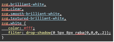
3. Accommodating White Color and Textures
Some products had white and clear options for their products. Since the SVG would be lost on a white background, a drop shadow was applied so the SVG remained visible during these selections.
My initial solution for this involved an SVG filter. Unfortunately, when conducting cross browser testing, we encountered the issue that the drop shadow did not appear on iOS devices on Chrome and Safari. These browsers treated the color white as being 100% transparent meaning the filters applied to the SVG were not visible.
Luckily there is a simple purely CSS solution to this. Apply the filter property via CSS. This addresses the iOS Chrome and Safari issue.
4. Applying the Animation
Now that the SVG has the proper color and textured applied, the last step is to apply the animation so it appears the SVG is being painted in. We used GSAP’s DrawSVGPlugin to accomplish this. As the documentation details: “DrawSVGPlugin allows you to progressively reveal (or hide) the stroke of an SVG <path>. It does this by controlling the stroke-dashoffset and stroke-dasharray CSS properties.”
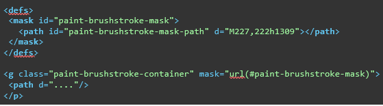
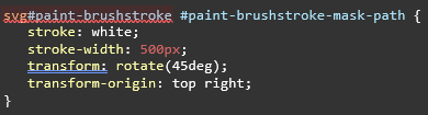
In order to accomplish this, we need to make sure a mask is applied to the SVG. This is a simple path that spans the width of the SVG. CSS properties are used to ensure the SVG is covered and to position it properly.
Once those pieces of the puzzle are in place, a single line of code is implemented to execute the animation. Properties like duration and ease can be tweaked to your liking.
Beginning an animation can often be overwhelming to execute. Usually, the best place to start is to break up the animation into manageable pieces. By tackling the color, texture and animation separately, I was able to achieve the desired outcome.