You spend a lot of time on your smartphone. We all do. You use it as an alarm clock, to check your email in the morning, to pay your credit card, to browse the web, and you probably use it for about a hundred more tasks every single day. Mobile devices have become as common as wearing a watch or carrying a wallet; they are attached to you and you don’t leave home without them. As service providers make these devices extremely accessible to audiences worldwide, phones and tablets have become the primary devices for users.
There’s been tremendous growth in mobile use over the past several years. In fact, 2019 is the first year that more than 50% of US social network users will be mobile-only.
This doesn’t mean that the desktop computer is going away, as many users still prefer to use their home computers for more “secure” actions, like shopping, for example, and for more “daunting” actions, like creating a photo album. But this increasing traffic for mobile tells us that users are now doing most of their media related actions (like browsing the web) on their phone or tablet.
Mobile has become the “primary touch point” for users. And it makes sense, right? We have extremely powerful computers at our fingertips. Phones and tablets have as much processing power as any other computer in the market, and 4G allows users to gain fast download speeds that are comparable to a home internet connection. Mobile internet speed was a crucial factor slowing the growth of mobile device popularity, but that’s in the past. It’s been estimated that in the future 5G will offer 20Gbps download speeds (in comparison to the fastest 4G download speeds today of 2Gbps) and 1ms latency.
What Does This Mean for Marketers?
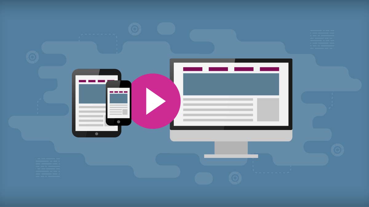
What does this mean for marketers, and how does it relate to the influence of mobile on desktop? With mobile traffic exceeding desktop traffic, the web is becoming a cross-device medium and mobile patterns and practices have bled onto desktop. Several years ago, we would create specific mobile versions for websites. Responsive design was non-existent, and phones didn’t have enough juice in them to handle pages with MB footprints. Not to mention that we would categorize mobile browsing as strictly on-the-go, forking content and scratching features claiming we knew what the user wanted and needed.
As responsive design has become a standard for web experiences, layouts are adapting to every different breakpoint by simply re-arranging their elements. At this point, the only difference between mobile and desktop devices is screen size. We’ve come to the realization that mobile is no longer a category defined by urgency or specific wants/needs. Users browse the web on their tablets and phones from the comfort of their couches. They research, read, watch, and shop from both small and large screens.
How Mobile Influences Desktop
This cross-device consistency has surfaced many benefits that we weren’t aware of in the past. The evolution of the web is now influenced by mobile usage more than anything else. Patterns and practices that have become beneficial and popular for the mobile web are, in result, also applied to the desktop version of websites. The following are some of the categories where mobile has influenced desktop.
Performance
The increased mobile traffic has required us developers to be more conscious of website performance.
Different Devices
Our logic needs to function throughout the large spectrum of devices, taking into account potential slow connections. This is beneficial for the web as developers have the responsibility to code logic that works everywhere. The power of CSS3 allows web designers and developers to create websites that look gorgeous without clogging the browser’s memory, contributing to a leaner download and a better experience for the user.
Image Compression & Type
Image compression has become a standard for any developer as it is the easiest way to reduce page size. Saving for web and setting images as progressive should never be overlooked at this point. Services like TinyPNG offer an extra nudge of performance by crunching your images to their limit.
Another option that’s become popular as it’s been adopted is the use of Scalable Vector Graphics (SVG). These are vector images that are composed of shapes, as opposed to pixels like in traditional raster graphics (JPG, GIF, PNG). This means that an SVG can grow to any size and retain its clarity. They are also written in XML, so the file size is extremely small. Since this has become popular it has been a big win for designers, developers, and the end-user.
Lower Interaction Cost
A popular topic in human computer interaction, which was recently made popular by the Nielsen Norman Group, is interaction cost. Interaction cost is defined as the sum of efforts—both mental and physical—that a user must deploy in interacting with a site to reach their goals. In simpler words, it’s the measured effort you make when you interact with a website.
A simple example to help grasp the concept of interaction cost is the global search field that appears on most websites. Let’s say you visit a news site and have a specific article in mind. Based on the fact that you know most websites have global search functionality (specifically ones with archives, like news sites), your instinct drives you to look for a field with either a magnifying glass or the words “Search” next to it. Once the page is loaded, the interaction cost for this goal is the time it takes you to identify and locate the search field.
As a web designer, the aim for a low interaction cost should lead you to placing this type of field at the very top-right corner of the screen. Based on the history of this pattern, users expect it to be placed in that corner of the layout. Placing it somewhere else will increase the interaction cost for the user, causing stress and frustration that might affect their experience and ultimately their decision to visit your website again.
Lower interaction cost is especially important for mobile devices. The limited real estate available for website layouts requires web designers and developers to think thoroughly about the best solutions that return a low interaction cost. This mindset, which has been forced upon creators due to the limitations of mobile, is beneficial throughout any experience. The lowest interaction cost should be a priority when designing mobile and desktop layouts. Assessing designs with this mindset can save money in the long run as it is a good measure of how difficult your interface is for the user. Figuring out the lowest interaction cost will always be the right choice.
Larger Typography
Due to the multiple factors that have placed content as a priority for websites, and with the rise of web fonts—thanks to Google Fonts and Adobe’s Typekit—typography is now a tool that can be leveraged to improve the user experience. Body copy displayed at a 12-14 pixel font size isn’t going to cut it anymore, specifically on mobile devices. Larger font sizes (which have now appeared to have been standardized to 16-18 pixels) allow for better readability on smaller screens and command attention from the user. Moreover, the vast array of beautiful web fonts (most of them available for free) allow designers to create content that has great type treatment. Gone are the days of Arial, Myriad, or Comic Sans (Bleh!).
Conclusion
The rise of mobile in the past several years has greatly affected the web. There is no longer a line dividing it into device specific categories. UX designers and web developers have shifted the direction of their work to tailor for small screens and large screens alike. The best practices for performance and design apply to any kind of device with a web browser.