How Movement Can Make or Break Your Design’s Usability
Meaningful movement is imperative to good design. The keyword here being “meaningful.”
When done well, and with purpose or meaning, movement can dramatically improve a user interface (UI), which can improve the user’s overall experience. However, when done poorly and with no purpose, movement can have a negative impact on the design, ultimately damaging your users’ experience.
Take the following video from Google for example. The video showcases a photo gallery on a mobile device, with two variations of the app’s movement occurring right after a photo is deleted.
You can see how important movement is in this scenario. You can also see how important the right movement is in this scenario. The first variation includes a lot of extra movement, visually showing the photo from the bottom row shifting, diagonally, up to the row above. The second variation, however, achieves the same end-result but with less movement, resulting in a cleaner and less overwhelming solution. The difference may seem insignificant, but imagine yourself deleting photo after photo after photo—that slight difference in movement will quickly become more significant.
As you can see in the video example, implementing movement isn’t quite as simple as it may seem. While there may be a million and one ways to do it, only a handful of those implementations are going to add real value to your final product. To ensure you’re adding movement to your design in a meaningful way, you need to consider the UX, design, and proper implementation.
- UX—how will movement impact the UX?
- Design—what will the movement look like and why?
- Implementation—what technology can, and should, be used to implement the movement(s)?
How to Improve UX Through Movement
As mentioned above, there’s a very fine line between adding movement to your UI in a way that adds true benefit to your users, and adding movement that harms and disrupts the user experience. Too much movement can be incredibly distracting while no, or not enough, movement can result in a dull, confusing, and uninspired UI.
Before you begin designing anything, first ask yourself these three questions:
- Why do I want to add movement to my UI?
- What am I trying to achieve by adding movement?
- How will this movement help my users?
Some level of movement is necessary in interactive design. In the video example we looked at earlier, when a user deletes a photo from their gallery, movement provides a visual cue confirming the photo was deleted. It also explains (in a visual way) the new order of photos in the gallery.
Another different, yet common trend in web design right now is animating in pieces content while a user scrolls down the page. Doing so can draw attention to the content, while also adding a bit of a ‘wow-factor’ to your site. However, it can be easy to go overboard so make sure your animations aren’t negatively impacting your UX and carefully choose specific portions of your page to animate in.
At the end of the day, movement is necessary. However, meaningful movement is preferred.
When done well, your users:
- should benefit from the movement.
- shouldn’t think twice about the movement.
- will have a positive UX.
How to Design the Right Movement
Tailoring your website to catch the user’s attention and imagination is a great way to showcase your products or services in an eye-catching way. But when designing these interactions, there are three big things to consider:
- What is the tone of your brand?
- Who is your audience?
- What is the purpose of the animation?
Tone of Your Brand
One of the most important things you must do before designing your website is to figure out your personal brand. If you are selling yourself as a serious, straight-to-the-point company, it doesn’t make much sense to have a lot of playful animations. Same goes on the other front, if you see yourself having a goofy, bubbly brand personality—you want that reflected in your animations, so you may select more loose and free-style animations instead of simple geometric styles.
Brand Audience
Why are people coming to your site? Are they here just for answers or do they tend to linger and look around the site more? If your audience is seeking purely information, a lot of animation will be distracting to them—try sticking to simpler interactions if this is the case.
The Purpose of the Animation
Is animation there to help make the loading time feel shorter? Are you using it to navigate from one element to the next? Does it show the user that they are hovered on something? Is it to inform them they have something in their cart? Or, is it simply to delight or entertain them? Always make sure you have a defined reason for the animation to avoid a sensation overload to your users.
Pre-Loader Animations
One of the best reasons to use movement in design is to keep the user happy and interested while they wait for something to load. There are several reasons why this is beneficial. For example, if you create an animation that indicates how much longer the wait will be, it puts the user at ease. But, even better, if you create an animation that is fun or interesting to watch, the user will not only be put at ease, but will also be entertained, distracted, and less likely to leave your site while waiting. If your page or application takes longer than normal to load, a “percentage-done animation” is a great solution. It makes waiting a little longer bearable because it keeps the user in the loop. The user knows when they can expect the page/video/app to be ready.
There are unlimited ways to animate your wait times. It could be as simple as a spinner wheel, or more quirky and fun like this loading animation from ITG.
If you choose to have a more intricate animation for you loading page, remember to go with something that aligns with your overall brand, or something that’s relevant to the subject matter that’s being loaded.
Scroll Animations
Moving from one section to another doesn’t have to be a straight and linear experience. Adding scroll-controlled zoom effects that take you from an extreme close-up to a wide-angle shot can help diversify the experience of your website while also allowing you to incorporate nice detail shots of your product. For elements like timelines, try including an up and down motion of the mouse to navigate the user from left and right. You can also incorporate fun illustrations to appear with scroll and other unique elements.
Designing Animations with a Purpose
Movement in design is not limited to having a pre-loader animation or scrolling effects. Below are a few examples of animations that serve a purpose—whether it’s to help or delight the user.
This website does a great job utilizing a pre-loader animation that fits with the brands sleek and minimalist aesthetic. It also has a nice flow of constant motion that keeps the viewing engaged without being distracted. The fluid-like motion they used to transition from page to page is a nice touch as well.
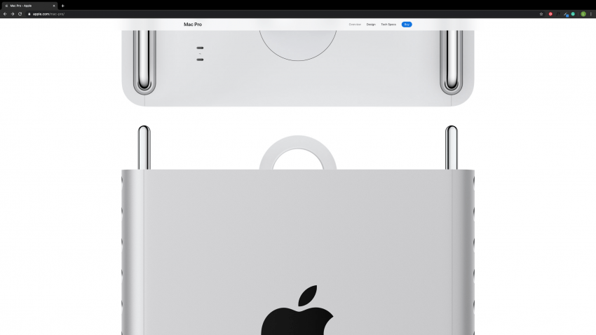
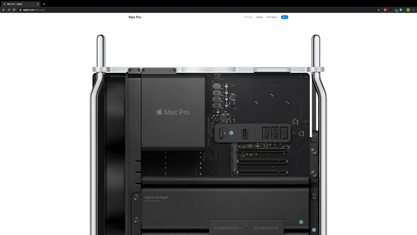
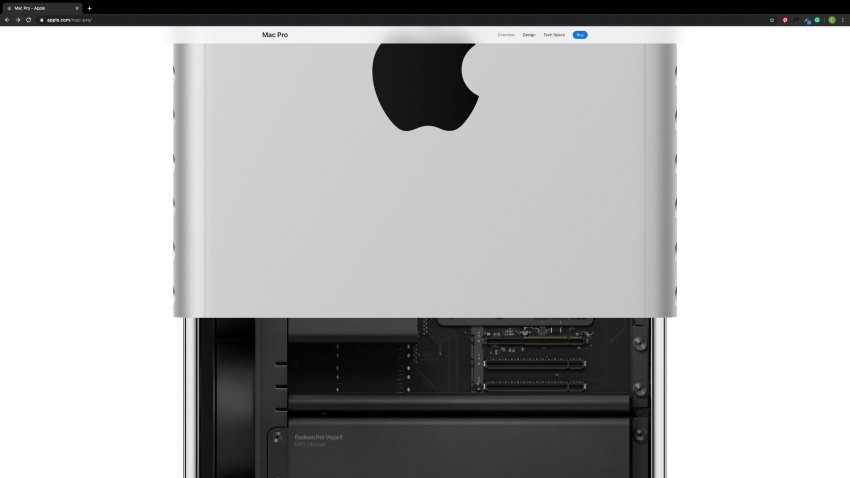
https://www.apple.com/mac-pro/
Apple does a great job incorporating scroll-effects throughout their site. One of my favorites is allowing the viewer to see the product at a different angle when scrolling. This simple motion helps give more information to the viewers without having them do too much extra work.
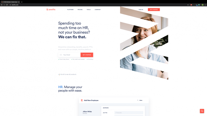
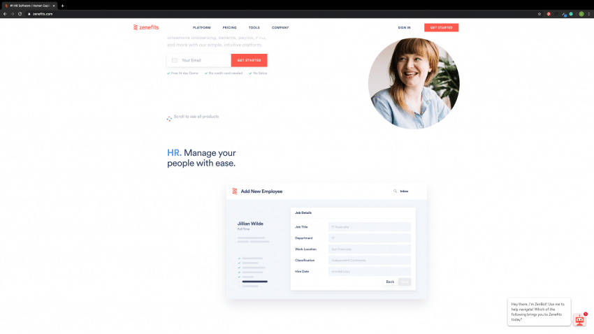
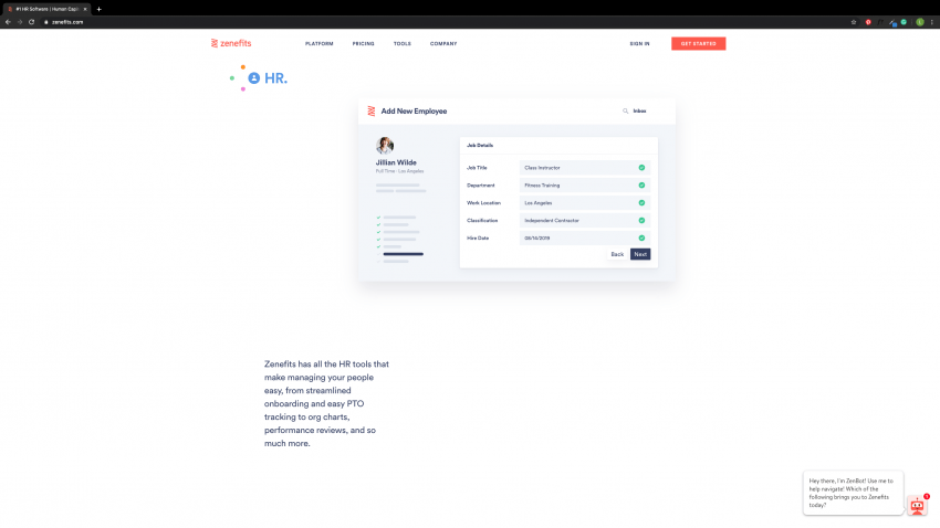
Zenefits uses their logo overlaid on an image that when you scroll, it falls neatly into its place in their software. It’s a beautiful transition that showcases their brand and software at once. As you scroll through their site, it neatly explains all of the benefits of their HR tool with effortless and elegant animations.
How To Properly Implement Movement
Technologies at Your Disposal
Movement can take shape within web via many technologies. It started in HTML, with the html tag, which simply shifted text from one side of the page to the other.
The marquee tag has been deprecated, and its use is highly discouraged from both the people who write the HTML specifications, as well as just about any web developer on the planet—regardless of how alluring its nostalgia is.
After a few other technologies were introduced to the web, such as Macromedia Flash (now owned by Adobe), Dynamic HTML (DHTML), Java, CSS, JavaScript, Scalable Vector Graphics (SVG), and Canvas, the internet is finally beginning to mature and settle into a recommended subset of tools for animations.
Most simple two-dimensional animations involving the four primary methods of transforms—translate, scale, rotate, and skew, or basic visual animations are generally created on the web via CSS. CSS continues to evolve where it is not as necessary to involve JavaScript in order to perform simple animations. Combining these four transformations in different ways gives a large amount of options for conveying or reinforcing the visual and emotional connection with the content it applies to. The limitation here is that CSS is not able to manipulate specific vectors of a shape; only applying to the shape as a whole.
For more advanced and organic two-dimensional animations, SVG has settled in as a great way to apply the four basic transformations on a per-vector basis, rather than the per-shape basis that CSS has to offer. SVG, combined with JavaScript libraries such as GreenSock can be a great way to create highly detailed, very flexible, and highly controlled animations on the web.
For the more advanced, three-dimensional animations, the element can be used alongside JavaScript to create some pretty stunning environments.
Following are some basic concepts for understanding and implementing two dimensional animations using CSS for the desired mood of a design. Because of the complex nature of implementing SVG animations and three-dimensional animations, we’re forgoing those technologies in this post for the sake of brevity. I encourage you to seek out tutorials on the use of GreenSock for more information on implementing more rich, diverse, and complex animations.
The Mechanics of a Timeline
Transitions
In CSS, transitions are the building blocks of animations, and are defined as the period of change from one state to another. Think of the aforementioned transformations: translate, scale, rotate, and skew.
As a basic example, the “translate” transform is the change of an elements x and y position on the page to a different x and y position on that page. This change in position can be made over time, rather than instantaneously, to create a smooth transition. Transitions can also apply to properties of an object outside of the basic mathematical transforms mentioned above, such as fading from a green background to a blue background; the orientation of the element has not changed, but its basic visual representation has.
Animations
Animations are the combination of several transitions. Animations allow you to run several transitions in sequence, or slightly offset from one another. Animations allow for a more complex representation of movement through those combinations.
There are three components of an animation—a transition, a timeline, and a curve. A timeline is a representation of a period of time it takes to move from a starting point to an endpoint. Transitions can only have one timeline which defines how long it takes for that transition to complete. Animations are a collection of transitions, and therefore, can have many timelines that can be merged into a single, higher-view timeline.
Curves
The last component in animations and transitions are curves. Curves (or “timing-functions”) determine how far an element should progress through its change in state at any given point on its timeline. Curves can be represented on a grid, with time as the x axis and progress as the y axis.
If you were to create an animation that ran for one second, that moved an element from one end of a container to the other, and your curve was a straight line—the element would move at a consistent rate for the entirety of that one second.
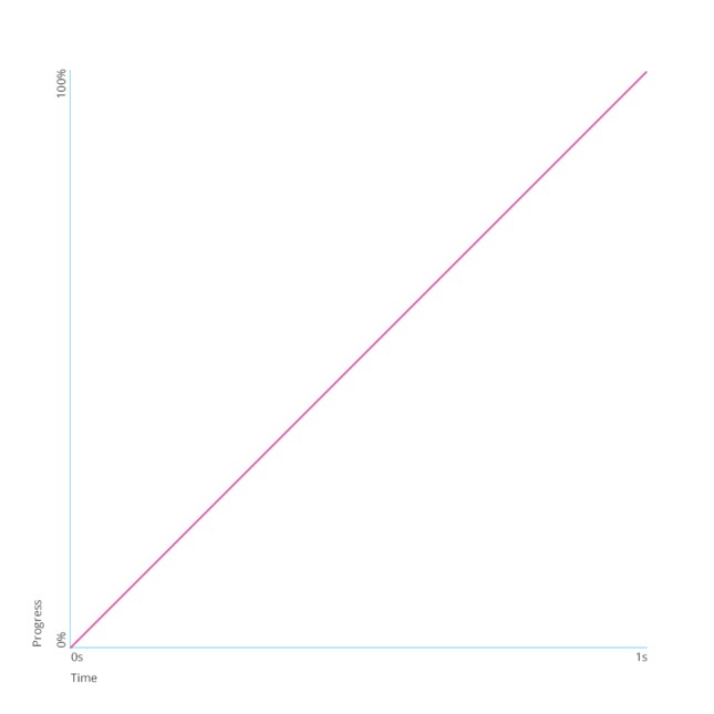
See the Pen Simple Linear Curve by Timothy (@mindfullsilence) on CodePen.
However, if you created a curve that was sloped upwards at the beginning, and leveled out at the end, as pictured below, the transition would start out rapidly and then slow down significantly over the course of that one second:
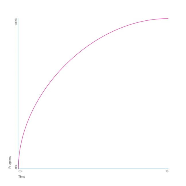
See the Pen Quick Start Slope by Timothy (@mindfullsilence) on CodePen.
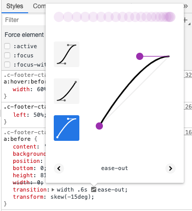
Although both animations last exactly one second, the perception of the two are distinct, with the first seeming bland and uneventful, and the second invoking an almost jarring discomfort that relaxes toward the end. The curve is one of the most valuable components of transitions and animations for depicting emotion. Creating your own is as easy as jumping into your Chrome Dev Tools and clicking on the curve icon that appears next to your transition or animation. Chrome gives you some predefined options while also allowing you to create your own custom configuration. From the Chrome Dev tools, you can immediately apply that to your code and see your new curve in action.
A CSS Transition
Let’s finally jump into an actual example of creating a transition. For demonstration, let’s assume we’ve gathered requirements from our team for a soft transition from the right of the page in the main header. The transition should last 0.3 seconds and fade from invisible to visible as the element moves fifty pixels to the right. The intention of this animation is to pull the users attention to some important content on the page without too much excitement or disruption from the main content. We’ll start with a very basic page that contains the elements for the demonstration. See my example here.
The element we’ll be transitioning has an HTML ID of hero-callout, and we’ll use that to target it. We’ll first set its initial state, which has an opacity of 0, and shift the element to the right by 100 pixels.
#hero-callout {
	opacity: 0;
	transform: translateX(100px);
}
Let’s also set up the endpoint of our timeline. We’ll create some CSS rules that apply to the callout whenever it has the “fade-in-left” class:
#hero-callout.fade-in-left {
	opacity: 1;
	transform: translateX(0);
}
Our next task is to setup some simple JavaScript that adds the “fade-in-left” class to the element. This will allow us to create our final state and apply our transition. We’ll set this up on a timer so that the animation begins a few short moments after the page has loaded in.
$(document).ready(function() {
    $('#hero-callout').addClass('fade-in-left');
});
We now need to add in the transition property that tells the browser to create a tween from the starting point toe the endpoint. We’ll do this by adding some new rules to the endpoint. Note that we broke out the transition properties but you can consolidate these properties into the shorthand version when you’re more familiar with them.
#hero-callout.fade-in-left {
	opacity: 1;
	transform: translateX(0);

  transition-duration: 0.3s;
  transition-property: opacity, transform;
  transition-timing-function: linear;

}
This tells the browser we want to transition the opacity and transform values over a 0.6 second period of time, and use a flat line for our Bezier-curve. The linear curve here is useful for creating the “soft” feel the team described.
Conclusion
Movement in design can greatly improve the user’s overall experience, when the design of the animation/movement is done well and for the right reasons. Remember to think about who your users are, what they would be drawn to, and whether or not the animation fits into the overall strategy of your website and/or mobile application.
In the end, with the right UX tools, design elements, and technology on your side, you’ll be one step closer to creating powerful and purposeful movement in your designs.