If you’re a UX designer or in the marketing industry, it should be no surprise that mobile usage is on the rise. Gone are the days where a “mobile-friendly” website, let alone a separate mobile website, will get the job done. In fact, mobile usage has far surpassed desktop usage on a global scale, starting back in late 2016.
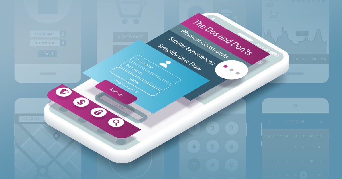
In order to execute a successful mobile user experience, there is a lot to consider. UX design principles and user behaviors are always adapting, so as UX designers, it’s our job to never stop learning to keep up with it all. But, before getting too ahead of ourselves, let’s start with the basics. Here are a few important dos and don’ts you should consider when creating your mobile user experience.
DO Consider Physical Constraints
When it comes to tailoring a user experience to a mobile device, the most obvious consideration is this: mobile devices have way less real estate than desktop, or even tablets. Desktop designs are most commonly done at a 1200-pixel width, while mobile designs are typically done at a 320-pixel width. That means you have about one-fourth of the screen width to work with on a mobile device than you would on an average desktop computer.
Now that I’ve stated the obvious, what does this mean for you? Think through what’s absolutely necessary first and foremost and consider those items before anything else. Prioritize content, eliminate unnecessary elements, and overall, declutter and consolidate what appears on the user’s screen. It’s your job to make sure mobile users can get to where they need to go in a quick and easy manner, without becoming frustrated with too many options (hello, cognitive load).
DO Create Similar Experiences
While it’s crucial to declutter the screen on a mobile device, like I previously shared, that doesn’t mean you should declutter the screen to a point where you lose or change the overall experience. Much more goes into the experience one has with your website outside of functionality. Elements such as creativity, branding, content, and more all contribute to how a user feels about your website, and ultimately, how they feel about your company. Don’t discard these elements by mistake by only paying attention to the functional pieces.
The old stereotype that users are just looking for your address or contact information on a mobile device should be thrown out the window. Trends show that mobile users are now completing purchases, watching videos, signing up for newsletters, and more—all from their mobile device. Make sure you’re considering this and creating a similar experience for users across all device types.
DO Follow the ‘Pinky-Fail’ Technique
There’s nothing more frustrating than trying to access a page on a mobile device, only to not have it work. For example, you open the mobile menu, concealed by the famous hamburger icon, and scan through your options. You see: Lunch Menu, Dinner Menu, Reservations, About, and Contact. You’re trying to book a table, so you click on Reservations. Click. Click. Click. The page loads (finally) and you’re on the About page. Ugh.
When it comes to a mobile device, users shouldn’t have to struggle to use your interface. The “fat thumb” or “pinky-fail” technique is a prime example of this. The average area of a finger is .75 inches, while the average area of a thumb is 1 inch. Make sure you create enough breathing room between buttons and other components on mobile, so users don’t attempt to make a reservation on your About page, like the example above.
DO Simplify the User Flow
Thinking, Fast and Slow by Daniel Kahneman covers Kahneman’s work on cognitive biases. While it holds a vast collection of principles, theories, and stories, the entire book’s thesis can be boiled down and summarized as this: people are stupid. Or, to put it more gently, people are lazy.
We live in a society where when we want an item, we want it now, and we want it in as little steps as possible. The same goes for your website visitors. Users generally come to your site with a specific goal in mind. Everything you can do to make completing that goal quicker and easier, the better the user experience.
While there are infinite ways to execute a successful user flow on a mobile device, two of the most common include linear user flow and progressive disclosure.
Linear User Flow
A linear user flow has a clear beginning, middle, and end. The most obvious example of this comes from Amazon. Their checkout process is clearly marked with a start and end point. This allows users to estimate what’s to come and what’s required of them to complete their purchase.

Progressive Disclosure User Flow
Another popular type of a user flow is progressive disclosure. This is most appropriately used when users don’t need access to all the information upfront. Instead of displaying all the information at once for a user to access, progress disclosure animates in specific information, one at a time, to declutter the screen and simplify the user flow. Take the below screenshots for example, which outline the experience we created using progressive disclosure for one of our clients, Sun Health.


DO Keep Accessibility Top of Mind
Mobile devices are just that—mobile. It’s important to consider the context in which users will engage with your site on their devices. Don’t assume users are engaging with your website at their desk while at work, or even at a coffee shop during their break. Mobile users can be virtually anywhere engaging with your website. This means you should consider text size, light source, and more.
The best way to make sure your website lives up to the standards of various environments is to test it in those environments. Quality assurance, or QA, should be a key part of your process before you launch your website to ensure everything is up to par.
DON’T Jump in Before Researching
The cardinal rule of user experience is that you are not your user. It’s called the false-consensus effect and is something even the most experienced UX designers fall victim to. It’s much too easy to assume users are performing particular tasks on a mobile device. Where instead, it’s our job to test it and conduct user research before falsely jumping to conclusions.
There’s an abundance of user experience research tools out there that will help you better define your audience on mobile. Some of the most common tools we utilize at Zion & Zion includes the following.
- Google Analytics is leveraged to achieve greater insights into current user demographics, site visits, and user behavior.
- Competitive Analysis includes observing and analyzing your competitors to get a better understanding of the industry landscape.
- Heatmaps provide data from real users that access your site, including where they hover their mouse.
- Clickmaps provide data from real users that access your site, including where they click.
- User Testing is facilitated to identify the overall experience users have with your website, which in turn, reveals common areas of user confusion and frustration.
- Preference Tests uncover how your site stacks up to your competitors by asking users to select which website, or page, they prefer over others.
- Click Tests measure the usability of your mobile website by asking the question, “Where would you click to….”
To learn more about the different types of user testing tools, including how to use each, visit my recent article, 7 Critical User Experience Research Tools and How To Use Them.
DON’T Ask for Permission from the Get-Go
Pop-ups of any kind are all around frustrating. They catch users by surprise, and worse, distract them from the current (and likely more important) task at hand.
To avoid this common user frustration, we recommend eliminating pop-ups wherever possible to create a better mobile experience. However, we know there are certain times when pop-ups are absolutely needed on your website, like when you need to ask users for access to their current location to help them better find their closest location. In this scenario, we’d say avoid asking for permission from the get-go. Users are more likely to ignore and close out of this type of pop-up on your homepage, versus on your location finder page, when that task is top of mind.

DON’T Make Users Wait
Load times are a huge contributor to high bounce rates. That’s because users are impatient, and they don’t want to wait for your website to load. Instead, most will simply return to Google and select another resource that loads quicker. This is especially true on mobile devices, when users are often in an “on-the-go” mentality.
To avoid losing your users in these moments, incorporate fun loading animations or utilize skeleton content. Loading animations will distract users momentarily and give them something fun and engaging to interact with. On the other hand, skeleton content, or a skeleton screen, will help create an illusion that the load time is shorter than it actually is. Below is a great example of how Facebook uses skeleton content to give the feeling of a shorter load time.

In Conclusion
Although user behavior and trends are always adapting and everchanging, mobile adoption is here to stay. Make sure you’re equipped with the right tools, strategies, and principles to create a successful mobile experience for your users.