Optimizing Parallax Websites
Parallax websites are great. While the technology has been around for a while, people are now creating /masterpieces in the form of html and css. Parallax websites provide a unique way to tell a story or share data, allowing users to digest the content slowly while stimulating their senses without a single click of the mouse. While these sites provide a great user experience, webmasters have often had trouble driving organic traffic to these types of sites, as the majority (if not all) of the content appears on the homepage, providing users with easy access, but search engines with very few pages to index. In this guide, I will discuss how to optimize parallax websites without losing the unique and though out experience.
What Is Parallax Web Design?
Parallax design was first created for video games. By layering images over each other and having them move at different speeds, a 3D effect could be created. This technology has now migrated to websites, allowing for background images to move or scroll at a different rate than the foreground content. This affect can be used in many different ways to achieve different looks and feels.
Parallax web design is a styling technique, it is not a new way to create a website. This technique does a great job at moving users through a page and telling a story. This leads many parallax websites to having a single page. This is done by choice and is not a requirement of Parallax design.
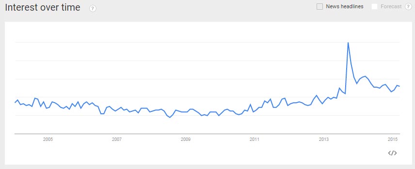
Parallax web design has grown in popularity recently, many new websites are featuring this style. Below is a /Google Trends chart for the topic.

Parallax Web Design Techniques
There are three ways to utilize parallax design in a website.
- Single page parallax site
- Multipage parallax site
- Multipage page site with a single or few parallax pages
Single Page Parallax Site

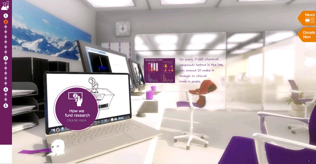
/http://poppyspend.britishlegion.org.uk/
This type of site has a single page with all of the content on it. There are no other pages for the user to visit, so navigation is minimal, if present at all. These pages tend to be very long and all encompassing. Each section will switch topics so that users find out everything they need to know.
Multipage Parallax Site

These sites have multiple pages that all use the parallax style. One page can lead into another, or a navigation can be created for users to go from page to page. These sites often have the same architecture as a traditional site, using the parallax design style.
Multipage Site with a Single or Few Parallax Pages

/http://badassprogrammers.com/
Traditionally this technique is done with a homepage that has the parallax styling. The rest of the site uses traditional styling and navigation. It is akin to adding icing to a cake; the top layer, or homepage, is fancy and artistic, but the rest of the site has a slightly different design that is much more traditional.
Optimizing Parallax Websites
Traditionally parallax sites have had a hard time ranking well. A majority of them are image heavy with less content than the average site. This leads to slow load times and low text to html ratios. Many are a long single page that cover many aspects of a business or topic. This singularity in content makes it difficult to target a set group of related terms.
For this reason, I do not recommend creating any site that is a single page, even if it is parallax. It is much more difficult to target terms, and it will be difficult to accrue a high domain authority. Some try to get around this by using the /pushstate function in JavaScript to create new urls for each section. I am not a fan of this method, even though there are multiple url’s for the website, they all have the same content. It is also a tracking nightmare for any analytics program. Finally, going this route may hinder the user experience. For instance, when a user clicks the back button, they will expect to go to the previous website they visited, instead they are moved to a section above, yet staying on the same page.
To truly optimize parallax sites, you must treat them like any other site, and style them in the parallax effect. There should be a proper site architecture that divides content into different pages with cannibalization of terms. To find out more about optimizing websites, please see our article about SEO.
While I do not recommend this technique, there are instances where it can work very well. If your goal is to rank for only one term, or a single group of terms that are related, a parallax site may be the answer. Because parallax sites do a great job breaking up content into sections, this type of site works well for niche products or companies.
Finally, here is a video Google came out with answering the question “What does Google think of single-page websites?”
We got a question from Fredrik in Munich, Germany. Fredrik wants to know: “What does Google think of single-page websites? They are becoming more complex and there are some great websites using only a single page, plus lots of CSS and JavaScript, bringing the same user experience as a regular website with many subpages.”
That’s a really good question, because there is a trend. You’ll see the conference page or the hot startup where you just keep on scrolling forever, and they have a whole lot of content. And sometimes they do cool dynamic stuff.
So Google has gotten better at handling JavaScript. A lot of the times if you’re doing some strange or unusual JavaScript interaction or pinning some part of the page or something like that, or having things fold in or fold out, we’re pretty good at being able to process that.
In general, I would run a test first. I wouldn’t bet your SEO legacy on this one single page working well if the JavaScript or the CSS is really obscure or maybe you’ve forgotten and blocked that out in robots.txt. But if you run the test and you’re pretty happy with it, I don’t necessarily see a problem with that.
It’s a different convention. Sometimes it works. Maybe you get better conversions, maybe you don’t. It’s going to depend on what your particular area is, what the topic is, what kind of layout you come out with. But if it works for you and for users to have that all on one page, for the most part it should work for Google as well.
