
Scaling from desktop to mobile presents unique challenges. Much of this difficulty lies in the fact that we need to provide a consistent experience, no matter the device. Constraints like device width and varying input types contribute to this challenge. Even with these responsive hurdles, it is possible to provide a seamless experience across devices.
Why Is Scaling Important?
At this point you may be asking yourself why we are considering scaling from desktop to mobile? Why are we not following the mobile first mentality that is so commonplace today? While our team does encourage and practice mobile first, the reality is that we receive wireframes and design mockups for desktop. For customized components with complicated functionality, we will receive wireframes and design mockups for mobile. But in many cases, we as developers, use our best judgment for how these common web components, like carousels and maps, scale and function.
Before diving into these solutions, there are some things to keep in mind when transitioning from desktop to mobile. The most obvious being available input types. On desktop, our main input type is a mouse. A mouse lets the user have precise control over where we are clicking. Closely grouped or small items can be clicked with ease.
Transitioning to mobile, that click accuracy is lost when touch becomes the main input type. It should also be noted that in recent years, touch has started to make appearances onto desktop screens. Compared to a mouse, fingers are bulky with the average fingertip width being approximately 16-20 mm and the average thumb width being approximately 25 mm. Google’s Material Design Accessibility guidelines suggests touchscreen items be 7-10 mm. The difficulty of clicking on closely grouped or small item dramatically increases with touch.
With this information in the forefront of our minds, we can proceed to discuss responsive solutions.
Carousels
Carousels, also referred to as sliders or galleries, are unavoidable on the internet and yet often have great missteps with their execution, especially on mobile. At the bare minimum, carousels are composed of text or images and navigation controls. The two most common navigational controls for desktop are left and right arrows and dots to indicate the number of images (along with the current slide in rotation). When transitioning from desktop to mobile, dots should appear near the images but never on top, as they may get lost with a busy image behind them. Unfortunately, dots are still not the strongest navigational signifier on mobile since they do not quickly promote the idea that there is more content to be seen.
On mobile, there should be a horizontal swiping gesture to navigate the carousel. While unconventional on desktop, horizontal scrolling is expected on mobile so don’t be afraid to utilize it. Even with horizontal scrolling in place, know that you will need to further assist the user with realizing there is more content. The ‘cutting off’ or ‘bleeding’ effect suggests the presence of additional content by showing a small portion of the next or previous item. This is a strong indication that there is more content to be seen and can be achieved by swiping in its direction. By combining these two mobile strategies, your user is more likely to engage with your carousel content.
Carousel on Desktop:

Carousel on Mobile:

Be cautious with swiping gestures as IOS and Android. Both have predefined gestures and you don’t want to create a bad user experience by having a gesture that is different than its native use. For example, swiping back in Safari causes the user to return back to their previous page. For full width carousels, adding space to the left or right of the carousel will reduce the possibility of this happening.
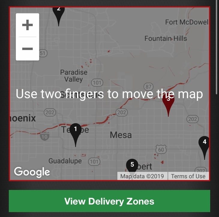
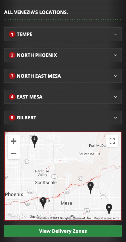
Maps
Maps pose certain usability problems for touch devices. For example, full width maps on mobile can lead to scrolling traps. A scrolling trap is when the user attempts to scroll down the page but finds themselves stuck scrolling within the map instead. Not only did this provide the user with a different experience than expected, but it also reoriented the map away from its original location. If the user did wish to revisit the location on the map, they would either need to refresh the page or attempt to relocate the original location by scrolling in and out of the map. Here’s to hoping there was a marker on the map in the first place!
By default, Google Maps requires the user to scroll inside the map with two fingers to avoid this exact issue. If you’re not using Google Maps or disabled this setting, one way to avoid this behavior is to make the map a little less than full width by either reducing its width or adding a border or margin. By giving the user some of the page to grab onto while scrolling, they can avoid that unexpected interaction. If this is less than stylistically ideal, the other solution is to prevent scrolling on mobile altogether. The user can scroll on top of the map without ever finding themselves in a scrolling trap.
Accordions
On mobile, we are able to reduce a lengthy page by transforming our content into an accordion. Of course, accordions should be used with caution as they come with their advantages and disadvantages. Ultimately, the content should drive whether an accordion is the proper UX solution. Accordions are best suited for sectioned content that is not likely to be read in full. For example, if you have an FAQs page that features more than a dozen questions with varying content lengths, it is unlikely that a user will read all the questions. Instead they are more likely to seek out the questions that led them to this page. In addition, accordions also helped facilitate scanning by providing section headings. These section headings allow the user to quickly find the information they were looking for.
The one disadvantage to accordions is that they have a high interaction cost. The content for each section is hidden until expanded, forcing the user to go out of their way to get the information they need. Once again, this goes back to content driving the need for accordions. Some content, like frequently asked questions or product details, may be better suited for accordions.
There are some best practices when incorporating accordions. When your content creates false floors, carefully decide whether a pre-expanded section is appropriate. A false floor is the illusion that there is no content below what the user is currently seeing, signaling to the user that they have reached the end of the page and to stop scrolling. In addition, don’t move the accordion to the top of the page when expanded. Accordions do not need to function like anchor tags. In fact, this has a disorienting effect.
The design of the accordion is also important in conveying the current state. Directional indicators should communicate whether the accordion is expanded. For example, arrows should be pointing down when collapsed and should be pointing up when active. This state change can be further enhanced by applying a different background color, font color, or a combination of the two.
Forms
Forms should be optimized for mobile. Here are several ways to make forms mobile friendly.
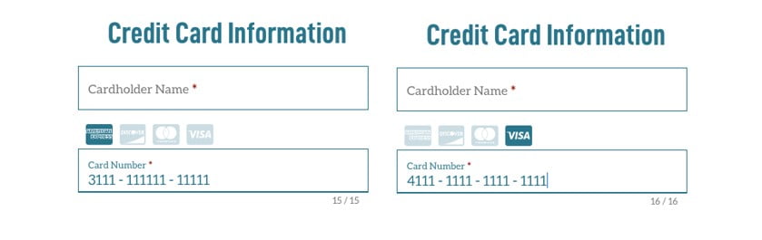
Reduce Form Fields
When possible, reduce the number of fields within the form. For example, don’t have the user select which credit card they will be using for the transaction; instead only require them to input their card number (as shown below). You can determine the credit card type from the card number. The same applies to zip code to determine city and state.
Abandon Placeholder Text
Placeholder text disappears once a user starts inputting information into the field, leaving the user guessing exactly what information they needed to input. This is especially true on longer forms or forms with unusual fields. Labels serve as a point of reference when filling out the form. If placeholders are a must, then try the float label pattern. The float label pattern allows the use of placeholders, but upon input, keeps the placeholder in view.

Reduce User Error
Additionally, make sure fields are full width to avoid horizontal scrolling within field. On mobile, correcting mistakes becomes increasingly difficult. Depending on the input type, ensure you display the correct keyboard. For example, input fields that require only numbers, like prices and years, should use the telephone keyboard. This also has the benefit of reducing user error by only allowing numbers to be entered.
In Conclusion
Almost every website is littered with simple web components like carousels, maps, accordions, and forms. Surprisingly, these simple web components are often not equipped with the right styles or functionality to ensure they are just as user friendly on mobile as they are on desktop. Even with the unique challenges that come from scaling from desktop to mobile, the simple techniques above can be incorporated into the development flow to ensure a great user experience on mobile.