
At Zion & Zion, we design custom websites for our clients that are rooted in strategic thinking. There are many websites out there that have good UX, but bad visual design execution and vice versa, but it’s important for a business to come across as professional while also being user-friendly. A common misconception is that designers just make websites ‘look pretty,’ but that is just scratching the surface of what we do for our clients.
Understanding the research
Before a designer even starts thinking about visuals, our team puts together an overall brand strategy and conducts web and UX research to better understand the goal of a website. See the first article in this series by our UX/Content Associate, The Basics of Building Your Website: A UX Perspective to learn more about this phase of building a website. The first step in our design process is understanding the strategy and the research to ensure that all of these elements of the brand translate visually into the finished product. For example, if we want to strategically position our client as trustworthy, we as designers utilize appropriate color palettes, typography, and imagery to portray that feeling to users.
In the design of a website, we also want to address any concerns brought up by users that the UX team comes across in the research phase through user and preference testing. We gain invaluable insights into what users find appealing, and just as importantly, what they find unappealing, as well as what they find challenging on a website.
Judging a Book by Its Cover
It may seem superficial to base preference on something that ‘looks prettier’ but research shows that visually appealing sites make users feel like they’re more user friendly, and may even be more forgiving of bad UX on sites that are more attractive. This is referred to as the aesthetic-usability effect by this Nielsen Norman Group’s article on the matter. Think about it this way; when two people go in for a job interview, the person that is well dressed and appears more put together is perceived as more professional, and you’re going to be more likely to trust that person. Luckily, at Zion & Zion, our clients get the best of both worlds!
Content and Wireframe
A wireframe that a UX specialist puts together helps the designer understand the hierarchy of information, what we need to give emphasis to, as well as what elements can fall back. Here is an example of a website wireframe with the built-out design next to it.
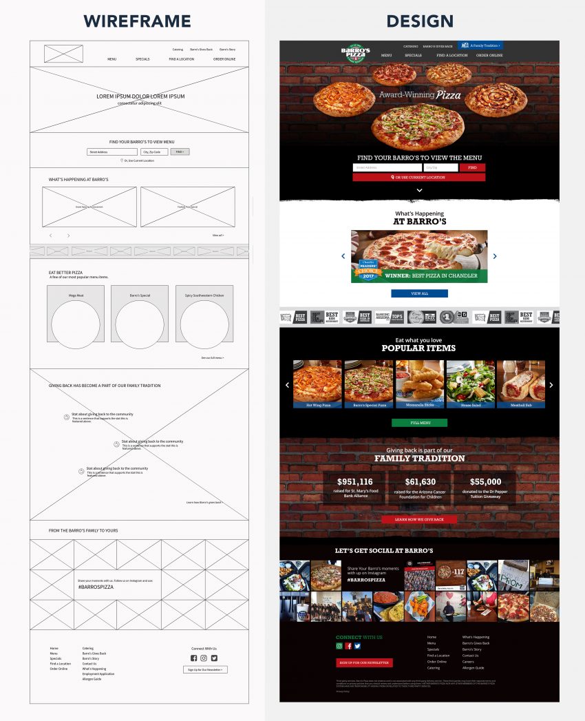
Note that there are differences in the height of certain sections and general placement of elements going from the wireframe to the mockup stage. The wireframe is a great starting point for being able to picture the design and acts as a blueprint for hierarchy and order of information decided in the UX research phase, but is flexible to fit the flow of information once in the design phase. Depending on the project, creative decisions such as the rotating pizza carousel on the Barro’s Pizza website may come during the wireframe stage or once the design is started.
Design Elements
Color Palette
If you have a strong brand with a professional look-and-feel already developed, it’s best to stick with those brand colors for brand consistency. If you’re choosing colors in order to develop a brand, consider what industry you’re in and what color palette your competitors are using. You don’t want to stray too far from what your competitors are doing, but you also want to differentiate yourself.
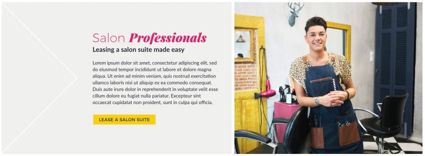
You can use colors to organize and create hierarchy of information. Notice where your eyes are drawn to within the content section of the example below. The headline is large and bright, drawing your eye to that first and foremost. The brightly-colored call-to-action at the bottom of the section helps users quickly find what you want them to do after reading the information. This organization helps visitors scan through and find exactly what they’re looking for on a page quickly and easily.
Photography
When we are working on a website project, we always aim to get high-quality, custom photography that will tie into the new website seamlessly. Many times, this means doing a photoshoot, which might not always be feasible for all budgets. Stock photography is a more economical option for clients, but can be tricky to find consistent look-and-feel for all photos used throughout your website. There are many different photography styles, so it’s important to choose a style and stick with it. Another downside to using stock photography is the risk of the same photo appearing on a competitor’s websites whereas with custom photography, you will never run into that issue.
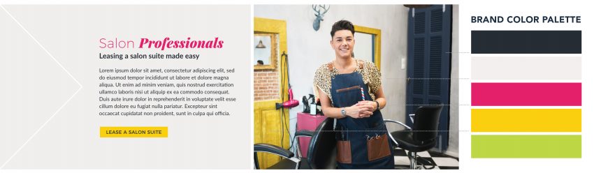
Whether your photography is stock or custom, consider incorporating your brand color into photography. You can see in the example below the full brand color-palette to the right and the design to the left. You don’t have to use all of the brand colors, but incorporating them throughout photography on a website will help them tie in.
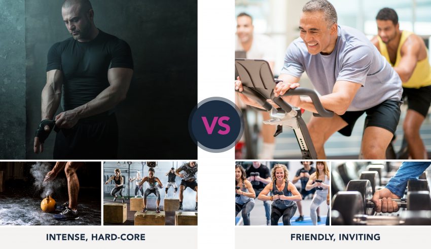
Below you can see two dramatically different styles of photography, both in a gym setting. The examples on the left utilizes very dramatic lighting and shadows to portray the brand as intense and hardcore, while the examples on the right utilize a lot of natural, even light to portray the brand as friendly, inviting, and more easy-going. When choosing a style of photography, think about who your audience is and cater to them. In this example, the photos to the left would appeal to a more intense audience looking for a serious workout, likely someone that knows their way around a gym and has been working out for a while. The photography style on the right are more inclusive and can speak to beginners as well as those that are more seasoned gym-goers.
Icons
Icons are a great tool to visually break up information as well as add visual interest. When used to visually reinforce the information, icons can create clarity and further help users scan information quickly. Here an example of how icons are used to break up a step-by-step process.
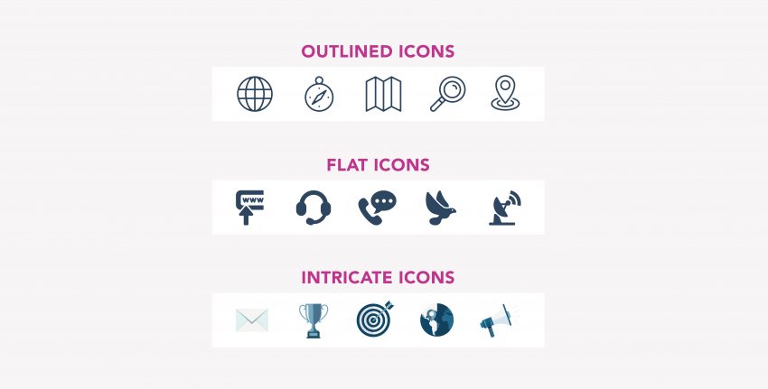
There are many different types of icons, so it’s important to stay consistent throughout your site and brand overall. Just like photography, there is a difference between stock and custom icons, depending on the budget of the project. Below are some examples of different types of icons that exist, each coming with their own benefits and drawbacks. Outlined icons can portray a more modern feeling while flat icons are more straight-forward/to-the-point. Intricately built icons are more interesting and have more dimension to them but can be challenging when scaling down since they do have more detail that the previous two.
Conclusion
When designing a website, K.I.S.S. (Keep It Stupid Simple) is always a good rule of thumb. It’s easy to go overboard with textures, patterns, and busy elements, but if you stick to a strict color-palette and a hierarchy structure to organize your information such as consistent use of headlines and buttons, users will be able to navigate your site and find the information they are looking for.
It’s vital for your brand to have a professional-looking website that is rooted in strategy and utilizes excellent UX practices. Good design is not only a cherry on-top of a well-function site, but is also a large factor in how your brand is perceived to your users.