
Some brands are instantaneously recognizable by a single color, which is why color is one of the most important elements to consider when developing a new brand. Brand can be defined as the name, term, design, symbol, or other features such as imagery and colors, that distinguish one seller’s product or services from the competition—and even more broadly, brand can be defined as the set of emotional associations that go with the brand.
Why Color Matters
Studies show that many people judge brands and products on color(s) before they convert. A startup company may offer a truly great product, but consumers might decide to shop elsewhere if their color scheme is off-putting. The color(s) a company selects for its brand conveys their trustworthiness, their products’ quality, and much more to consumers.
“Ads in color are read up to 42% more often than the same ads in black and white.”
Source: “Color for Impact” White, Jan V, Study on Phone Directory Ads
Brands and color go hand-in-hand because color wordlessly conveys meaning and messaging. A brand is able to instantaneously communicate the “idea” of a company or product, forming a connection with consumers.
Quiz
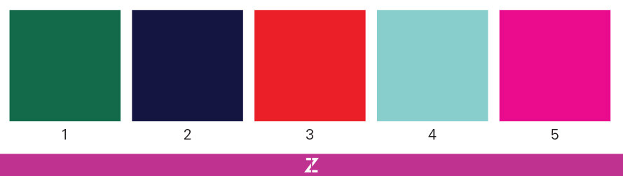
Color can increase brand recognition by up to 80%. View the graphic below and test if you can match the brands to their colors (answers are at the bottom of this page).
The Psychology of Color
Whether or not you’re aware of it, our minds are programmed to respond to color. The psychology of color is the science of how color affects human behavior, and is a branch of the broad field of behavioral psychology. Many articles have been written on the subject, yet research results are difficult to prove. This is because reactions to color can be difficult to associate with a single feeling and usually depend on personal experiences, upbringings, and cultural differences.
In spite of this problem, color psychology is an important research subject since color can be used to persuade and affect consumers. Colors are related to specific traits and, when used effectively, will trigger emotions. Color is something to explore when developing your brand, but remember: it’s far more important for the target audience to view the chosen color as appropriate for the brand.
You have the ability to use color to transform a brand and to create the desired emotional experience for your target audience. However, in order to do so successfully you must first do your research.
Know Your Audience & Brand Personality
The first thing you should do is consider your target audience. To whom are you trying to appeal? A 55-year-old businessman will react to colors differently than a 20-year old female college student. Secondly, your color choice needs to reflect your brand’s personality. A vegan restaurant should have different branding colors than a startup tech company, for example.
Let’s compare two companies competing in the same market and discuss briefly their target audience, personality, and how their brand reflects it.
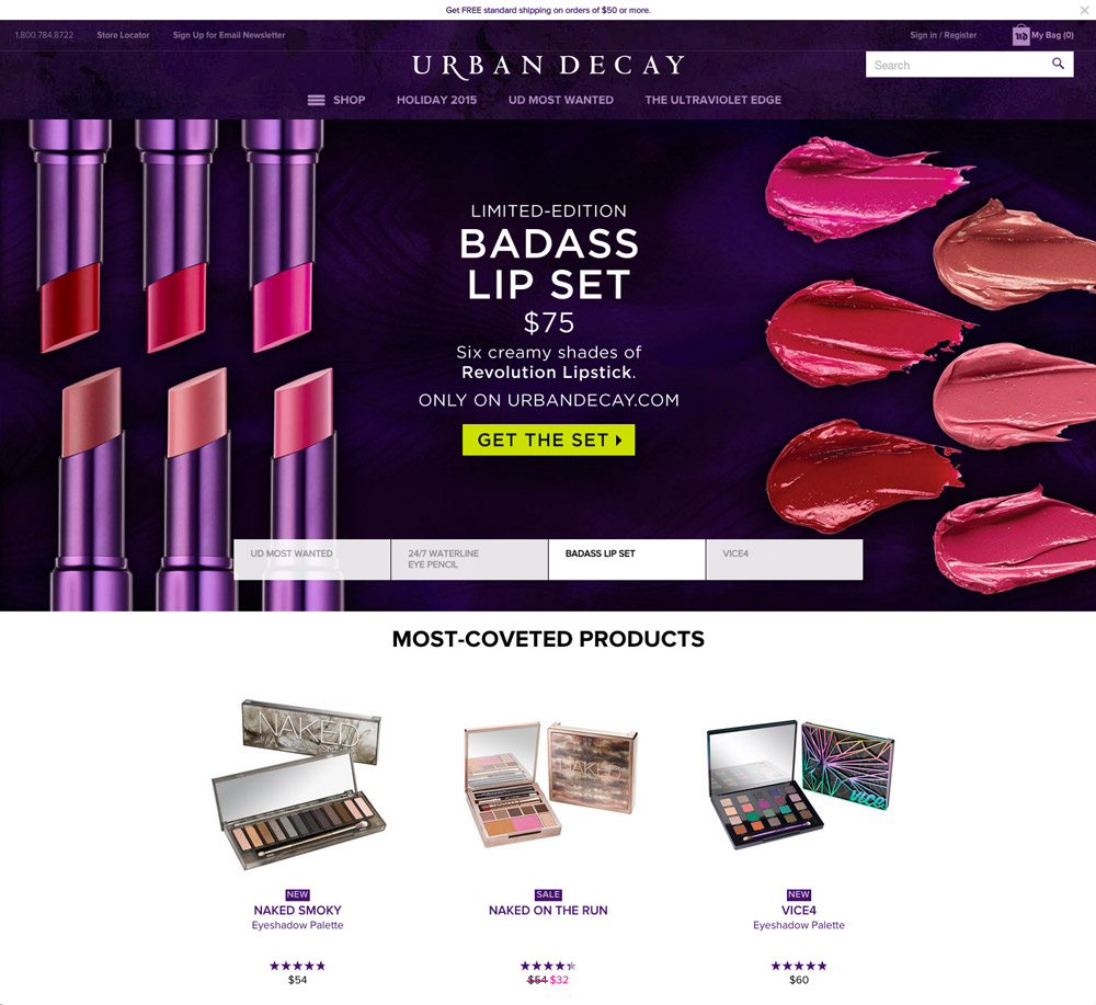
Urban Decay
The first brand is Urban Decay, which has a broad target market—women between 15-40 years of age—and specifically those who want vibrant cosmetic products.
Lip Smacker
The second brand is Lip Smacker, a cosmetics industry competitor with an entirely different target audience: girls between the ages of 6-16.
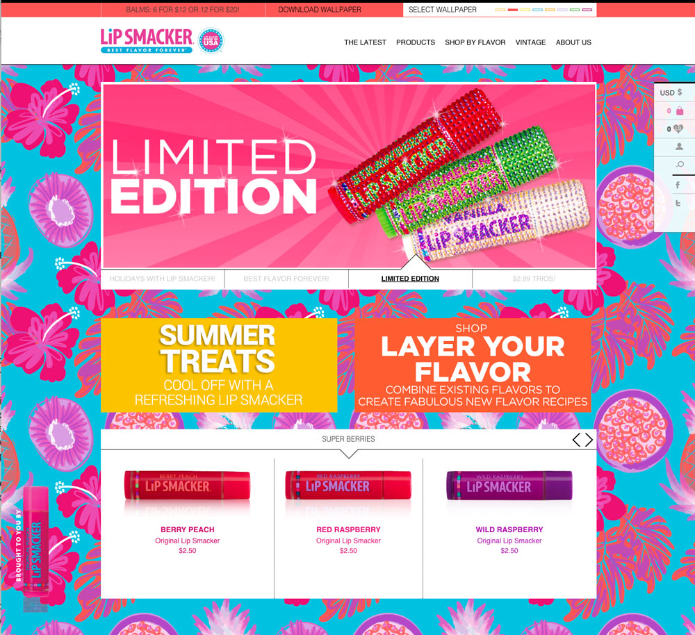
Both have similar layouts, with sliding promotional graphics at the top and a showcase of their products below. But you immediately notice a difference in the colors, design, and brand personality.
Urban Decay employs black and purples with pops of vibrant colors, a color scheme appropriate to their self-definition as edgy, colorful and distinctive. Lip Smacker, on the other hand, uses bright colors, playful graphics, and fun, girly imagery throughout their site. Both brands successfully identify their target audience and brand personality, effectively employing that information to develop their brands into two completely different looks.
Stand Out in Your Industry
Once you have identified your audience and brand personality, it’s time to research the competition.
If other industry players are using the same colors, it will be difficult to stand out. You should use other colors appropriate to your brand personality to differentiate your brand. This doesn’t necessarily mean selecting a completely different color. It could be as simple as opting for a different shade and using it more effectively than your competition. It’s important to know the competing brand’s strengths and weaknesses in order to improve upon them.
Increase Conversions
Another item to consider when choosing brand color(s) is conversion rates. Once you know your target audience and how they respond to color, you can use it as a tool to increase your conversion rates.
Use your brand colors intentionally. Typically, you really only need two to three colors to make your brand effective. Designers tend to follow the 60-30-10 rule, which suggests that you choose three different colors and use them in the ratio of 60%, 30%, and 10%. This allows you to employ your colors as a tool to emphasize or de-emphasize areas when needed, specifically when designing call to actions (CTAs).
Consider choosing complementary colors, which are directly opposite each other on the color wheel. This will create contrast and attract your viewer’s attention. Choose the color that will create a sense of urgency for your audience, but make sure it’s not a color that’s already overused. If your website primarily uses orange, for example, you should consider choosing another brand color that will stand out by contrasting with orange.
Contrast relates to color value as well if your background is dark you should use a light CTA (call to action) button. Additionally, do not discredit the power of white space. People often think they should fill the entire page with color, graphics, or content. Yet, white space can be a powerful tool in drawing the user’s eye. It can also create a sense of spaciousness and breathability.
Lastly, make sure to test. You may not know which color will be the best for your CTAs, in which case you should consider A/B testing. Discover what color combination works best for your brand and audience.
Color Creates a Stronger Relationship
Every time a consumer interacts with a brand, there is an opportunity for the company to influence their audience’s impression. It’s therefore very important to know which designs and colors will motivate consumers to make purchases, and influence brand loyalty. By educating yourself on the psychology of color theory, and on your market, you can use branding techniques to your advantage and better connect with your consumers—resulting in a stronger relationship and increased profit.
Quiz Answers:
- Starbucks
- GAP
- Coca-Cola
- Tiffany & Co.
- T-Mobile
Resources
/http://www.colorcom.com/research/why-color-matters
/http://www.colormatters.com/color-and-marketing/color-and-branding
/http://www.entrepreneur.com/article/232741
/http://conceptdrop.com/blog/60-color-theory-the-psychology-of-color-marketing-and-branding/
/http://www.businessinsider.com/branding-and-the-psychology-of-color-2012-12?op=1