Let me first start by saying the UX Mobile Immersion Conference (@UX_Im) was by far the best conference I have ever been to. Focusing on user experience (UX) for mobile, this conference touched on everything from workflow, content and prototyping to coding, design and architecture. It was pretty eye opening to listen to speakers from all over the country, both from agencies like us here at Zion & Zion, and even some from the corporate world talk about UX from their personal points of view.
UXIM 2014 Denver, CO
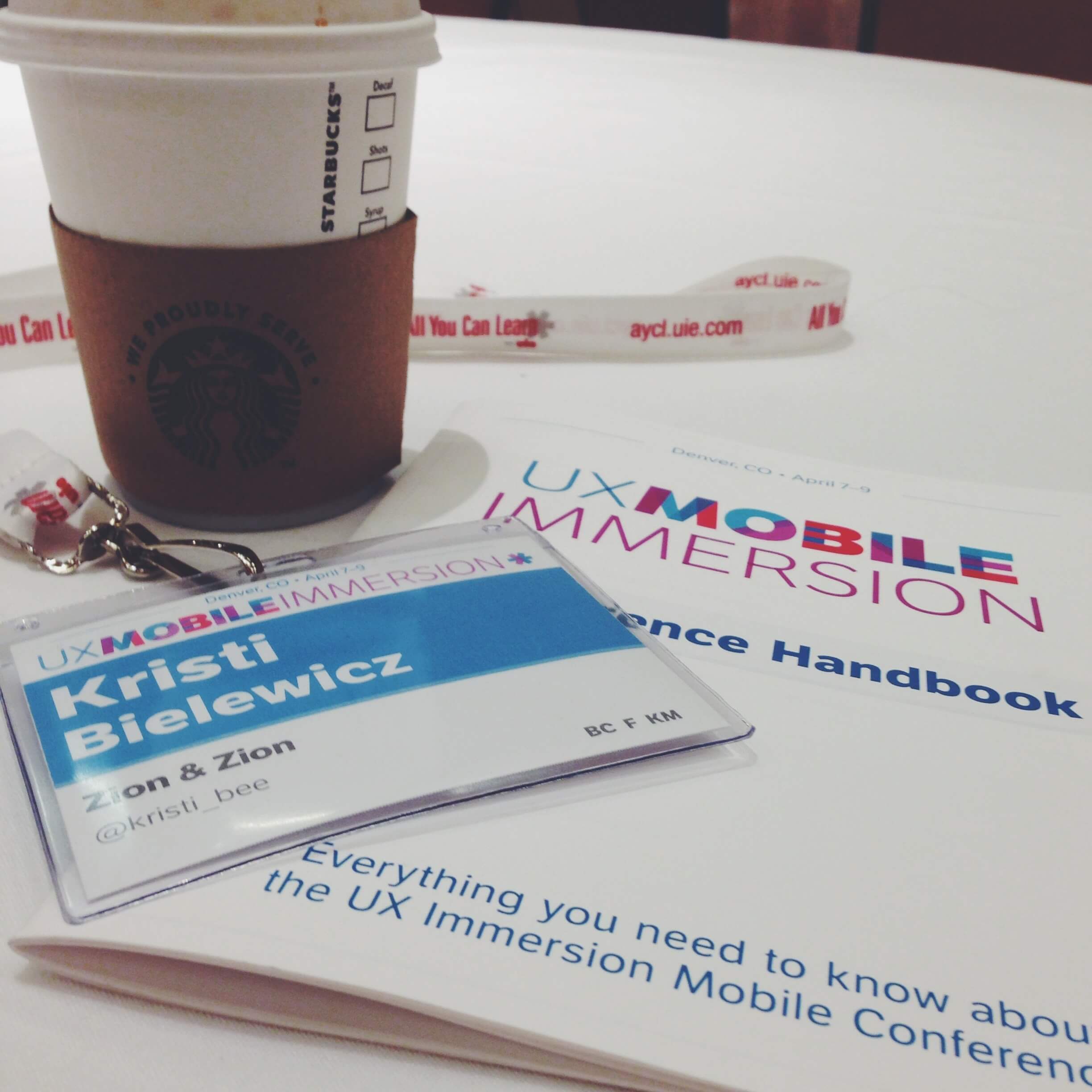
This year, the UX Mobile Immersion Conference was held in Denver, CO. Lisa Murray and Raul Salido, two members of our UX and Web Development team here at Zion & Zion, and myself ventured to cold Denver (okay, maybe 70’s aren’t so cold for those of you not from Arizona) to attend the conference.

Between the three of us, we figured we’d be able to take in as much information as possible and look at everything we learned from three different points of view: content, user experience, and development. We were right. The conference lasted three days. Day one was made up of three full day workshops, from which conference attendees were able to choose the one they wanted to attend. We chose Ben Callahan’s Workflow on Responsive Web Design Projects. Day two followed a more casual approach made up of four shorter sessions spread throughout the day. Finally, day three rounded out the conference, following the same structure of day one. We chose to attend Karen McGrane’s Adapt Your Content for Mobile workshop.
Ben Callahan’s Workflow on Responsive Web Design Projects
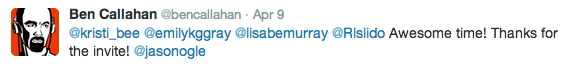
After participating in Ben Callahan’s (@bencallahan) full-day workshop and grabbing lunch with him and a few of his co-workers from his company Sparkbox on day three, I can personally say that Ben is an extremely bright, dedicated and kind person. His workshop started broad and got more and more detailed as the day went on.
Spiral Workflow
While there were plenty of great takeaways from this workshop, the biggest takeaway we brought home with us was more of an idea than anything else. The idea that the responsive web design process should be spiral, not linear. When Ben explained the idea of a spiral workflow, he showed us a visual in which all of the different areas that are touched upon during the responsive web design process are laid out in a straight line. He then showed us a visual in which those same areas were laid out on a spiral. It was pretty obvious what he was getting at. In the linear example, every area was touched upon once, and then seemingly forgotten as the process moved forward. However, in the spiral visual, all of those areas were touched upon multiple times.
By following a spiral workflow rather than the typical linear workflow, everyone on the project is able to work together more easily and not feel forced to finalize their portion of the project before sending it off to the next department. Instead, we would work together on our specific tasks throughout the duration of the project, reducing the time spent on final revisions tremendously. To quote Ben Callahan:
“There is no one way to do this.”
Every agency is different, following different processes and structures, however the idea of following a spiral workflow is intriguing.
Brad Frost’s Atomic Design
Brad Frost (@brad_frost) spent the duration of his talk explaining (and in great detail, thankfully) Atomic Design. Atomic Design is the idea that an entire website is built similarly to the very planet we live on. The atoms make up molecules, which then make up organisms. In this metaphor, Brad Frost explained that the atoms to a website are things such as tags. A tag is extremely useful, however on its own, it doesn’t do anyone any good, just like atoms. Molecules would be things such as search fields and buttons. The atoms combine to make up these molecules. From here, the molecules then combine to make up the organisms. In this metaphor, the molecules combine to make up larger items such as headers and footers.
Sadly, the metaphor stops here, but the idea does not. From organisms, we can create templates and from templates we can create pages. Pages make up the website.
Jason Grigsby’s Adapting to Different Forms of Input
Jason Grigsby’s (@grigs) session was all about different forms of input, and how we can adapt to meet the needs of any and all input types. An input is the form in which a user performs an action on a device. For instance, on the iPhone, the primary input is touch, however the iPhone also has the home button which is a click, and Siri, which is voice activated. These are all different forms of input that need to be addressed in the web development process.
Jason Grigsby went on to say:
“Input type is a bigger challenge than screen size.”
Additionally, input type will continue to become more and more of an importance as new technologies are created in years to come.
This was a really interesting talk; a bit different than the others we attended at the conference, however extremely enlightening. It forced all of us to think beyond what our current struggles are and reminded us that this is an ever-changing industry. Something that works perfectly today may be outdated a year from now. That is the industry we are in, and that cannot be forgotten.
Luke Wroblewski’s Mobile Behavior and Design Trends
Let me start out by saying we all loved Luke’s (@lukew) talk. He is funny, energetic and you can’t help but want to be his friend! Luke talked about his personal experience; where he started and how far he has come and compared that to the Internet; where it started and how far it has come. This really put into perspective just how young the Internet is and how much can change in such a short period of time. However, the biggest takeaway from Luke’s session came from one point he made halfway through his presentation. That point was:
“It can always get simpler.” – Luke Wroblewski
He used mobile apps for booking a hotel room as an example. One app required 40+ taps (on a touch screen) and nearly 100 seconds to book a hotel room, whereas the other app required only 4 taps and roughly 8 seconds of the user’s time. Can you guess which app was more successful? Yep, the simpler app. This can be applied to just about anything in our industry. From sign-up forms and receiving contact information, to downloading a brochure or making a purchase, the simpler the process is, the better it will convert.
Jared Spool’s How Do We Design Designers

The final session of day two equates to a necessary coffee run. These days are long, but boy are they entertaining! Jared Spool (@jmspool) is the CEO and Founding Principal of UIE (User Interface Engineering), a research, training and consulting firm that is behind UXIM and UIE conferences. As the keynote for the conference, Jared wanted to focus on something close to his heart, which is the future of our industry. And that starts with the students who are still in school.
Between being CEO of UIE and running various conferences throughout the year, Jared is somehow finding the time to start a school with Dr. Leslie Jensen-Inman, a designer and renowned UX expert. The school is called the Unicorn Institute and is designed to help create the next generation of UX experts that are so desperately needed. Jared spent the duration of his session discussing what it takes to be a true UX expert, and how we can work to ensure that the future generations fit into those requirements.
Karen McGrane’s Adapt Your Content for Mobile
Our final day consisted of a full-day workshop with the one and only Karen McGrane (@karenmcgrane). This was my first time hearing her speak and I was beyond excited to learn from the expert in Content Strategy. Her workshop focused on content for mobile and she didn’t waste any time diving deep into this topic.
We began by discussing the four mobile truths as defined by Karen McGrane:
- Content matters on mobile.
- Strive for content parity.
- It’s not strategy if you can’t maintain it.
- You don’t get to decide which device people use. They do.
All four of these truths are just that, truths. They are statements that we need to keep in the forefront of our minds at all times when planning and developing websites.
For me, the biggest takeaway here was #4. If you are in this industry, you know that screen size can no longer depict device type. A phone held landscape has a screen size similar to a small tablet held portrait. The new “phablets” have enormous screen sizes, making it near impossible to determine if users are really on a mobile phone or a tablet.
This brings us to Karen’s next big point. Just because a user is on a phone does not mean they are out walking on the go, only looking for a phone number or address. In fact,
“Device and screen size are not context.” – Karen McGrane
Personally, I can be found on my couch, watching TV with my laptop on the coffee table, iPad on the chair next to me, and iPhone in my hand. I have made purchases (on more than one occasion) from my laptop, iPad and iPhone. Screen size is not context.
Karen’s talk was enlightening to say the least. She made great points, had the proof to back up her claims, and was an excellent speaker. We cannot wait to hear what she has to say in the upcoming years.
Summary
All in all, UXIM was an amazing experience. We met great people, got to listen to true experts in our field talk about subjects they are passionate about, and came home with knowledge that our entire agency will benefit from. If you have the opportunity to attend in the future, I highly recommend registering for next year’s UXIM, wherever it may be held. You’ll be glad you did.