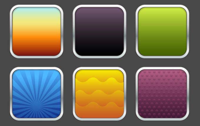
At&t did it. NBC did it. Even Apple did it. From major corporations to the little mom and pop, any post turn of the century rebranding meant a company needed to have a cool 3D bubbly logo and a website flooded with the same features. Flat was out, and gradients, beveled edges and a metal shine were all the rage. As every website introduced buttons, boxes, and logos with all of these same characteristics, a design standard soon emerged which was believed to be the keys to a modern and successful website. It was as if the user experience would have been compromised had the areas of interaction not appeared to be popping off the screen.

In the end, it was a designer’s best solution to translate our 3-dimensional world into a 2-dimensional space in a way that hadn’t been done before. Simply put, a good website had these elements; a dated website was flat and chaotic. As a result, a consistent user experience created a massive audience completely comfortable with engaging and utilizing this old tool, the Internet. It had been around for decades, but the usability of website interfaces before the Web 2.0 explosion made for a very awkward user experience.
Fast-forward five years and in comes the smart phone and tablet revolution. Gradients and bevels are now at the epicenter of user interaction. 49% of the entire US population uses a smartphone; by 2017 that number is expected to rise to 68% /according to a Media Bistro study. Between smart phones, tablets and computers, virtually every American interacts with one of them at least once a day. That number will only continue to grow as the older generations are replaced with the younger generations who are growing up with technology as an integral part of their development.

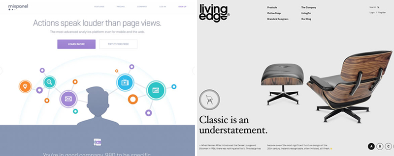
In the last year or so, we have seen a significant shift in design, especially web and interaction design. So long are the days of the gradient and incessant shine. Design has taken on a “less is more” approach to logos, web design, and even mobile interfaces. Perhaps this is a direct result of the cultural shift from introducing a new form of interaction with technology, to a time now where that very same technology has evolved into a common space of daily purpose. Designers and developers no longer have the job of training a culture to accept these devices, but rather simply improve on the experience. Web design began the trend of pulling back from making everything feel 3D and began rethinking what had formerly been considered “best practice” of web design. In addition to these design trends, we have been also seeing advances in the way navigation is treated, how pages scroll up and down or even left to right, and understanding that the user wants to click on less pages, making the experience on each page richer and more direct to the consumer.

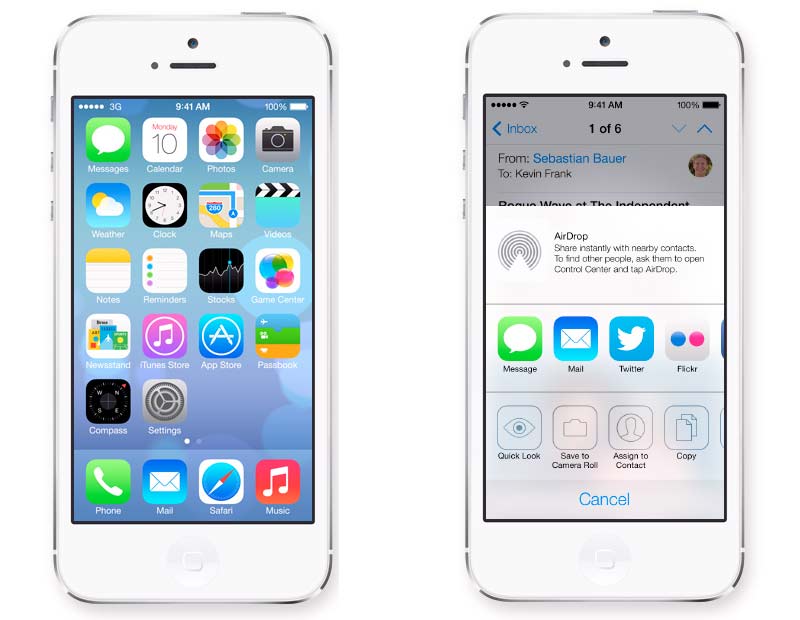
We see this trend slowly beginning to make its way into smart phones as Apple introduces their iO7 Operating System. The beautiful icons are simple, clean and missing several of the key Web 2.0 stylistic features. The streamlined interface of the chat becomes less crowded with goofy colorful bubbles and unnecessary dimension.

As a way to move into this era of simplistic design, while still understanding that people enjoy legitimate 3D effects, Apple programmed the phone to have slight motion so you feel as if the icons and background really are on different layers in space. What a substantially more interesting way to enhance the 3-Dimmensional experience for the user, by actually emulating the real motion picture techniques as opposed to faking the process as though it’s a static printed, non-clickable piece. It is exciting to see how the next stage in UI design will evolve over the next couple of years. Despite the critics who see this change as boring or elementary, as usual our culture will learn to adapt and will wonder how we dealt with it any other way.
