Recently, members from the Zion & Zion team traveled to the windy city to attend seven straight days of user experience training by Nielsen Norman Group (NN/g), one of the world’s top UX research and training firms. The conference consisted of seven full-day, immersive classes which covered topics in user experience design.
The Courses
Between the five Zion & Zion employees that attended this seven-day conference, we were able to cover a lot of ground and further our knowledge in the principles of user experience. Together, we completed the following courses:
- Managing UX Design
- Persuasive and Emotional Design
- Generating Big Ideas with Design Thinking
- Design Tradeoffs and UX Decision Frameworks
- User Interviews
- Usability Testing
- Journey Mapping to Understand Customer Needs
- Web Page UX Design
- Information Architecture
- The Human Mind and Usability
- Measuring UX and ROI
- Design Ops: Scaling UX Design with UX Research
- Writing Digital Copy
- Service Blueprinting
For the purposes of this article, we’re sharing our top five favorite courses we attended over the week, including what we learned and how we plan on applying these teachings to our work at Zion & Zion.
1. Generating Big Ideas with Design Thinking
Many times, when people hear the term “design thinking” they think of abstract, crazy, out-of-the box ideas that seem out of place when looking at it in the context of their day-to-day business practices. NN/g still encouraged abstract ideas, but taught design thinking in a way that put parameters and structure around the process.
While we continuously leverage design thinking for our clients at Zion & Zion, this course provided an additional perspective.
Feature-Focused vs. Experience-Focused
Design thinking allows us to frame problems differently. All too often, we get stuck in our thinking and get hyper-focused on the micro details of a small sub-section of our product or service. In reality, breakthrough ideas come from thinking of the entire experience.
During this course, the instructor ran us through a simple exercise that really illustrated this point:
- First, we were told to take one minute to design a vase, using a sticky note and sharpie.
- At the end of the minute, the instructor asked a few of us to share what we came up with. I personally came up with a long, glass vase that would fit perfectly on my kitchen table. Others shared similar ideas—all that seemed to focus on the features of a vase.
- Then, the instructor shared the same problem, but in a different light. We were told to take one minute to design a better way to enjoy flowers in our home.
- By simply reframing the problem to be less focused on a single solution and instead focused on the overall experience, we were all in a better headspace to create a new concept that had a greater impact overall.
In business, our problems should be treated no differently. Instead of saying “let’s make a dashboard,” design thinking should challenge us to ask, “what’s the best way to solve this problem?”
As-Is Scenario Mapping
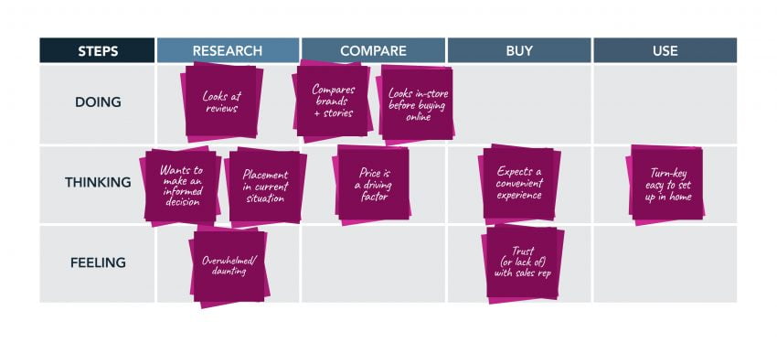
Similar to a customer journey map, an as-is scenario map plots the relationship between a task and an experience from the user’s perspective. Within the design thinking process, this step comes after developing an empathy map for your user and/or persona.
Your as-is scenario map should be built with high-level steps of the journey across the top, and three distinct “swim lanes” that are represented horizontally across the map. These “swim lanes” should be marked as: Doing, Thinking, and Feeling. Once this framework is set up, you can plug in key pieces of the journey and see more visually what your users are thinking, feeling, and even doing during each stage of the purchasing process.
Here’s an example of an as-is scenario map that we developed at NN/g for a TV purchasing experience. After this was set up, the team could then go in quickly identify where the user is experiencing pain. Because in design thinking, where there is pain, there is opportunity.
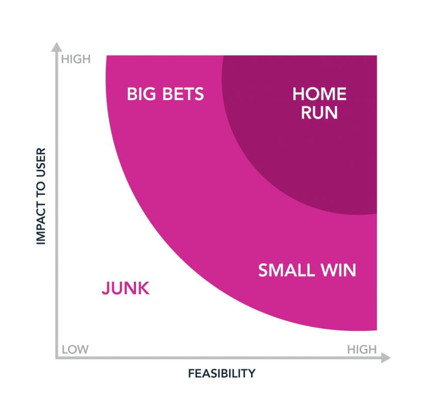
Democratic Prioritization and Voting
While design thinking focuses heavily on idea generation, there is (of course) a time and a place where you and your team will need to evaluate and prioritize which ideas are worth pursuing. At NN/g, they introduced a useful matrix and voting system to help align your team during this evaluation process.
The first step is to hold a democratic vote, where the most votes on an idea wins. However, instead of having everyone simply vote on which idea they prefer, assign a key to your voting process. As an example, hand out stickers where a star sticker represents a vote that impacts the user and a circle sticker represents a vote that is feasible to your organization.
After all team members vote on an idea using either a star or circle sticker, the next step is to build your matrix. Use your voting key to build an x and y-axis, each representing the criteria that you voted on. In the below example, you can see that we used “impact to the user” and “feasibility” to prioritize our ideas. From there, plot the voted-on ideas accordingly (using the high to low scales) and see where everything lands. By doing so, your team can collectively understand which ideas are worth pursuing and which ideas should be filed away under “junk.”
2. Measuring UX and ROI
Benchmarking: A process that shows how a design for an application, website, product, or service is performing.
That’s a pretty vague definition, right? Benchmarking is an important process that can be done before, during, and after any design changes are made to your product. It helps you understand if you’re moving in the right direction and can tell you if the changes you made worked.
While there are many reasons to utilize benchmarking, here are some of the most popular:
- Compare old vs. new designs
- See how you stack up against your competitors
- Check your performance against industry benchmarks
- Progress towards stakeholder goals and business KPIs
- Advocate for projects that align with stakeholder goals and business KPIs by estimating ROI
When Should I Start Collecting Data?
Short answer: Now! Benchmarking can be a difficult process to begin when you didn’t prepare for it ahead of time. However, that doesn’t mean you can’t start now and continue to test moving forward. Here are some ideal times to test and collect data:
- Before: If you have a product that exists already, run tests on it before making additional changes or updates. If you’re starting from scratch, analyze industry standards and competitors to get an idea of where to begin.
- During: Test, test, test! Testing while making design updates helps you understand if you’re moving in the right direction to accomplish company and user goals.
- After: Testing after you’ve completed your project is a true indicator of if your updates worked and whether you accomplished those stakeholder goals and business KPIs.
What Should I Test?
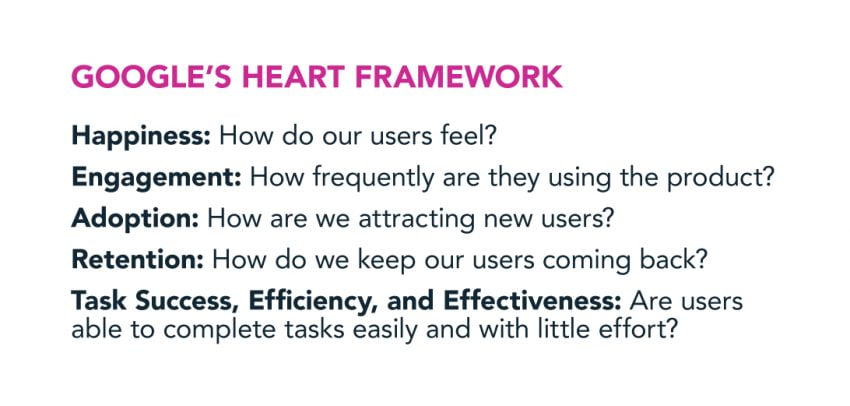
A great starting point is looking at Google’s HEART framework to help you decide what you want to measure.
How Do I Measure It?
Now you need to answer the how portion of this equation—how do I measure happiness, engagement, adoption, retention, or task success?
For benchmarking, you typically want to collect quantitative data. You can collect this type of data through surveys, Google Analytics, and usability tests. When it comes to quantitative usability tests, the key is to make sure you’re asking quantitative questions, which are task-based and are measured with numbers, rather than qualitative questions, which are more open-ended and focus on what users say and do. Here’s an example:
Quantitative Question:
How much per night is a King Suite room at the Phoenician Resort in Scottsdale, Arizona during January 1st-9th, 2020?
Qualitative Question:
Find a place to stay during your vacation in Scottsdale, Arizona.
I’m Done Testing, Now What?
Use that data to determine what you do next. If a design update isn’t having the effect you thought it would, revisit your design, test again, and…repeat!
3. The Human Mind and Usability – How Your Customers Think
In user experience, we can use concepts from human psychology to anticipate how users will react to designs and postulate why they reacted the way they did. When creating websites, it’s easy to fall into the trap of assuming users are just like us and think like we think. In reality, factors like context, similarity, proximity, and prior experience influences a user’s interpretation of your site’s usability.
Context
A design element can be interpreted in different ways, depending on the visual context in which it is placed. The blue symbols below are identical in appearance, but their context determines whether the symbol is perceived as the letter B or the number 13.

Similarity
Using the same color for different types of user interface elements can make it difficult for the user to scan and determine which part of the page demands priority. This can cause confusion and lead the user into thinking these elements are related and have the same level of importance, even if that was not your intention.
Proximity
The proximity of certain elements to each other can positively or negatively affect the success of your website. For example, if you’re working on an e-commerce website, placing the price right next to your product image may lead to better “add to cart” and conversion rates since they are in close proximity.
Prior Experience
Placing important content in the far right column of your website can lead to a phenomenon called “banner blindness.” In other words, the user may completely ignore these items based on their prior web experience, assuming they must be ads due to their placement on the page.
4. The Human Mind and Usability – Language
Communicating the right message to your end user is also crucial on a website. It ensures users feel attracted to your content and have a better interaction with it.
The reality is that users don’t process every single word in a sentence. Instead, they scan the content looking for something specific that makes sense to them or applies to current their task at hand. When looking at the UX, make sure your text is structured in a way that makes it easy to scan and understand so users can get what they are looking for.
A good order of words can help improve this. When writing for web, it’s important to give the context of the sentence first to speed up comprehension. After providing context, you can then provide additional details. An easy example of this is the sentence “He saw a bat that he liked at the zoo.” When most start reading this sentence, you start thinking of a bat, either an object or an animal. In order to correctly understand what is being referenced, you need more context. On the other hand, if you organize the sentence like this “At the zoo, he saw a bat that he liked” it is easier to understand that the sentence is focused on the zoo, thus once you read “bat” you automatically think of an animal.
Another thing to keep in mind when writing for the web is that users look for signposts. These can be headings, links, bolded words, or lists. Signposts are easy to spot when reading a page, give more context to the text, and help the user to find information quickly.
5. Service Blueprinting
A service blueprint is a diagram that helps you visualize how a customer interacts with a company during their purchasing journey. This is done as part of the greater service design, with the goal to improve the employee’s experience, and in turn, indirectly improve the customer’s experience.
At Zion & Zion, our use for service blueprinting is a little different than a traditional business. As part of our web process, service blueprints fit into our research phase, where we plan a client’s new website. During this phase of our process, we look at how customers interact with the client’s current website. By utilizing a service blueprint, we can visually see breakdowns and look for opportunities on their current website, as we plan the new one.
A service blueprint can either be looked at from the current service structure or the ideal experience that a company would like for their customers. Utilizing one and then the other helps align departments with where they are now, and the vision for how customers will ideally interact with the company in the future.
In Conclusion
There’s more than meets the eye when it comes to UX. We need to create innovative ideas that are feasible for our company, but also useful for our users. To truly understand user needs, we need to learn the psychology behind the human mind. For us to create successful products and designs, we must understand what evokes emotion in our users, why users would be using our products, how they purchase them, and their entire journey across different channels throughout the brand. And that’s only the beginning.
Overall, the Zion & Zion team is excited to take our new and extended knowledge, strategies, and processes, and apply them to our work moving forward.