This year, two of Zion & Zion’s web developers, Omar Hernandez and Wes Couch, were sent to the Smashing Conference that took place in New York City. We attended their two-day conference along with the optional day-long workshop. Here are some of the things we learned during the conference.
Developer vs Designer: The Hot Potato Process
In this presentation, we got an interesting idea of how a team can work together while developing a website in a quick way, even before wireframes are developed. The process is simple: the developer and the designer have a quick talk about what the website is going to be about. Is it going to be a content-driven website, an ecommerce website, a catalog of products, a service website, etc.?
Developers and designers can start working on their own on common things that the website is going to need. For example, if you are building an ecommerce website, you don’t need flushed-out website specs in order to determine if it will have a product overview page, product detail page, shopping cart, checkout, etc. The developers can then start working on those elements and build the bones of the website. Once the developers get to a point where they need direction of which colors, images, etc. they should use, they can get with the designers and ask them those questions. But, the benefit is that they already have the bones of the website and in addition to its main functionality. At the same time, the design team is able to start working on a style guide or images and distribution for elements inside the pages. When they get to a point where they need to know more about the functionality of certain elements in order to continue, they can get with the developers and ask them as well.
The point of this technique is to start working on the project before the team receives final content, approved wireframes, and other additional details we typically wait on to start creating the website. Developers and designers can get started on elements that are commonly known on other websites and will behave almost, if not exactly, the same. By the point the team gets all the details for the website, they can have 30%+ of the site functionality done.
CSS is Rad: CSS and Fallbacks for Older Browsers
One thing that all web developers have in common is a struggle with Internet Explorer. Internet Explorer has been around for a long time, being one of the most used browsers until the mid 2010’s and it is still being used today. Even though IE has improved during the last years, its last version, Internet Explorer 11 (IE11), still doesn’t support all the newest CSS properties that make our lives easier and websites look great. Sometimes because of this, we will style our websites using “older properties” because our clients need to support IE11, due their target users or other reasons.
One solution for this are CSS fallbacks. Meaning, we would write code specifically for IE and then write our updated code for all the other browsers that support the new properties. By doing so, a property that is not supported by IE11 will not be applied when browsing on IE11. A property that is supported, takes advantage of the new style. The fallback used in IE will still look good in that browser, acting the same as if we were not using the newer property at all.
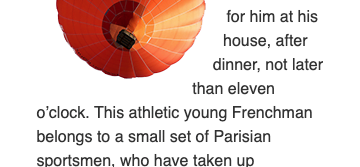
An example for this would be the CSS property shape-outside, a property that is not supported by IE11 or Edge. This property allows text to wrap around images depending on the border of the contents of the image. When applied, you get an effect around your image. But, if you were to open it on IE11 or Edge, you would get a square wrap around the image, like the example below.
Other Browsers:
Internet Explorer/Edge:
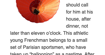
As you can see, your website might not look exactly the same on both browsers, but it still looks good. If you implement different properties that are available for IE as a fallback, you can use these properties on your new websites without worrying about what Internet Explorer is going to do with them.
Lightning Fast Web Performance
This was a workshop we attended focusing on increasing performance across websites and apps from a variety of sources and approaches. Let’s go through a few takeaways that we found the most helpful and interesting. This won’t be a deep dive into how each work, but rather an introduction to what they are.
HTML
HTTP/2 Server Push
HTTP version 2 (HTTP/2) opened up a number of features previously unavailable, including Server Push. What this does is allow a server to send multiple responses for a single client request. During a typical website request the HTML will be first, which will include links to CSS files, JavaScript files, and possibly others. Server Push can be added as an instrument to tell the server that when a file (like HTML) is requested, go ahead and send a CSS file and two JavaScript files along with it, because the user will need those. It’s a way to save time for the end-user by not having to wait for those resources to come later when they are needed.
Link Preload
Using <link rel=”preload”> informs the browser that this resource will be needed, and should start getting retrieved as soon as possible. A good use case for this would be critical (render-blocking) CSS and JavaScript or Fonts. The “as” attribute of this tells the browser how to handle the information when it arrives and is required. Many different content types can be preloaded.
The possible as attribute values include:
- audio: Audio file, as typically used in <audio>.
- document: An HTML document intended to be embedded by a <frame> or <iframe>.
- embed: A resource to be embedded inside an <embed> element.
- fetch: Resource to be accessed by a fetch or XHR request, such as an ArrayBuffer or JSON file.
- font: Font file.
- image: Image file.
- object: A resource to be embedded inside an <object> element.
- script: JavaScript file.
- style: CSS stylesheet.
- track: WebVTT file.
- worker: A JavaScript web worker or shared worker.
- video: Video file, as typically used in <video>.
Link Prefetch
Using <link rel=”prefetch”> informs the browser to utilize idle time to download documents that the user may use in the near future. This is best used for things on upcoming pages, especially in a flow, like an ecommerce checkout, for example.
JavaScript
Async vs Defer
Utilizing async or defer are both ways to tell a browser how to load a JavaScript asset, both of which in a non-critical way (doesn’t block page rendering).
Async
These scripts can download while the webpage is being downloaded and can execute either before or after the webpage has finished rendering. This may be best for independent scripts, like ads, as they are not critical to the webpage functionality.
Defer
These scripts execute after the document has loaded and parsed, leading to a faster page load feel. Unfortunately, without these scripts the page may not be functional, so use in non-critical JavaScript or add a loading feature so the user knows that the JavaScript hasn’t completed.
Images
Srcset
What srcset does is allow a browser to adjust the image loaded for the user based on the browser window width. The sizes and images are defined in an image or picture tag along with the width of the window to know when to use those different images. The great thing for us at Zion & Zion is when we use WordPress to build a website srcset is built into their core.
Lazy Loading
Adding loading=”lazy” to an image allows for the browsers to support this feature to lazily load the image as it comes into view for the user. This is best used for images that will be down the page below the fold and will not be needed immediately on render. It’s only supported by a few browsers. However, if a browser doesn’t support it, it will just be ignored—so no harm is adding it if desired!
Applied Accessibility: Practical Tips for Building More Accessible Front-Ends
This was a talk by Sara Soueidan that could have been an all-day workshop. Accessibility is so important nowadays in our industry. The web should be a place that all can access and enjoy, regardless of how they interact with it. We as developers are the ones that can either provide or prevent this accessibility, so it’s critical for this to always be on our mind as we develop.
Planning for Accessibility
The best thing that a developer can do for accessibility is plan for it while they are building. Make it a part of the process just like QA checks or code reviews. It will save time in the long run by planning for accessibility as components are being built, rather than having to go back later and having to make adjustments to the code.
If there is already a library of components to pull from internally or externally, ensuring these are already accessible when importing them is an ideal starting off point. If the initial code already has everything it will need, time can be saved every time that code is reused, and the accessibility will already be included. Win-win.
One of the most important things is practice. Practicing accessibility is important because many times you can’t see if there is something wrong from an accessibility aspect, like if a button is black when it should be blue. Planning for accessibility needs before development begins, almost to the point of being second nature, will allow it to become just another part of the regular coding process.
Testing for Accessibility
Lighthouse
Lighthouse is an open-source, automated tool for improving the performance, quality, and correctness of your web apps. The beauty of it for the web is it’s built into the dev tools of Google Chrome. You only need to open Dev Tools and go to the Audits tab to run an audit of your website, either on desktop or mobile. There are also a few other audits that can be run from this tab, including performance and SEO. When it’s finished it will look something like this:
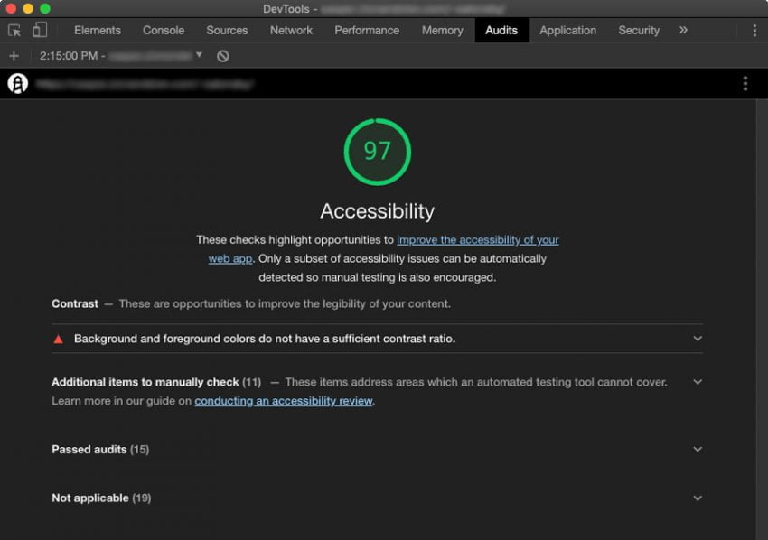
Lighthouse is also nice because it will provide the code where there are issues or potential issues, so you know exactly where to look as a developer.
WebAIM
Web Accessibility In Mind (WebAIM) is a great website with all sorts of tools and articles to learn more about accessibility. They have a color test to see if your chosen colors are WCAG AA and AAA compliant. They also have an evaluation tool similar to Lighthouse to check the accessibility of your web page called Web Accessibility Evaluation Tool (WAVE).
Conclusion
Smashing Conference is both an interesting and enjoyable conference to attend. What we have shared is just a sliver of what they offered over two days. We hope to be returning soon to one of their four annual conferences around the world to continue learning and growing.