
CSS is incredibly transformative. Without it, the web would look like a Wikipedia page! While it is extremely powerful, it does have its limitations. Sometimes our styling needs are not fully met by the available CSS features and we need to seek out alternative solutions, like JavaScript. Ideally, we would keep design and functionality separate (of course there are exceptions to this rule like GSAP). Thankfully, new CSS features are constantly being released. In this article, we’ll overview some new and exciting CSS features. While these new features may not be staples for your everyday CSS needs, they do address a current gap in what is possible with CSS.
It should be noted that for every new CSS feature there are concerns for browser compatibility. If you’re working on a project with certain browser requirements, it is in your best interest to see what the browser compatibility is beforehand. There are a wide range of resources available to do exactly this. One of the most popular resources being Can I Use. Consulting these resources will allow you to avoid the headaches of finding a proper polyfill, or worse yet, having to completely start over with your styles!
1. CSS Shapes
Oftentimes, the web can feel like a ton of squares and rectangles stacked on top of each other. Organic shapes aren’t nearly as equally represented on the web. Thankfully, the CSS shapes properties: shape-outside, shape-image-threshold, and share-margin, allow us to break the mold by having content wrap around organic shapes.
One of the most practical uses for CSS shapes is having content wrap around an image. For this example, we will be using the png format since it allows for transparency. Currently when an image is floated, the content will wrap around it but will follow the boxy bounds of the image—not the actual shape of the image itself, in this case a teardrop. This leaves a lot of unnecessary whitespace. Of course, we could reduce the whitespace on the image itself, but we will always be left with these boxy edges no matter how much we crop the image. When we apply CSS shapes to our image, we can make the content wrap around the image’s teardrop shape. These properties can autodetect the image’s shape, so you don’t need to define this for each individual image. After defining these properties, we can successfully reduce the amount of whitespace on the page.
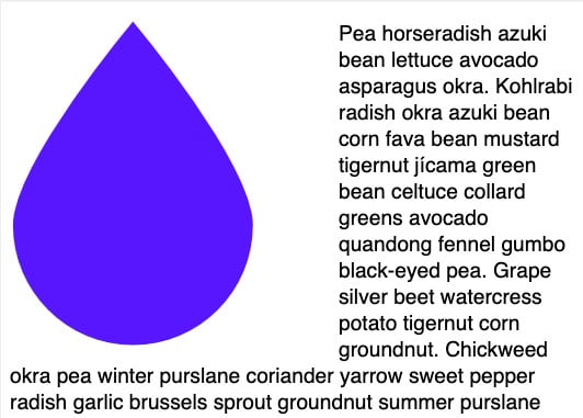
Source: https://www.smashingmagazine.com/2018/09/css-shapes/
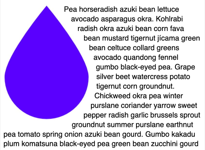
Source: https://www.smashingmagazine.com/2018/09/css-shapes/
These properties can be applied to other things besides images like generated content, :before and :after. With a little imagination these CSS Shape properties can produce fun and exciting results. An interesting use case for this would be creating a shape overlay on background images to ensure that the content doesn’t overlay the image emphasis. This could reduce the dreaded readability issues that arise when having text on top of an image. To learn more about what is possible with CSS Shapes read Rachel Andrew’s article.
2. Grid
Grid is one of the greatest developments in CSS in recent years. Grid allows us to reconsider what is possible with layouts in web design. It’s amazing how you can drastically transform a page with a few CSS properties. Something unimaginable a few years ago. If you’re unfamiliar with Grid, here’s a quick overview of the Grid basics.
Grid Inception
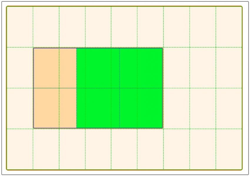
One of the latest Grid enhancements has to do with the subgrid. With Grid, you define a parent element as the grid container. Any direct children of that parent element are grid items. These grid items can be placed anywhere on the grid container with a few Grid properties.
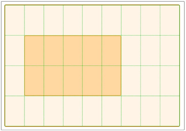
Source: https://developer.mozilla.org/en-US/docs/Web/CSS/CSS_Grid_Layout/Subgrid
However, it is very rare that are you working with only one level of nested elements. Often those direct children of the grid container will contain several elements themselves that we will want to position on a grid as well. To do this, we must declare our grid item as a grid container. This is where subgrid comes in. This ability to define a grid within a grid has always existed within the Grid specifications.
Source: https://developer.mozilla.org/en-US/docs/Web/CSS/CSS_Grid_Layout/Subgrid
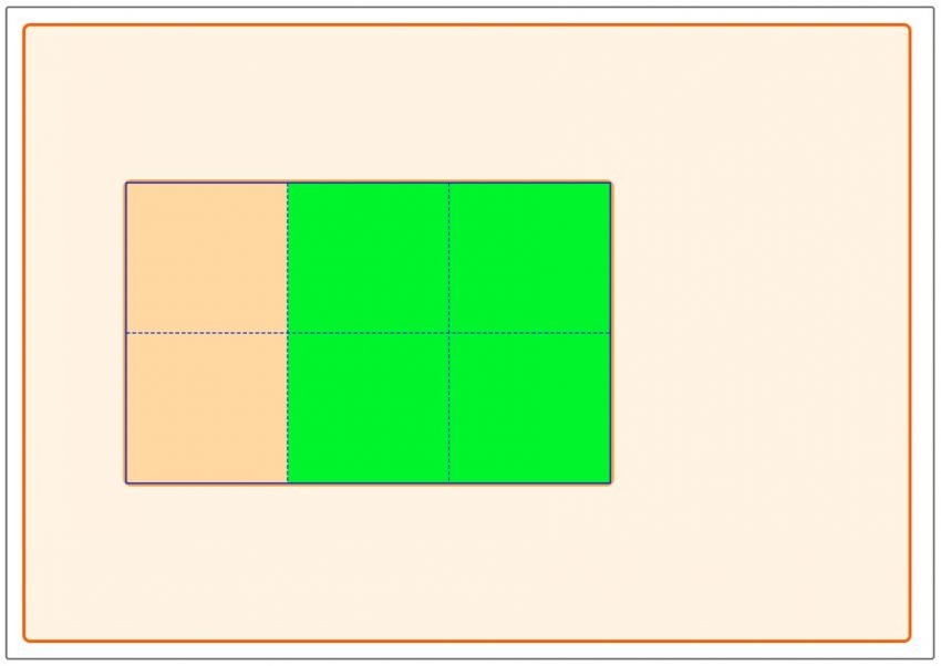
Unfortunately, what has not been available is the ability to inherit the parent’s tracking, the number of rows and columns. Previously if you wanted to inherit the parent’s tracking you need to redeclare all the CSS properties you had on the parent grid container. This inability to inherit tracking made it extremely difficult to match up the parent and children grids with each other.
Source: https://developer.mozilla.org/en-US/docs/Web/CSS/CSS_Grid_Layout/Subgrid
Templating with Grid would have been a burdensome task before the subgrid. As demonstrated above, you can deviate from the parent grid item if needed by declaring custom tracking on either the columns or rows. Grid has always been a superior solution for our layout needs but with subgrid the possibilities are endless.
3. Variable Fonts
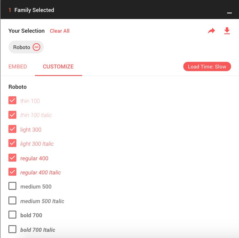
Fonts are such important part of the look and feel of a site. It’s such a rarity that a site will only be using one font and one font weight. Most of the time, a site will be using several different fonts and several font weights. Unfortunately loading too many fonts can have performance implications. Google Fonts allows the user to be conscious of this fact by displaying the expected load time. For instance, Roboto has 12 separate font weights and styles. Selecting half of those font styles causes the load time to display as slow. While this may seem like quite a few font weights, it is in fact quite common to load this many styles for an individual font. You can only imagine the performance impact when loading many fonts onto a site.
Variable fonts provide a performance boost that has always been lacking for web fonts. Web fonts are a necessity to any site, but it doesn’t mean our website should suffer because of it. One of the major benefits of variable fonts is that we can load in one font that contains all possible font weights. You have all the font weights and styles at your disposable without ever having to explicitly declare which ones are being loaded in your project.
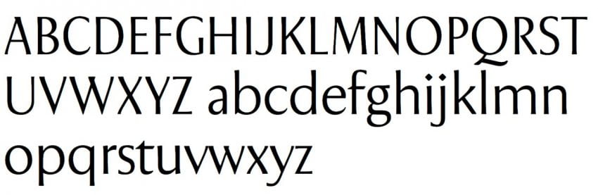
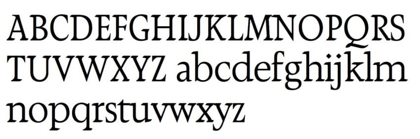
While font weight is perhaps the most practical aspect of variable fonts, there are numerous other features we can utilize. For instance, variable fonts also have the ability to act like several fonts in one. It has the ability to completely transform itself by declaring properties like strange-width and slant. Perhaps one of the most practical applications of this is by having a font that can act as a serif and a sans serif font. Variable Fonts is the best resource when looking for available variable fonts. Below is an example of the transformative powers of variable fonts like Seraphs font.
Conclusion
CSS is constantly changing and evolving to better meet our needs as front-end developers. Every year new CSS features are being released that allow us to push the bounds of what is possible in web. Since CSS is ever evolving, it is important to keep up with the latest and greatest as these new and exciting features will surely make their way to more and more websites that you visit every day. While it is tempting to incorporate these new features into upcoming projects, it is also important to be conscious about what browsers support you need to meet since some browsers are slower to adopt support.