
CSS (Cascading Style Sheets) is an awesome tool that many websites use. CSS describes how elements should be rendered, and thanks to it, we can produce awesome, colorful, intuitive, and easy to understand websites.
In this article, I am going to talk about some CSS properties that can be helpful when developing a website that requires specific styling, or styling otherwise known as custom handmade styling. There are a lot of premade libraries out there that you can use to add certain classes to div tags or other types of containers, however they don’t always let you create exactly what you need.
1. Border Image
In my opinion, this property is one of most underrated CSS properties. If used correctly, it can make a significant impact, but usually only when you’re using it on a very well-designed image. The property takes an image and slices it into different pieces, which are then used as the border of the container.
The below example is using an image with a width of 81px and a height of 81px. The image has three regions, so by dividing it into three columns, we get the ones on the sides (the orange ones) as the corners of the border. The width of the border is set in pixels clockwise starting from the top, and the outset is set to half of the width, so the border is centered in the container. Finally, the property round is added to prevent gaps between the images.

HTML Code
CSS Code
#bitmap {
 width: 200px;
 background-color: #ffa;
 border: 36px solid orange;
 margin: 30px;
 padding: 10px;

 border-image:

  url("https://mdn.mozillademos.org/files/4127/border.png")/*source*/
 27 /                    /* slice */
 36px 28px 18px 8px /    /* width */
 18px 14px 9px 4px       /* outset */
 round;                  /* repeat */
}
Result
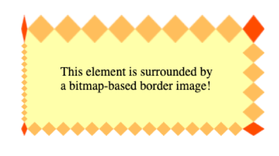
As you can see, you can place borders with different widths on them, but the corners will adapt depending on the width of the adjacent borders.
CSS Code
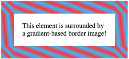
Another interesting thing you can do with the border property is using gradients as the image border. The gradient effect will repeat itself to fill the entire space around the element.
#gradient {
 width: 200px;
 border: 30px solid;
 border-image: repeating-linear-gradient(45deg, #f33, #3bf, #f33 30px) 60;
 padding: 20px;
}
Result
The compatibility of this property is well supported. Currently, only IE10 and below can’t support it. To check if the property you want to use is supported by specific operating systems, check out this site. It’ll tell you everything you need to know about properties, including bugs and other known issues.
2. Mix Blend Mode
If you want to give your images a different or fun look, the mix-blend-mode property is simple to use. It’s also a fun property to watch come to life on a website. The property can be used to overlap elements and change the color of the background images/elements depending on their position.
There are a lot of different affects you can accomplish with this property. Some of them blend with the background, and others stay within the elements of the property. Below, you’ll some different examples of how to multiple, darken, lighten, and more with and without blending the background of the property.
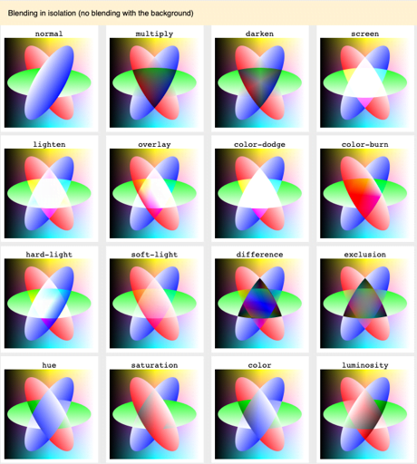
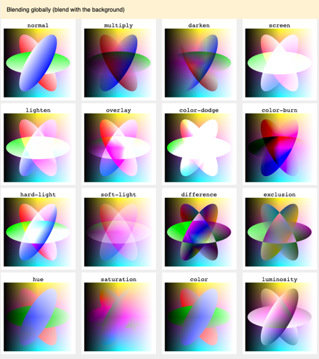
On a more technical note, the code is pretty simple. All you have to do is apply the property mix-blend-mode to the element that you want to give the effect to and choose an effect from the images above like overlay, darken, or multiple, for example.
HTML Code
CSS Code
.circle {
 width: 80px;
 height: 80px;
 border-radius: 50%;
 mix-blend-mode: screen;
 position: absolute;
}

.circle-1 {
 background: red;
}

.circle-2 {
 background: lightgreen;
 left: 40px;
}

.circle-3 {
 background: blue;
 left: 20px;
 top: 40px;
}

.isolate {
 isolation: isolate; /* Without isolation, the background color will be taken into account */
 position: relative;
}
Result
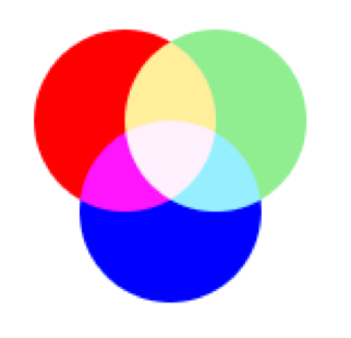
The great thing about this property is that it also supports SVG elements, allowing you to achieve vibrant and fun effects.
On the other hand, this property is unfortunately not well supported in IE or Edge. However, it could be supported in a future release of Edge where they use chromium (the engine for Chrome) as the base engine, but that will be covered in different post. To view the compatibility of this property, check out this site. It’ll tell you everything you need to know about properties, including bugs and other known issues.
3. Filters
This property is used to create different effects on whole elements, including content. The nice thing about it is that it has several functions that can be used together. Here are some of the attributes you can use for this property:
- blur()
- brightness()
- contrast()
- drop-shadow()
- grayscale()
- hue-rotate()
- invert()
- opacity()
- saturate()
- sepia()
- url() – for applying SVG filters
Here is the basic syntax for this property:
HTML Code
.filter-me {
 filter:  []* | none
}
Where is one of the previous mentioned functions. If you want to use multiple functions on the same element you can “space separate” them and apply as many as you want.
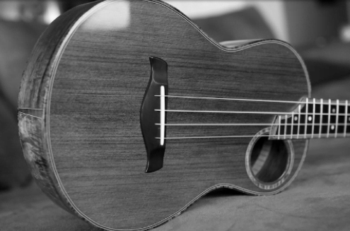
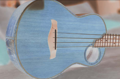
Here are some examples of filters. The next image is the original image followed by the image with the filter applied.
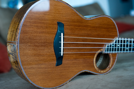
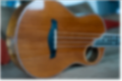
Grayscale CSS Code
img {
 -webkit-filter: grayscale(1);
 filter: grayscale(1);
}
Result
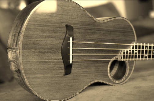
Sepia CSS Code
img {
 -webkit-filter: sepia(1);
 filter: sepia(1);
}
Result
Invert CSS Code
img {
 -webkit-filter: invert(.8);
 filter: invert(.8);
}
Result
Blur CSS Code
img {
 -webkit-filter: blur(5px);
 filter: blur(5px);
}
Result
All around, this property is supported by most browsers, except for IE and Edge (which I’m sure you could’ve seen coming). To view the compatibility of this property, check out this site. It’ll tell you everything you need to know about properties, including bugs and other known issues.
BONUS: Native CSS Variables
The next thing I am going to talk about is not a property of CSS but is a new feature that has been added recently—variables for CSS. (Yes, you read that right! Not SCSS or LESS). This is a fairly new feature that CSS is bringing to the table and it seems to be more than useful in its early stages. I must clarify this is not a CSS property, but it is used as one.
CSS variables, or custom CSS properties, are simple to declare and use. Even if you’ve never worked with SCSS or LESS, you will understand what it takes to create a variable on CSS. First of all, these variables are limited to the scope that they are set on, if you ever worked with JavaScript you may know what I am talking about. Let’s do an example.
/*can you spot the variable here? */
.block {
 color: #8cacea;
 --color: blue;
}
In this case, the variable is –color which is inside the .block class and can only be used for this specific class. If we want a “global variable,” we will need to add a “:root” selector which will try to find the highest-level element in the DOM, making this variable available for all of the classes used.
:root {
 --color: blue;
}
So, how do we use them? The answer is simple. Once you’ve declared your variable, you can use it by adding it to any property in the CSS code with the var function.
:root {
 --font-size: 20px
}

.test {
 font-size: var(--font-size)
}
One thing that’s important to remember is that CSS variables are inherited through elements. What you’ll see in the next example is a div with a declared variable, then we use class selectors for specific divs and apply variables inside those.
div {
 --color: red;
}
div.test {
 color: var(--color)
}
div.ew {
 color: var(--color)
}
Also, variables can be modified depending on the size of the screen with @media conditionals. Meaning, when the screen gets to a certain size, the value of the variable will change. Here is another example to clarify this:
:root {
 --gutter: 10px
}
@media screen and (min-width: 768px) {
 --gutter: 30px
}
Compatibility for CSS variables is excellent, but I’m sure as you can guess, IE is not compatible with this. As always, check out this site to view the compatibility of this property. It’ll tell you everything you need to know about properties, including bugs and other known issues.
Are These Properties Useful?
The properties that I talked about are fun to implement but are only appropriate to use when the design and user experience of the overall website has been considered. While you may not use these properties for every web project you work on, it’s good to have them on hand in case you come across an opportunity to deliver on your user experience strategy by drawing upon these techniques.