Here at Zion & Zion, we develop and re-develop a lot of brands for a wide range of clients, and we often develop those clients’ websites as well. As part of that process, we focus on the tone of a brand’s website. And, when it comes to the tone of a brand’s website, there are endless opportunities to stand out and be unique. Tone is achieved through a combination of visual elements (like the color palette, photography, typography), the copywriting, and the interaction experience of the website.
To make this article accessible to everyone, I’ve chosen seven well-known brand websites, each of which does an excellent job of adhering to a particular tone. Specifically, each portrays one of the following tones:
Comical
Witty
Playful
Friendly
Casual
Cheerful
Aggressive
1. Comical: Old Spice
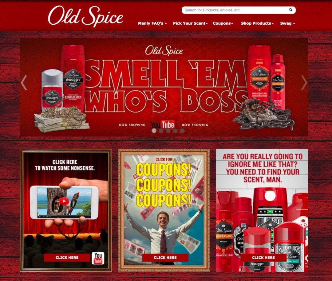
The branding pioneers over at Old Spice clearly love their jobs. Their commercials are both iconic and memorable, and they make sure to carry that all the way through the look and feel of their website. Although red can come off as alarming and brash, they’ve managed to find the energy in the color by aligning it with a very fun and energetic attitude.
Their copy alone helps them to stand out, with lines in their CTA (call-to-action) graphics like “Are you really going to ignore me like that? You need to find your scent, man.” In addition, they are providing interactive content that allows the user to further engage with the brand outside of just purchasing the product. They do this through featuring videos that were made strictly for the web, in other words, videos that were not produced with a large budget meant to become TV commercials. This is one of the best parts of the internet: being able to deliver custom content to their actual audience, allowing them to tailor the subject matter more efficiently. Even their navigation says “Manly FAQs” instead of just “FAQs” so they can pull that machismo ruggedness even deeper into the tone of their site.
2. Witty: Dollar Shave Club
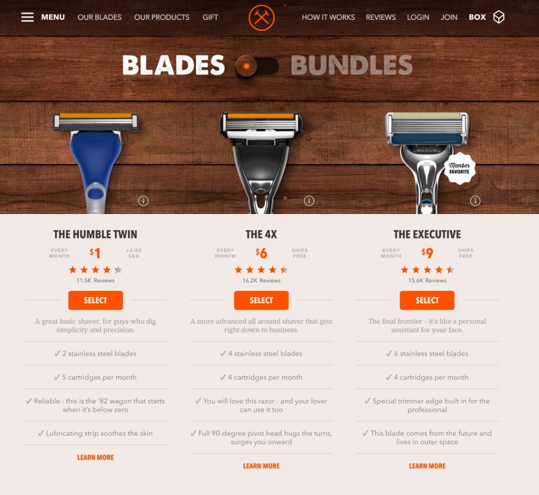
Dollar Shave Club, another “manly” brand. They started out marketing directly to men until they realized there was a whole market of women using their boyfriends’ razors that they could tap into—they did so while maintaining the same branding.
If you’ve ever received their product, you’ll know it comes with a monthly newsletter that is full of useful information. The twist? It’s delivered with top-notch wit and comedy. The tone of their website has the laid-back gentlemen’s barber feel to it, using the wood textures and an earthy vintage-like palette (with pops of orange to modernize it). The copy is the most obvious display of wit, through catchy use of alliteration like “Blades or Bundles,” and creative names for their blades like “The Humble Twin” (for its two-blade model). This doesn’t stop at headlines and titles—they carry it down to the descriptions where they describe features like how the Executive blade “comes from the future and lives in outer space,” which is substantially more interesting to read than your typical razor description. The toggle between Blades and Bundles is a playful interaction that gives a life-like interaction to the user. These small details are what give the online experience for a brand like this life.
3. Playful: Skittles
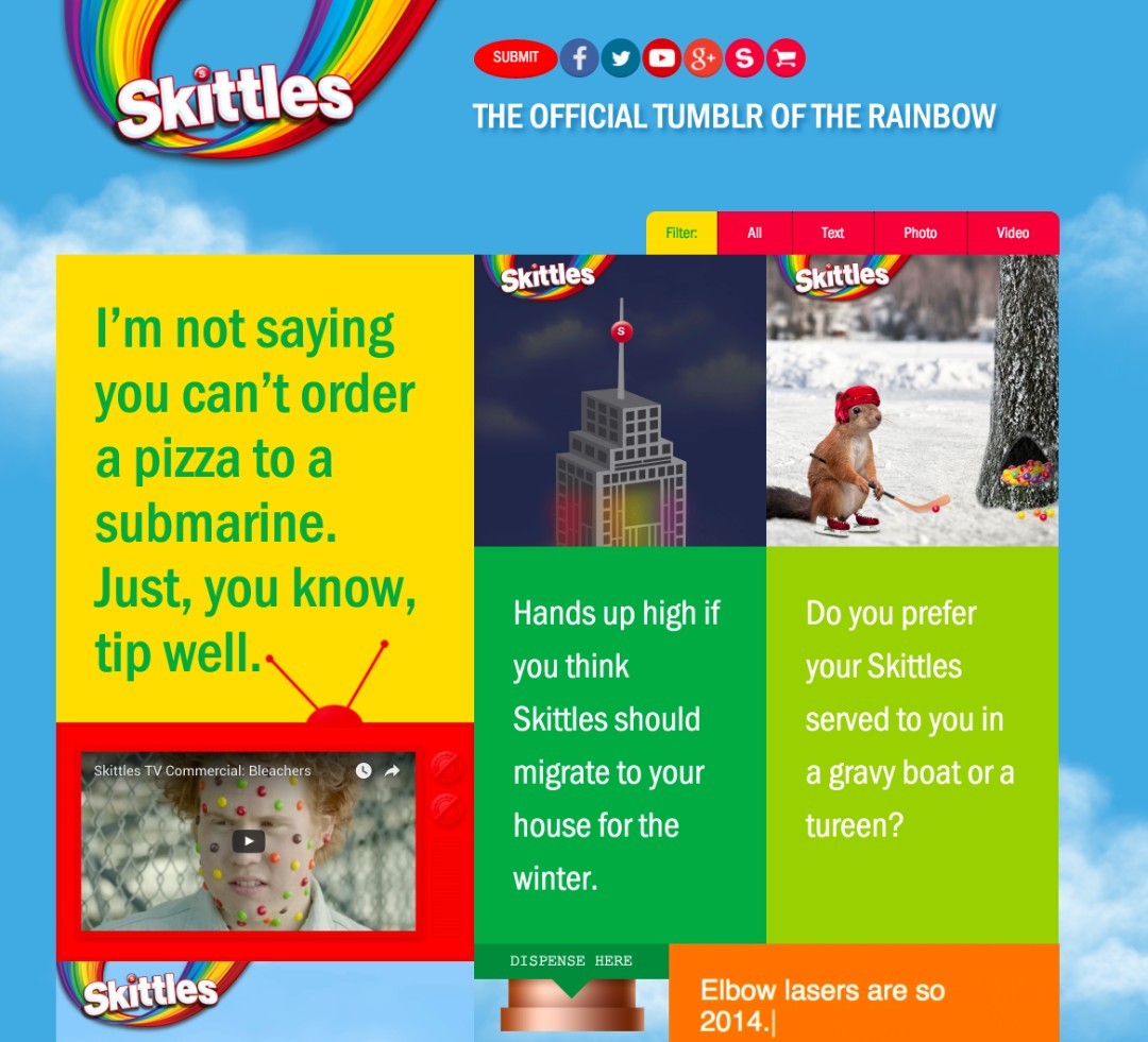
Skittles is the epitome of a playful brand (albeit sometimes just plain weird), so they had no problem bringing that same sensibility to their website. The rainbow theme allowed them to bring a lot of color to the website, while also having a lot of fun with the content. They leveraged the popularity of the Tumblr interface (and content) by using that as their homepage. They acknowledged that their consumers love this type of content, and they are capitalizing on it. Their messaging is super tongue in cheek, and their animated GIFs do not disappoint.
4. Friendly: Payless
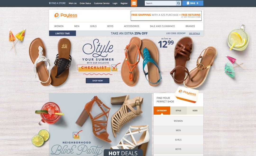
Payless is a shoe store well known for their low prices on trendy shoes, making fashion available to just about anyone. This business model aligns perfectly with a brand that is friendly and welcoming, appealing to a wide consumer base. Payless accomplishes this through their website in a couple significant ways. The first is through the copy and messaging. They have organized their products on the homepage into common events that most people participate in over the summer: block parties, family picnics, play dates, etc. Connecting to your audience through lifestyle scenarios is an important way to appeal to them on an emotional level. Additionally, they’ve styled the copy with a playful script to push the friendly tone even further. Another way they are accomplishing this friendly tone is through the style of photography for both their product and their supplementary lifestyle images. Birds-eye view shots of their shoes set alongside summer-like elements create a warm, inviting scene as though this could be actual footage from someone’s life. Through strategically worded copy, such as “find your perfect shoe,” Payless allows users to search their inventory, while constantly remaining friendly, which makes the user feel like Payless understands their needs and cares about them enough to help them while they shop.
5. Casual: Chubbies
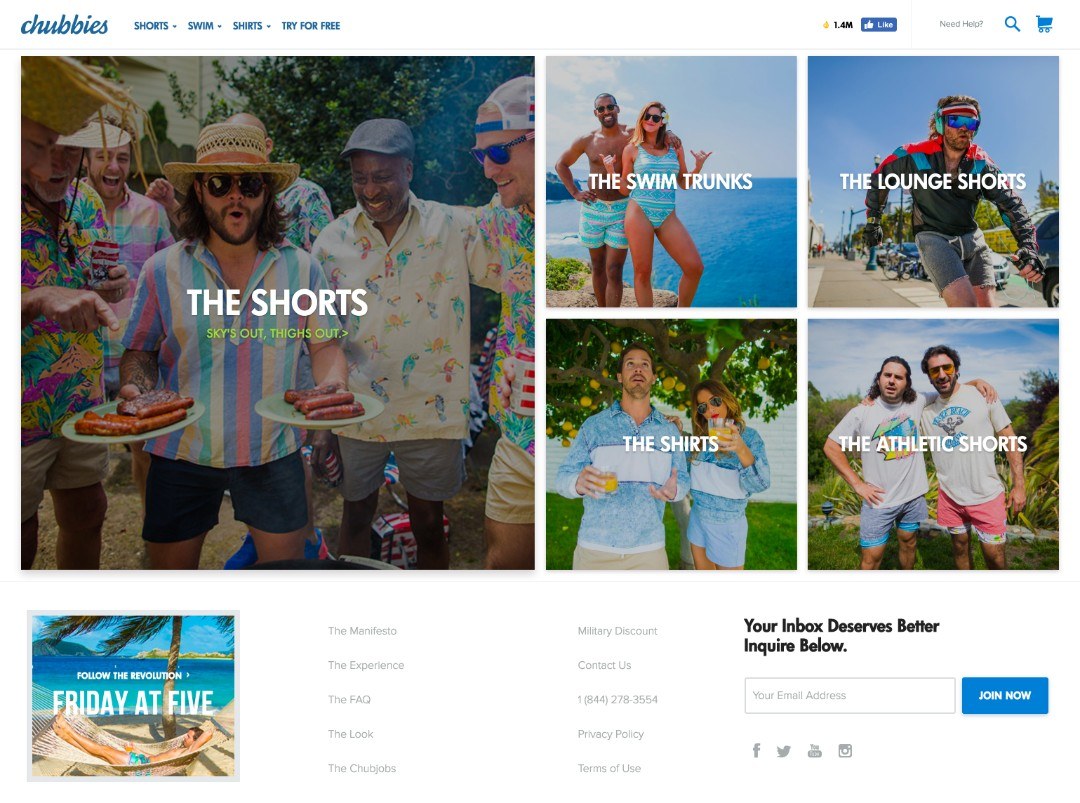
Ah, Chubbies. The name alone is hilarious and makes you go “Wait, what?” The nice thing about this company is that they took their name and the impression it gives, and they turned it into a brand that is just plain off the wall and ridiculous. However, they still maintain a cool, laid-back vibe by making the brand feel like their products are for the free-wheeling cool kids. To do this, they used colorful lifestyle photography showing people enjoying perfect summertime activities. Summer is everyone’s favorite time of year, where they think of barbecues, sunshine, enjoying open water, and hanging out with good friends, all of which are captured on this website. Clearly Chubbies shorts make these experiences a reality, or at least that’s what they are wanting you to believe.
The CTA in the footer for email collection is especially impressive: “Your inbox deserves better. Inquire below.” In addition, the navigation is a clean and straight forward monotone pallet, which helps bring the gorgeous photography center stage.
6. Cheerful: Bath & Body Works
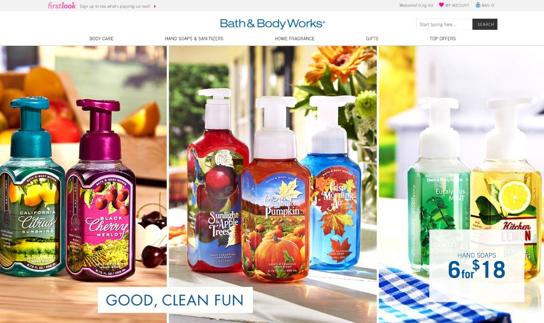
The Bath & Body Works brand has always been tied to that feeling you get when you smell something pleasant. Until our computers come with scratch-and-sniff functionality, they have the challenge of bringing the sensory experience of smell to life visually. In store, the aroma of their products sell themselves. However, on their website, it takes more creativity and crafting to get that same feeling to come across visually. They do this by focusing the product photography on the energetic labels and letting those images be the focus of the website. The rest of the site is bright white and clean so that the plethora of colors can really stand out. The messaging “Good, Clean Fun” says exactly who they are and what they are about: making bath products a fun part of your day. This theme is perfectly carried through the entire ecommerce shopping experience.
7. Aggressive: Harley Davidson
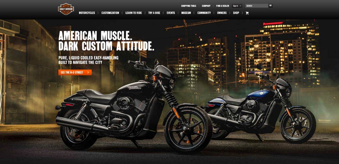
This final example shows how a more aggressive tone can be applied to the right brand in the right way to give themselves an edge that reflects what their customers are looking for.
Harley Davidson is the epitome of a hard-edged, ultra-rugged, in-your-face brand whose dedicated fans embody every part of it. The nature of the product alone isn’t enough to portray this, but the way it is executed is everything. All the photography is dark and ominous, with contrast in all the right places on the products themselves. They utilize a heavy black palette with simple contrasts in white and orange, their brand colors, in order to keep the sensibility of their brand on point through the whole web experience. The headlines such as “American muscle. Dark custom attitude” bring that aggressiveness even further. Overall, the site is a little outdated, so we will likely see an update in future where we can expect the interactive experience to take advantage of the brand’s edge a little more.
Conclusion
The tone of a website encapsulates everything that is your brand. There’s no individual part that can stand alone to define it; it’s comprised of the visual design, the style of photography, the implementation of video and animation, the way the content is written and the tone of voice that is used, and even the flow of the user’s experience. These pieces play a part in defining a brand’s website experience, and the more thought that goes into them, the easier it will be for brand advocates to become followers for life.