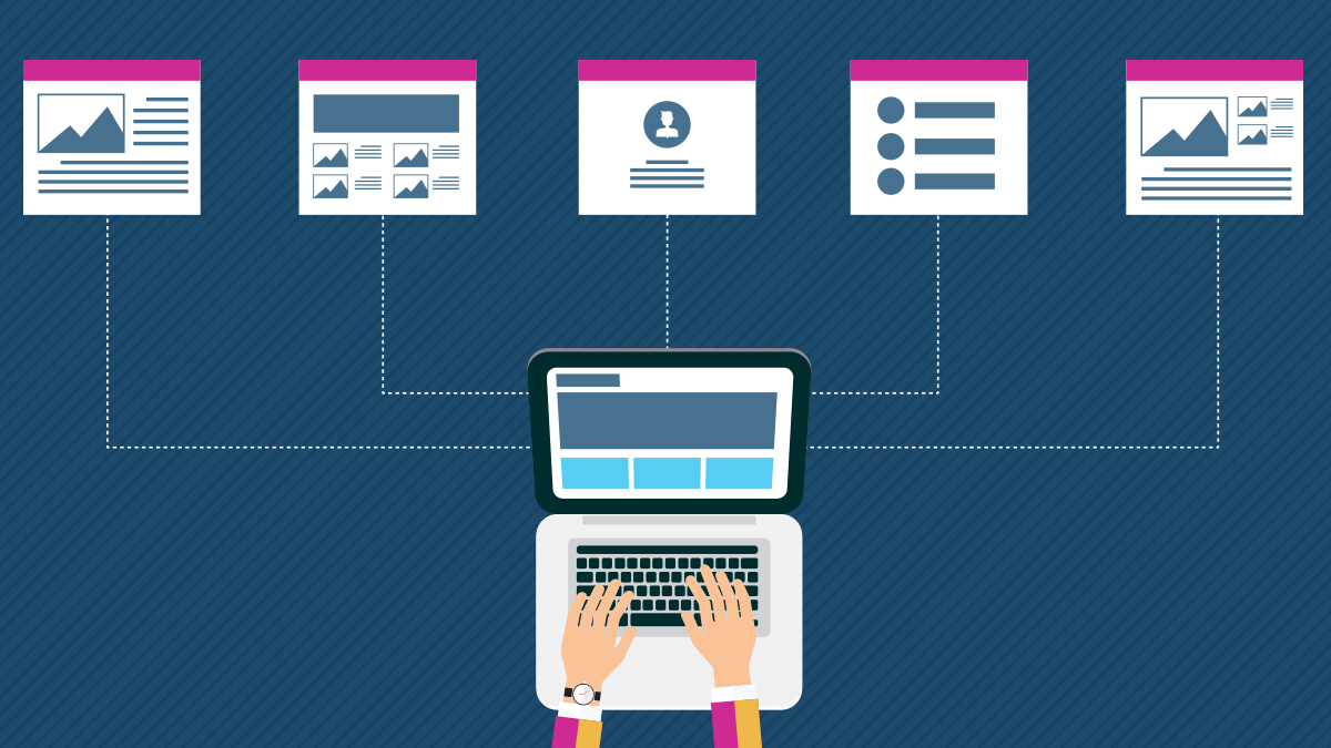
Information architecture, or IA, is used to create the structure of a website or mobile application.
In a perfect world, the IA of your website would give users the context needed to know where they are and where their desired information is located in relation to their current position. Before your IA can come anywhere close to this ideal scenario, you must first understand and apply the conventions and standards of information architecture.
Principles of Good Information Architecture
To begin, we’ll first cover principles of good information architecture. After, we’ll dive deeper into the details of developing a structure.
Point of View
Before developing the IA of your website or mobile application, it’s important to first establish the point of view you’re going to take. With this, we recommend that you take the point of view of your users, not your organization.
Take the company Columbia as an example. Below, you can see the company’s jargon seeping through their main product categorization. Other than long-term loyal customers and employees, most users would have a difficult time understanding what “3 in 1 Interchange” and “Titanium Collection” mean.
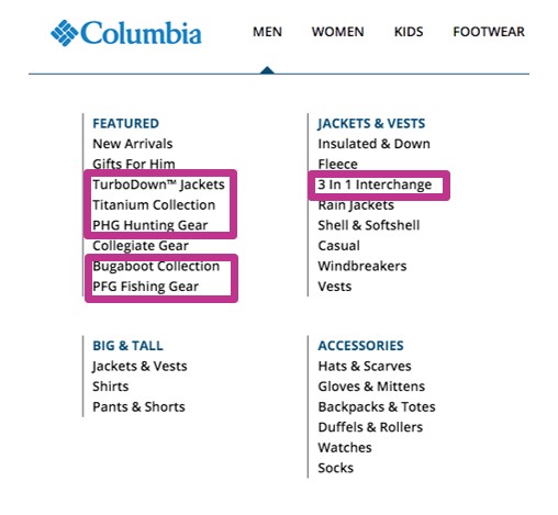
One of the ways to avoid this common mistake is by defining personas before developing the structure of a website. This helps keep your users at the forefront of your decision-making process. For instance, with the Columbia example, we may ask, “Would Tim (our persona) understand ‘Titanium Collection’ without trial-and-error clicking?” If the answer is no, we would go back to the drawing board and change the overall organization, label name, or categorization until Tim could confidently use the navigation with ease.
Applying point of view: Don’t let your site reflect the people who built it. Take the point of view of your users, not your company.
User Expectations
Over time, users become accustomed to certain elements of web design and anticipate specific items to be set up in particular ways. This is representative of Jakob’s Law of the Internet, which states “users spend most of their time on websites that aren’t yours.” Users assume certain standards are consistent across all websites and mobile applications because it’s what they’ve grown accustomed to.
In web design, there’s a time and a place to be creative, and your navigation is not that place. Make sure you keep this in mind when developing your website’s structure.
Applying user expectations: Don’t reinvent the wheel. Take what users are familiar with and work it into the structure of your site so it’s predictable, easy, and simple to use.
Information Scent
Information scent is defined by dictionary.com as, “visual and linguistic cues on a website to the information it contains.” In user experience, it essentially means how successfully your users will be able to find what they are looking for based on the label(s) you provide.
Users can either have high information scent or low information scent, depending on how confident they feel in their decision.
- High information scent: A user would have high information scent if they can confidently determine what is to come after they click a link or button on your website.
- Low information scent: On the contrary, when there’s low information scent, there’s ambiguity. A user may be left asking themselves, “After I click this link, what’s going to happen?”
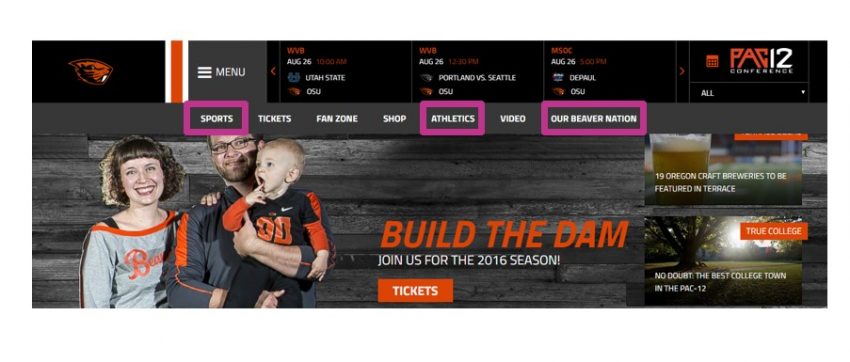
Here is an example from Oregon State University Athletics where users may have low information scent. Both “Sports” and “Athletics” can mean similar things, so it may be hard for users to predict what content is to follow after they click either navigational item. Additionally, it’s difficult to forecast what “Our Beaver Nation” entails. Does that link lead the user to a blog, login page, or newsfeed of current events? With their current structure and labeling system, it’s difficult to tell.
Applying information scent: Aim for high information scent within your site. Design your labels, categories, and links to be straight-forward so your users can easily predict what’s to come.
Developing A Successful Information Architecture
Now that we’ve reviewed principles of good information architecture, you should be in the right mindset to start developing your IA. With IA development comes more standards and conventions, including:
- Organization systems
- Labels
- Structures
Organization Systems
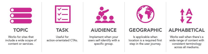
An organization system is how you decide to group and categorize the pages on your mobile application or website. While there are many ways to organize and group your content, some of the popular include organizing by:
- Topic
- Task
- Audience
- Geographic
- Alphabetical
Topic
Topic organization works well for sites that have a wide range of content and services.
For example, Arizona State University’s website, pictured below, uses a topic organization system. Being such a large university, they have an extensive amount of pages they need to include on their site. A topic organization system allows them to condense and refine their wide range of navigational items, including “Academics,” “Alumni,” and “About ASU.”
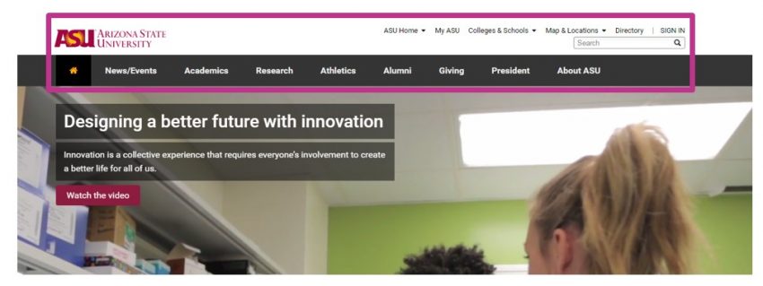
Applying topic organization systems: When your website includes a wide range of different services, products, or features use a topic organization system within your global navigation to condense and coordinate your various pages of content.
Task
A task organization system is when all navigational items are action-orientated. This works best when your CTAs (call-to-actions) require an immediate action from your user. For example, Virgin America Airlines labels their navigation with “Book,” “Check-In,” and “Manage.” These are some of the top actions a user would want to complete when arriving to their site, so it works well.
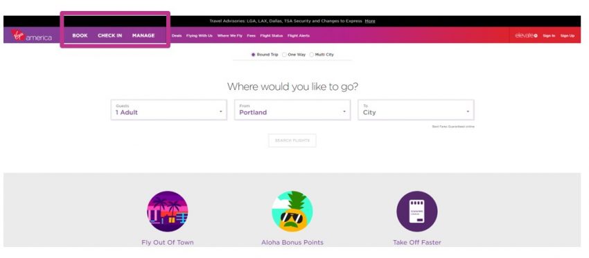
On the other hand, task organization systems don’t work as well when you try to force what should be a topic item into a verb so it can be viewed as a task item, such as “Discover.” Typically, when this is done, users have low information scent because there are few specifics behind the term.
Task organization system application: Identify your users’ main objectives on your website or mobile application. If those top objectives are action-orientated, consider implementing a task organization system.
Audience
An audience organization system is appropriate when your company has separate, defined user groups as a part of its target audience. However, this system only works when your users self-identify with the audience(s) you’re proposing. When defining your user groups, make sure there’s no overlap. You don’t want to leave your user questioning which group they belong to.
Take Wells Fargo as an example. Their global navigation is organized by audience. They list “Personal,” “Small Business,” and “Commercial” as the main items in their navigation. This segmentation works well because all three of these audience groups will need to interact with the bank in different ways.
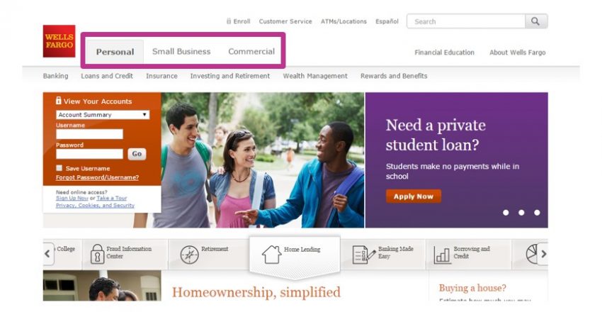
Applying audience organization systems: If your target audience has user groups that interact with your company in exclusive, distinct ways, try organizing your content by audience. But keep in mind, there should be no overlap.
Geographic
A geographic organization system works well for websites that have varying products or services across multiple locations. Take the below image as an example. Ikea, a home décor store, has close to 400 stores worldwide, and each store offers varying products.
Because of this, Ikea’s homepage automatically directs the user to a geographic organization system. This works well because it helps to refine the user’s search. After the user selects their location, they can then get into the details of Ikea’s local products based on their indicated location.
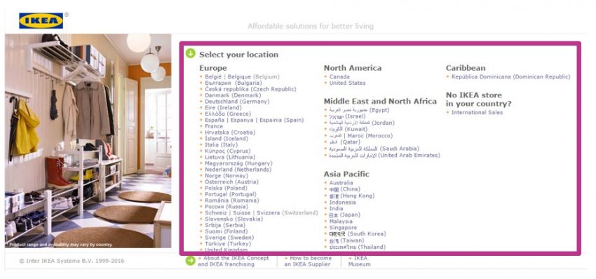
Applying geographical organization systems: Organize your content and pages with a geographical organization system if selecting a location is a required first step in your user’s journey.
Alphabetical
When many think of alphabetical navigation, they tend to think of a site that includes a terminology index, like a library. While this organization type does work well for academic websites, an alphabetical organization system can also work well in a few other scenarios.
For example, Backcountry, an online outdoor clothing company, uses an alphabetical organization system to categorize their brands from A-Z. This works well because a brand name doesn’t change. For instance, if a user is searching for an item from the brand Crocs, a brand Backcountry offers, they will always sort by the letter “C.” There’s no ambiguity here.
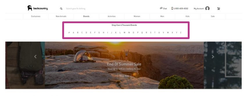
On the contrary, if Backcountry were to sort their product types from A-Z, there may be some confusion for the user. As an example, if a user was looking for a new pair of pants, would they sort by “P” for pants, “J” for jeans, or “B” for bottoms? Since there are multiple ways for the user to search product types from A-Z, an alphabetical organization system would not be successful.
Applying alphabetical organization systems: Before implementing this organization system, ensure your terminology is consistent across all mediums to avoid unclear, undefined search terms.
Labels
Now, let’s talk about labels in regard to IA. When selecting proper terminology for your labels, we recommend sticking to the following rules of thumb:
- Detailed: Labels should represent an accurate description of what the item leads to
- Brief: Don’t say more than what’s necessary
- Comprehensive: Make sure the label encompasses all (or the majority of) the content within the corresponding section
- Recognizable: Use terms that are familiar to your users
- Front-loaded: Put the most important text first for easy scannability
Applying the rules of labels: Get in the mindset of your user. If your labels aren’t detailed, brief, comprehensive, recognizable, or front-loaded, consider selecting new terminology until your labels are easy for your users to understand and interact with.
Structure
Structure, our last information architecture element to cover, is how categories relate to one another. While there are many ways to structure your IA, we’ll review the two most common: hierarchy and sequential.
Hierarchy
A hierarchy structure is useful because many users are familiar with it. It involves categories and subcategories that reveal a high-level view of how certain navigational items relate to one another.
Below, Sun Health, a website launched in early 2019 by Zion & Zion, includes a hierarchy structure. Underneath the main navigation label “Sun Health Foundation” we categorized the information into three sub-categories “Your Impact,” “Donate,” and “Get Involved.” Additionally, under each sub-category is a sub-sub-category that reveals what’s included within each.
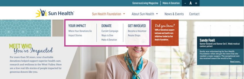
When you literally break it down into words, as I did above, this structure feels somewhat like overkill. But on the contrary, a typical user wouldn’t sit on a website and overanalyze or read through all their options. Instead, they scan to find what they came there for. A hierarchy structure provides users with an easy and functional way to dive in.
Applying hierarchy structure: Implement this structure when your website or mobile application includes a wide range of pages that can be broken into layers of categories and sub-categories.
Sequential
Typically, a sequential navigation is used within certain sections of your website or mobile application, rather than the entire website. A sequential structure is useful in scenarios where the user has to go through a process to complete a particular task, such as a check-out, login, or sign-up process.
Below, Amazon uses a sequential structure on their check-out page. Within the navigation, the user can see the defined, linear steps they must go through to place and order. It’s evident that the user is currently on step two out of four. This provides the user with clarity as to where they are in the process.
It also provides the user with a level of control, allowing them to click through the various steps as needed.

Applying sequential structure: Use this structure when there’s a process on your website or mobile application that’s linear. Keep your steps straightforward and give your users perspective and clarity through a progress indicator.
In Conclusion
Developing, executing, and applying a successful information architecture is no easy task. It requires time, patience, trial and error, and a lot of testing.
Whether your users realize it or not (and they probably don’t), the information architecture can have major implications on their experience. A poor IA leaves users frustrated, dissatisfied, and angry; whereas a good IA leaves users satisfied, calm, and fulfilled—knowing that their desired task was easily accomplished.