
CSS Grid Layout, also known as Grid, is one of the most exciting CSS features to roll out since Flexbox. Grid has the ability to completely revolutionize web design due to its advanced capabilities. The standard 12 column layouts used by site after site throughout the years can finally be something of the past, allowing us to explore new and exciting design patterns. Previously unimaginable layouts are now achievable with a few lines of CSS. This is how powerful Grid is. Let’s explore all that Grid has to offer.
The excitement around Grid is contagious and is generating buzz outside of the development world. Learn how CSS Grid impacts design in my colleague’s article, CSS Grid: The Future of Web Design. You’ll gain some insight into why this is also an exciting development for designers.
Grid Prede-CSS-ors (ha!)
To truly appreciate what Grid is able to accomplish, let’s revisit all the previous layout solutions of years past.
Tables
At the very beginning of web design, where there weren’t many CSS properties available, the best way to create a layout was with tables. The main issue with tables was it didn’t make sense semantically. More often than not, none of the data being entered into these tables was tabular. Thankfully, tables have been indefinitely retired from layout building (with the exception of HTML emails).
Floats
Float layouts were a vast improvement as more semantic HTML was able to be utilized for layout building. Unfortunately, floats came with many issues of their own. One of the biggest issues being that non-floated elements do not recognize floated children leaving the non-floated element to have a height of zero. A less than desirable result.
In order to avoid this float specific issue, you needed to implement one of the following clearfix methods:
- Empty Div Method: This method required adding empty divs to your HTML. Once again, a semantic issue as these additional divs were not added for structure but for styling purposes.
- Overflow Method: This method required setting the overflow property to the parent container. While this pure CSS solution was preferred to the empty div method, it could produce the undesirable results of cutoff content or unwanted scroll bars.
- Pseudo Selector Method: This method made use of the CSS pseudo selector, :after. All that was required for this to work was by adding a class to the parent div.
While the pseudo selector method was the best of the bunch due to its minimal impact on the code, floats always proved to be a very temperamental layout that could easily be ruined by adding additional elements or adjusting content.
Positioning and Inline-Block
By setting display: inline-block on the child elements, you were able to escape the many headaches that float layouts provided. Although this solution came with its own quirks, like how white space was rendered and limitations on vertical alignment. While this was the best solution of the previously mentioned, it still left something to be desired.
Flexbox
That’s where Flexbox steps in. Flexbox was everything we had been hoping and praying when it came to building layouts. Flexbox included awesome features like vertical alignment, horizontal alignment, and source order which was previously unavailable! Your layouts could be flexible depending on the available space calculated by the browser.
The one downfall of Flexbox was that it is only one dimensional. You can either define your flex container as a row or column (including row-reverse and column-reverse), not both.
Let’s Talk Grid
These past approaches were less than satisfactory in creating layouts. With Grid, we now have a CSS feature that allows us to create a two-dimensional layout. Yup, that’s right rows AND columns will be forming your layout! This ability to define rows and columns means that we can completely transform a layout with a few lines of CSS. No more hacks with their odd quirks and code bloating workarounds. Just CSS that was created with layouts in mind.
Grid introduces several new terms and units that we need to wrap our minds around before we can dive into code examples.
Grid Terminology
Grid Container & Grid Item – These should be familiar concepts if you’re knowledgeable of Flexbox. The grid container is the parent element that will have display: grid applied to it. The grid items will be the direct children of the grid container.
<div class="container"> <!-- Grid Container -->
	<div class="item"> <!-- Grid Item -->
		<div class="sub-item"></div> <!-- Not Grid Item -->
	</div>
	<div class="item"></div>
	<div class="item"></div>
</div>
The sub-item would not be considered a grid item since it is not a direct child of the container.
Grid Line – Grid lines are the lines that span the entire width of a row or the entire height of a column. For rows, there will be top and bottom grid lines. For columns, there will be left and right grid lines.
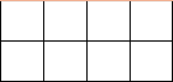
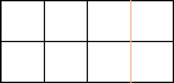
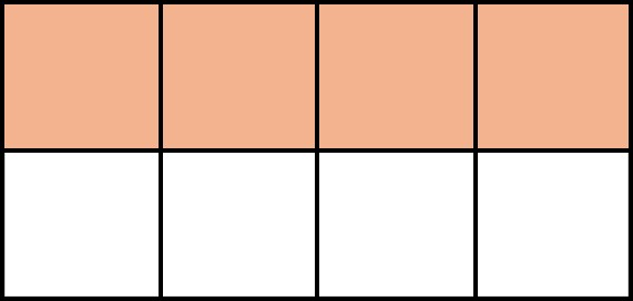
Grid Track – A grid track spans the entire width of a single row, or the entire height of a single column. A grid track cannot expand over multiple rows or multiple columns.
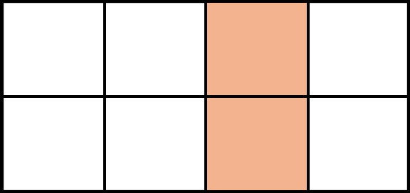
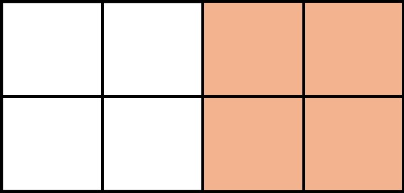
Grid Cell – A grid cell is the single space where a single row and a single column intersect.
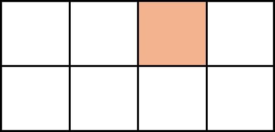
Grid Area – A grid area is the space where many rows and many columns intersect. It is made up of several grid cells.
Grid Units
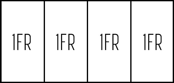
Fr – Grid accepts standard units like px, percents, em, and rem. But, it also accepts the new unit of fr, fractional units. Fr is a fraction of the available space.
grid-column-templates: 1fr 1fr 1fr 1fr;
This code would produce the following width columns:
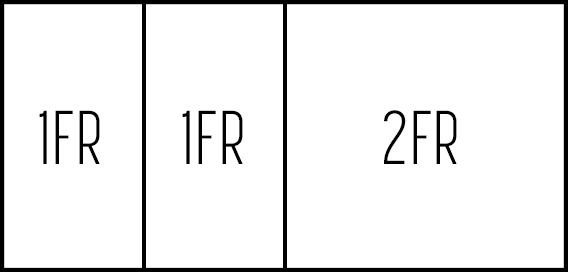
grid-column-templates: 1fr 1fr 2fr;
For a deeper dive into to fr, check out Medium’s article, What You Didn’t Know About The CSS Fractional Unit.
While I’ve covered some of the simpler concepts of Grid, CSS-Tricks Complete Guide to Grid gives a thorough overview of the many properties available for Grid. This served as my guide when I was coding examples for the article.
Grid Examples
To showcase the power of Grid, I took a CSS Zen Garden approach to my examples. Much like CSS Zen Garden, the examples use the same HTML structure only relying on CSS, especially Grid, to create two distinctly different layouts.
HTML Structure:
<body>
   <main>
       <img src="logo.png" id="logo">
       <nav>
           <ul>
               <li><a href="#">Judith Light</a></li>
               <li><a href="#">'SUV'-ed</a></li>
               <li><a href="#">Soulstice</a></li>
               <li><a href="#">BB&B</a></li>
               <li><a href="#">Cha-Chinga</a></li>
               <li><a href="#">Kirk Steele</a></li>
           </ul>
       </nav>
       <article>
           <h1>Yaaaaas Kweeen</h1>
           <p>You could have this Staples gift card that has one hundred and thirty-five dollars on it. I know: it’s Staples, what can you even buy there? Only any electronic device you could ever want.  Any type of paper -- your basic printer, card stock, construction, Post-it. Even like big things -- trash cans, rolly desk chairs, lamps--</p>
       </article>
       <img src="tori-alex.png" id="tori-alex">
   </main>
</body>
Example 1
See the Pen CSS Grid – Example 1
Example 2
See the Pen CSS Grid – Example 2
While CSS has always had great transformative power, Grid has increased the ease in which we are able to execute these layouts. Before Grid, it would have been necessary to include additional HTML or use less than favorable CSS solutions like position: absolute. Instead, we can retain the structure and produce two completely different layouts.
Cross Browser Support
So, what about browser compatibility? At the time of writing this article, CSS Grid is supported by most browsers, with the exception of Internet Explorer 11, which has partial support. To keep up with the latest on browser support for Grid, visit caniuse.com.
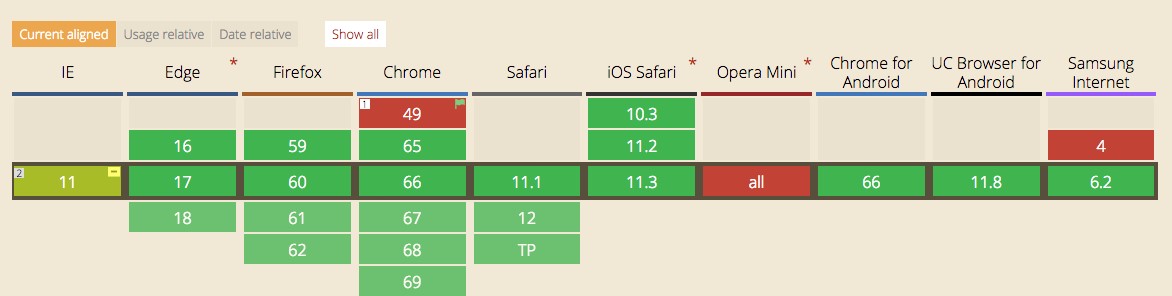
If you’re required to support IE11, this is where feature queries come to the rescue. Just like you can use media queries, @media, to adjust layouts based on screen size, you can also target browsers that support the newest CSS properties with feature queries, @support. Even without full browser support for feature queries, you can put the newest CSS properties within the feature query. Outside of the feature query you can have CSS properties that all browsers support. This CSS will act as the fallback.
Conclusion
CSS hasn’t previously provided a proper solution to construct layouts. For years, layouts used solutions that involved hacks that required us to tiptoe around their odd quirks. But, we can finally celebrate that this is no longer our reality. With Grid, we have CSS properties that were built with layouts in mind. The ability to create two-dimensional layouts will allow us to push the limits of web design. Designs once limited to print can finally make their way to the web. Once Grid is widely adopted on the web, we can expect to see a major design boom!