
CSS Grid provides a new way to create layouts on the web. It is an unrestricting layout tool available in the browser. With Grid, you’re able to create layouts that weren’t previously possible, which means a lot for the design and branding side of web design.
While I’ll focus on the benefits CSS Grid has on design, my colleague, one of our web developers here at Zion & Zion, covers how CSS Grid impacts the development world in her article, CSS Grid: The Future of Web Development.
History of Web Design Layout (Here’s Where I Date Myself)
Before I jump in and start praising all the potential benefits of CSS Grid from a design perspective, let’s go back a few years to really understand how freeing this tool is, and what it means for design.
Let’s first start way back in the 80’s—so retro! Way back then, there really wasn’t web design. Instead, there were blocks of green text with a blinking cursor. You could add more green text on a black background, create “commands” in that lovely green text, and perhaps send someone an email. But, there really wasn’t much to it.

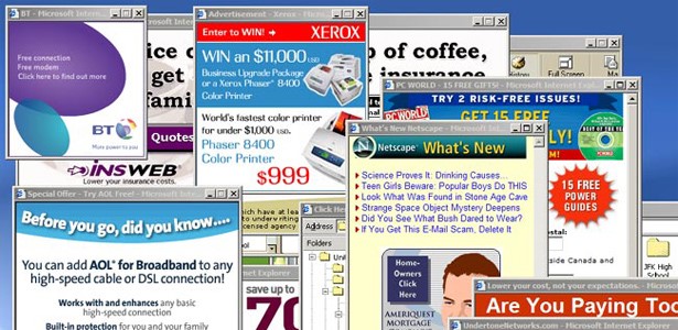
Then, in the 90’s, we got tables. Tables has a lot of benefits over the green text on a black screen era of web design. At the time, we could at least create graphics and finally use photos. (The Space Jam website is actually still hosted in all of its 90’s web design glory here.)
There were two big web browsers, Netscape and Internet Explorer, each creating their own benefits to try to get people to use their browser over the competition. But, this meant that if your site looked great in one browser, it likely looked horrible in the other. Obviously, Internet Explorer won that war. But, they haven’t exactly been winning since.
It wasn’t the easiest time to be a web designer. This was the wild west of web design. Then, there were no rules and no standards. We wanted them, but who was going to make them?
We did eventually get JavaScript, yay! But, that meant that we also inevitably got popups, boo.
Then, Adobe Flash became popular in the late 90’s/early 2000’s. So, when I was in college, I made several fancy Flash websites. Designers really loved Flash because it gave us the ability to design visuals the way we wanted them to look, put them where we wanted them to go, and create slick animations. But, those were the days where one size screen pretty much fit all. UX/UI design was not around at the time and neither was responsive design. In fact, if you were a web designer in the early 2000’s, you were inherently also a UX designer.
Flash started to decline once Apple decided not to support it on iPhones. Flash sites were too big for phone downloads and weren’t responsive (hey, couldn’t we have figured that out with Action Scripting?). So, designers got our cool toy taken away, and we had to go back to the days of being restricted because of code. At least we had CSS.
CSS was technically invented in the 90’s. It wasn’t widely used, like Flash, until a little later. I was still designing websites with tables in 2002.
There were a few years we struggled as web designers to build sites for different sized screens and phones, and it was a little messy, but then responsive web design in 2010 came along and saved the day. That’s pretty much how we’ve been designing for the last six-eight years, depending on how long it took you to get on board.
Unfortunately, though, this style of designing, combined with the strict rules of user experience design, has created a very templated look for so many websites. This is not ideal for a brand who is trying to set themselves apart from their competition, which I will get to in just a moment.
Finally Today, CSS GRID AND FREEDOM!
CSS Grid allows designers to get out of the box, literally. It allows designs to be whatever they need to be. For creative designers, what we need to know is that if we want a website that is designed like a poster without restrictions, IT CAN NOW BE DONE! And, it can be responsive. We also now have better ways to animate elements on webpages and can use video. It’s (almost) everything we’ve ever dreamed of, short of having a simple WISYSIG that doesn’t require background in coding.
CSS Grid And Why It’s Important For Branding
CSS Grid gives you the freedom to create more creative layouts. This allows a brand to express themselves appropriately by using color, typography, photography style, AND layout! This is huge, because as of now, web design has been missing a big piece of the brand storytelling pie. Now, of course, this is not to say we throw out all UX principles. But, we do need to consider that being able to visually tell a brand’s story through their website is also as important as navigating that website.
We all know color, typography, and photo styles are the core of communicating the right tone for a design. Choosing one color, font, or photo vs. another, can send a very different message to a viewer than was intended. The same goes for layout design.
Layout design plays an equally important role in design 101 principles. Symmetry, asymmetry, harmony, and tension are design principles that help draw people to your content, guide them, and help them understand it more easily. We’ve also been trained for years that in web design symmetric and orderly designs are better, and yes, that is likely true with many designs, but asymmetry also has the ability to capture a brands personality if that is the goal, so now if we need to, CSS Grids gives us that opportunity.
Again, I’m not suggesting throwing the baby out with the bathwater. Of course, we need UX and research so we can make educated decisions. But, we also now have the ability to design a website that makes the most visual sense for a brand by using all our design principles, creating a fuller experience, and weighing that with all the important elements UX and research bring to a web design project.