As interactive designers, it’s crucial to consider new ways in which we pursue website design. Diving deep into our digital design, it’s important to keep in mind not only the brand and site concept, but also the experience the website offers to its users. It can be easy to only focus on creating a “pretty” site, however, in our industry, it’s crucial to use visual design to enhance functionality and usability, while strengthening the client’s brand.
This article will walk designers through some key factors in creating a better user experience for websites, without compromising the quality and look of their final design.
Usability and Originality
When beginning a new website project, I gather inspiration from various sources, such as websites, emails, print materials, etc., to build an inspiration portfolio. An inspiration portfolio is specifically tailored to each client’s brand, voice, and uniqueness. This portfolio helps give direction to your designs by sparking new ideas and styles that align with your client’s brand. If you’re looking for new and innovative site inspiration, check out Awwwards.
At this time, it’s also helpful to consciously decipher a usability index. An index of this sort consists of web interactions that complement your client’s site. This could consist of parallax options, sticky navigations, certain scroll effects, as well as micro animations. Your usability index is just another resource for you to use when it comes time to design your website.
Also consider:
- Who the site is for
- How or why it will be used
- What will make it function more efficiently
- How to properly portray the necessary information
To find success in these answers, you’ll need to test different scenarios to enhance your design options. When doing so, remember to always recruit users that meet your target demographic, and make sure you’re running fair and successful user tests by following these steps. Your design should be original and inspiring, but also provide a flawless experience for users, and the best way to create something like this to test.
Mobile First
Because more and more users are viewing websites through their smart phones instead of a typical desktop set up, it can be a step backwards for us to be creating ‘desktop first.’
Some design feature guidelines for mobile that provide better website usability include:
- Less visual clutter
- Large elements
- Already mobile optimized
- Optimized navigation based on users’ needs
- Minimalist or essentialist design
- An app-like experience
- Easy access to contact information
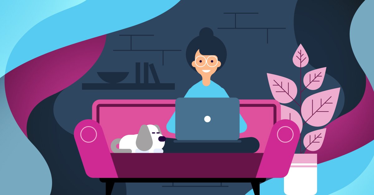
Designing for mobile first helps narrow down content to just the most pertinent information, leaving less room for confusion. This provides more negative space, giving users a chance to take a mental break between images or content. In addition, large text helps with readability, large imagery helps create drama and intrigue, and large forms are easier to fill out.
When these guidelines in interactive design are implemented, a better user experience is generated, and design is enhanced.
Gestalt Psychology
Gestalt psychology proposes a unique perspective on human perception. The premise of this theory is stated as, “Beauty alters how we think and behave” proving that a well-designed site is crucial to catch users’ interest. Kevin Rhodes, designer at Illumina, gives his two-cents on this topic, stating, “Gestalt psychology offers one explanation for this: people perceive the entirety of a thing before they see their individual parts.”
Meaning that before users can understand content and nail down the details of your website’s functionality, they already have an opinion created from the aesthetics of the website. If the page is stunning, it will have a positive effect on users, producing a good overall user experience.
Fitts’ Law
Another piece of psychology to remember is Fitts’ Law. Fitts’ Law is a theory based on how human mechanics relate to aimed movement. The theory states that the size of a target along with its distance from the subject allows one to calculate the ease in which a person could perform the intended action.
Basically, when it comes to human-computer interaction, how big and close an object is to us, the easier it is for us to move towards it. Spotify’s mobile site is an incredible example of how to properly execute Fitts’ law.
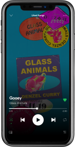
The “play” button is much easier to click than the others because it is larger and placed in an easy-to-tap location.
Adapting Designs from Mobile to Desktop
Using the premise of Gestalt psychology and Fitts’ law, with what techniques and elements does design beauty take affect? And how can you transfer these elements from mobile first in order to implement a user-friendly desktop experience?
For designers, there are several design styles that complement this new mobile first application while also bettering the desktop design, including:
- Large imagery and headlines
- Typography
- Conservative elements
- Maximizing negative space
- Limited color palettes
- Flat imagery, icons, patterns, and textures
- Grid layouts
- Content placement
- 3D Graphics and animation
Large Imagery
Right now, large background images and large headlines are trending and have positive user results. Large visuals can include: hero images, full-screen images, headlines as an image, and art as a graphic.
Reasons for this include the enticing factor of large images and their ability to persuade viewers.
When using large images for aesthetics or product sales, the following are good rules of thumb:
- Must serve a real purpose pertaining to the site’s information
- Must not be distracting to viewers
- Any overlaid text must be legible
- Understand the image file sizes and how site performance is affected
Typography
Better use of typography is always a plus. Larger than normal type can be a good way to persuade and entice viewers, while ensuring users of all ages can easily read your website’s copy. Additionally, interesting type can help better engage audiences, develop more diverse hierarchy of content and fill negative space created from fewer elements.
Conservative Elements
Organizing and structuring your content strategically, such as eliminating extra menu options and miscellaneous text, helps conserve elements on your site and gives your users a better experience. For example, when a user comes to your site, they’re quickly looking for answers to their question(s). Ensuring that there are no distractions positively impacts their experience and allows them to find the answers they’re looking for.
However, when consolidating and conserving elements, be careful not to hide critical items from users such as links, forms, or important navigational items.
Maximizing Negative Space
Negative space is a great style addition that can positively impact your website. Whether on mobile or desktop, creating areas with negative space allows users to rest their eyes, retain information, and bring hierarchy to the information presented. But when implementing this design, be aware. Too much negative space could leave users confused and lost when trying to find important information.
Limited Color Palettes
Limited color palettes are another style that tests well with users. When implementing this design style, make sure to think about where and why you’re using certain colors. For example, accent colors should be used intentionally and consistently to highlight important information or CTA’s (call-to-actions).
Currently, grey tones are popular amongst monochromatic sites. However, when designing, try not to be ‘too trendy’ as the nature of a trend carries the potential to fade over time and become obsolete. Rather, use current trends only after you’ve tested it for yourself and know that it’ll work with your brand’s voice, target audience, and positioning.
Flat Imagery, Icons, Patterns, and Textures
Flat imagery, icons, patterns, and textures are great styles to use with mobile first design because they’re minimal and precise. However, with flat design, hierarchy can be lost in translation. So, when using flat design, make sure to let the users know what information is critical, what is clickable, and what is not. With the correct use of icons, users can comprehend content and concepts more efficiently and effectively. It’s also important to note that while icons may appear to be more minimal than a traditional label, often times icons alone are not well enough known by users. Consider pairing icons with the label to improve the user experience.
Grid Layouts
Grid systems are mathematically based containers that help assign content into more structured layouts for better readability and viewability. Grid layouts in modern web design are continually improving, showcasing multiple items such as articles, images, and objects for ecommerce. When implemented successfully, these layouts are very helpful for user comprehension. They’re also great when designing responsive sites, as they collapse for mobile with ease.
Content Placement
Users may react positively or negatively to content, depending on its placement within a website. This can greatly impact how users interact with your site as well as their overall impression on the company. When placing content on your site, I recommend the following:
- Keep the menu in a consistent and familiar area – i.e. towards the top
- Use hidden menus sparingly as they have potential to hinder a user’s experience
- Make the menu obvious and easy to find
- Repeat important, or priority, content
When discussing content placement, The Huffington Post shares, “Repeat what works. If you’ve written great copy that keeps visitors coming back for more, repurpose it elsewhere online. Don’t simply duplicate it, however, because search engines take note of that. Rework the material and add a new viewpoint, update the information, or increase the details.”
Essentialism
Some of these elements remind me of the idea of essentialism, rather than the minimalist theories of current web design. The idea behind essentialist designing is to make the most important information the most readable and accessible—the way Greg McKeown, writer, would describe it. McKeown refers to essentialism as the “Disciplined pursuit of less but better.” This is how I approach all my designs; making sure they serve a purpose and provide the user with understanding.
3D Graphics and Animation
With today’s browsers being faster and more powerful than ever, we’re able to do so much more with motion design and graphics. Incorporating 3D animations instead of static images can make your webpages and app screens more dynamic and engaging. Motion design breathes life into the digital interface through animation and visual effects. There are so many different options available to incorporate movement and motion into your webpages like loader animations, micro-animations, bouncing logos/icons, full-sized animated background images, and more.
Now It’s Your Turn
These tips or suggested elements are in place to help enhance our designs, based on ample research, years of experience, and endless user testing.
When creating a new website, be sure to keep in mind the mobile first tips listed above. In conjunction with tests and research, these design tips will help create a clear, easily understood, and well-functioning website, while ensuring a great aesthetic.