
When designing a website, it’s easy to get caught up in the latest design trends and make decisions solely based on what you think looks the best. Odds are, if you take this approach without making your user the priority, this can lead to a bad user experience and an overall negative impact for your site and potentially even your brand.
Surely, everyone has experienced this. You land on a website that at first glance looks beautiful and modern. However, once you go to perform a task or find a piece of information, you quickly learn that the user experience, or UX, was not considered. This can manifest in the form of a confusing navigation, slow page loads, or overall poor functionality.
So how can you avoid these common design mistakes?
A plethora of studies have been conducted on Human-Computer Interaction (HCI), which focuses on the interaction between users and computers. By studying this topic, we identify several best practices to apply when designing a website. Being able to identify limitations of your users before you begin working on your layout is essential to the success of your site, creating a friendlier interface and an overall enjoyable experience for your target audience.
Minimize Memory Load
Minimizing memory load, or the amount of memory users must use to read and understand the information you are presenting on your site, can be accomplished in multiple ways. Specific ways that we will discuss include:
- Using only relevant content
- Reducing cognitive load
- Utilizing user recognition
- Keeping all the information in one place
Useful Content Only
It’s vital that you intentionally and thoughtfully cherry-pick the most important content to include on your website, so you don’t overload your audience. The amount of information considered to be “useful” varies based on your industry, your users, and the goals of your website. For example, Wikipedia is going to be very content heavy compared to a retail site like Tesla due to the differing user intentions. In general, the amount of content on your website should vary based on relevance, this will reduce the amount of effort required from your users.
Cognitive Load
Cognitive load is defined by the Nielsen Norman Group as “the amount of mental resources that is required to operate the system.” Studies have shown that the higher the cognitive load, the more stress an individual experiences, and the less likely they are to finish a task at hand.
The attention of your audience is always fleeting, so you should use it as efficiently as possible by following a few key suggestions:
- Avoid anything you would consider clutter, such as meaningless imagery, distracting design elements, and overuse of bright colors.
- Make it easy for users to pay attention to key information. This can be accomplished through the use of color, size, and position of content.
- Build off your user’s existing mental models. They already know how websites work and their eyes are trained to look for items in specific areas.
- Don’t try to reinvent the wheel, unless you have good reasoning and research to prove the benefits are worth the additional frustration.
- If something can be displayed visually, do it. Users process information displayed in an infographic a lot faster than reading through a paragraph of text.
Recognition vs. Recall
Another heavily researched topic in UX design is recognition vs. recall. Recognition involves the user being able to recognize something after seeing a visual cue. Whereas recall relies on the user’s memory in order to proceed with the task, such as a login screen. Promoting recognition in your interface helps the user accomplish their task faster. So, it’s important to make any important object, action, or information immediately visible and easily retrievable.
Keep Information in One Place
Lastly, keep all useful information on the page. Don’t force the user to remember what was on the previous page in order to continue with their task. Most likely, the user is already taking in a lot of new information, so the more aids you can offer them, the better experience they’re going to have.
The best example for keeping all your information in one place is form fields. For a long time, sites would default to a form field with the label inside of the field. As soon as the user started to type within a field, the label would disappear to make room for their entry. This can be extremely frustrating especially if it’s a long form because users can easily forget what they just clicked into. They would then need to click back out of the field and delete any information they’ve already typed in, in order to confirm what piece of information they should be entering.
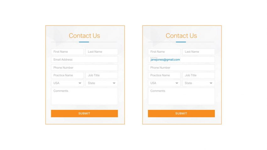
Above is an example of a great solution to this problem. One the left, you can see an empty form with prompts for field information. On the right, after the user, Jane Jones, enters her email address, the label shifts to above her entry. This keeps both parties happy and provides the best user experience.
Organization Is Key
Depending on how your company is organized, you may be responsible for setting up your own wireframe and determining how information is organized. At Zion & Zion, we have a team of UX experts who focus on figuring out the best wireframe layout for each client. Each site we produce is backed by strategy and hours of research. Luckily, by the time it comes to the design team, we have that part of the project already figured out. Our challenge then as visual designers is to organize all the information, making it easily scannable for anyone to find what they’re looking for as quickly as possible.
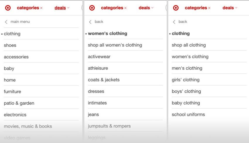
The Hick-Hyman Law, which has been studied in HCI, highlights the importance of reducing the number of choices available to a user at one time. It suggests that as the number of possible choices increase, so does the time required to make a selection.
A common occurrence of this is when you have an extensive list of navigational items and need to decide if it’s more beneficial to list your items alphabetically or categorically. As you can see in the example, Target’s navigation breaks their items down by category. This takes the user through several steps before sending them to the correct page.
This form of organization can also relate to the information on an individual page. Grouping information that relates to each other speeds up search time. You want to avoid grouping unrelated items just because you’re having a hard time fitting it in with something else. Consider a different method for displaying the information on its own. For more on the best ways to organize your site’s information, check out this article all about applying conventions and standards of information architecture.
In a lot of modern, full-width web layouts, it has become common to break up information with blocks of color or white space; this is a gentle way of informing the user that they’re viewing a different section without overwhelming them while they are scrolling down the page. Typography hierarchy also plays an important role; the user should be able to easily recognize headers and quickly scan the page for the information they’re looking for.
Don’t Make People Work Too Hard
You’ve probably already figured out that the theme of this post is how to make things easier for your user. Something that we all know is that people don’t like change. This is why skeuomorphic design is a good technique when developing something new. Skeuomorphic design is a design style used for items to resemble their real-world counterparts.
When Apple first released their iPhone apps, they used this design style liberally. For example, the calculator app, books app, even the contact book app all utilized skeuomorphism. Skeuomorphism is a familiar approach that allows users to instantaneously understand the purpose of an app. Familiarity increases confidence. However, because of the popularity of flat design, I haven’t seen this style being used as frequently, but it certainly shouldn’t be ruled out as a solution if your users are struggling in a specific area of your site.
Progressive disclosure, which presents minimal information for the task the user is currently on, is helpful to first-time users on an information-rich site. Progressive disclosure allows you to initially introduce only the basic information, introducing a more expansive set of instructions upon request. It also allows you to control where the user is going to be directed first. If a specific area is being called out it’s going to tell the user that this is important information that should be viewed first. This is extremely valuable tool for complex site, as it will minimize errors and confusion.
Keep It Snappy, Avoid Interruptions
Your user’s time is valuable. If they think a page is taking too long to load or isn’t going to load, that will negatively impact their overall experience. Below we will discuss tips on how to decrease the load time on your site and the benefits of progress indicators when you know a page is going to take a little longer to show results.
Decrease Load Time
By this point, everyone is aware that the longer your website takes to load, the more annoyed your user is going to be. Unfortunately (and fortunately), through the evolution of technology, we are now trained to expect immediate feedback from our actions. If we don’t receive it, we start to become frustrated. There have been times when I simply decided it wasn’t worth waiting for the page to load and left the site I was on to go check out a competitor’s site.
This is why it’s so important to make sure all your images are saved out at the lowest file size that still maintains good quality. Large images can increase page load time tremendously, which can increase your users’ frustration, and ultimately decrease conversion. If you’re in a situation where you can’t avoid the long load time, there is hope. Progress indicators are a great solution that makes waiting more tolerable. Users feel less stressed out and reassured that you are working on getting them the information they requested.
Saving out files at the appropriate size is important for loading time as well, i.e. not larger than they have to be. There are also great tools online to compress images without losing quality such as tinyjpg.com.
Modals
The last item of discussion is understanding the best way to present modal windows on a website. Pop-ups that obscure content are annoying and often interrupt users in the middle of their task. A dialog box that covers the page a user is on should only be used after the user has clicked on something.
You should always have a clear way for the user to close out of the window; the most common practice is a large X in the top right corner of the window. Although modal windows can be used effectively for a user to view information quickly, the least obstructing way to display information is off to the side so it doesn’t block whatever they’re currently viewing.
Next Steps
In the end, the more thinking and problem solving you do on behalf of your users, the more enjoyable their experience will be. Understand that no two users are the same. Everyone comes from different backgrounds, and because of this, their experiences may vary as well. The best action you can take is to conduct user testing to make sure you’re not missing key elements that might limit the experience for your users.