In today’s society, icons surround our daily lives. They’re essential in our fast paced culture. We use icons for aid comprehension and information retention, to unify communication, to provide warnings, and to reduce miscommunication. As designers, we also use them to save space and to simplify complex concepts.
The Importance of icons
Icons mirror the idea of essentialism, /written about by Ben Cleaver and Marcus Hewitt. The concept behind this is today there’s a driven pursuit for “less, but better.” Icons are a great example of less being better; and in the design world, this is critical. Icons are used not only for handicap parking signs and toxic warning labels— they’re also used in web menus, app tools, as well as advancing learning and user interface platforms. Icons can be used to visually communicate directions, ideas, and objects. Icons encompass important and enduring symbols.
/William Horton writes, “Designing symbols one at a time can waste your time and lead to sprawling, inconsistent sets of icons. On the other hand, designing a coordinated set of icons: Reduces the effort required to design, draw, test, and revise the icons. Ensures and enforces fundamental consistency. Makes icons self-explanatory and deducible and helps users learn more quickly.” Creating a cohesive icon set may help create standards and invoke better user interaction. Great icon sets are simple, clear, accurate and consistent.


What to Consider Before Creating an Icon Set
How do designers create a great icon set? There are a multitude of factors involved when it comes to generating an ideal icon set. /Sean Hodge describes a few key concepts to consider when beginning to create an icon set design below.
1. Approach icon design holistically
Icons are aesthetically pleasing on their own, but need to work within a system. “Whether they are designed for desktop applications or Web sites, an icon is one of many graphic elements that need to work together harmoniously.”
2. Audience consideration
This pertains to cultural considerations, geographical, and company type and size considerations. For example, some iconic symbols for the United States might be very different from other cultures.
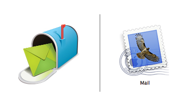
Denis Kortunov has a great example of Apple’s mail icon. He shares, “A rural mailbox would be less recognizable than a postage stamp.” The mailboxes we are used to in the United States might greatly differ from those of other countries.

3. Consistency is key
Icon sets work especially well when they’re similar in style and viewers can predict or interpret the other icons in the set easily.
Some key stylistic choices that need to be consistent throughout the set include:
- Line weight
- Width and height
- Color
- Lighting such as shadows, reflections or silhouettes
- Perspective
- Styled shapes
4. Icon Application
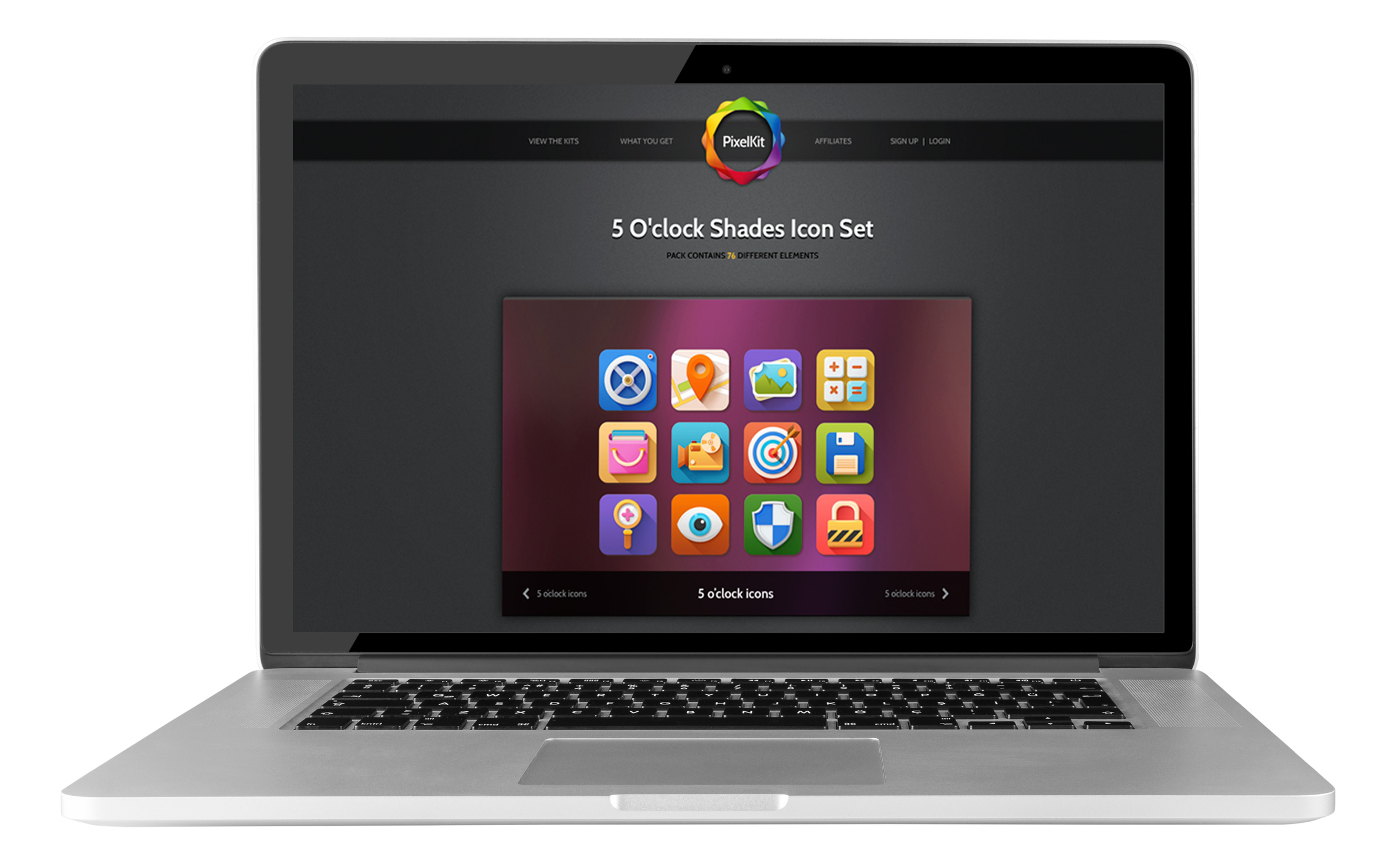
Whether the icon is used for apps, like the Mac Mailbox or for some software interface, understanding the application of the icon is important for sizing and legibility. A 20-pixel icon for a technical platform would have a different set of expectations and considerations when designing; compared to an app store icon that may contain more color and detail. Make sure the design process is adapted to the changing application circumstances.
How to Design a Great Icon Set
Once all the previous startup considerations have been addressed, you can begin the design process. The designer and/or project coordinator need agree on a list of visuals to represent the desired imagery first. From personal experience, I feel it helps to start with a large encompassing list and narrow down the focus by eliminating non-essential elements. From there, you can create and expand on great ideas.
When designing an icon set some suggested process steps include:
1. Draw it first
Drawing out rough ideas on paper before moving into illustrator to start digitally putting down ideas can help you create a great icon set. /Yegor Gilyov from Turbo Milk states, “Failing to plan how the whole set of icons will work together from the beginning will ensure a huge waste of time, as redesign will be inevitable.” This is very true. It’s important to keep an overarching idea for the set when drawing your icons.
2. User reference imagery
Search for some reference imagery if that helps your process, but remember to keep icons as simple as possible. Reference imagery can help when drawing complicated objects. After tracing the image, begin removing unnecessary details. These images can be a great starting point and use of real objects can also help creators stay grounded, which will in turn communicate the desired message more clearly.
3. Play with iterations
After your first set of ideas is laid out digitally, play around with some iterations. Two per icon is a solid number to shoot for. Iterations include various line weights, color options, spacing and negative space, reversing the icon out, and many others.
4. Keep it consistent
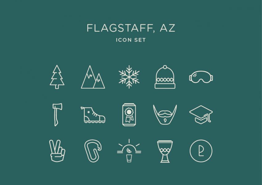
Keep in mind the key items of consistency from above. Consistent line weight and height, color, perspective, shapes, image details etc. Adam Whitcroft, an Icon Designer, uses smaller bounding boxes to keep icons within their respective specs more easily. A bounding box is similar to your art board; it is a set space for your design to lay within. I find this technique very helpful and I employed this while creating my Flagstaff Icon Set from above. For my icon set, I focused on keeping the line weight the same, and the shapes the same size. From close up or from far away, a good icon set can be recognized by the icon group consistency.
5. Narrow down your selection
After you have your different iterations, now is the time to narrow down and select the final candidates for your set. The icons considered for your final selection should fully encompass the theme chosen. They should be the icons that are most easily understood, and can be used in various applications without further iterations. Ideally these selected icons invoke a distinct style that coincides with the other chosen icons. And lastly the final chosen icons need to be visually stimulating and intriguing.
6. Know the difference between vectors and pixels
Depending on where and how your icons will be used, rather it be for real world applications such as street signs or for digital applications, it’s important to know the difference between vectors and pixels. Adam Whitcroft suggests when working with digital living icons to remake them in Photoshop in order to get them “Pixel Perfect.” This Photoshop method for digital icons will help designs set standards and provide an idea of what they will look like on appropriate scales. Vectored icons work well for scaling and real world applications. For example, the handicap icon can be printed on a rearview mirror hanger, license place, parking lot sign or spot, wall signs, and bathrooms. This icon needs to be scalable and adaptable. Vectoring this icon makes the application most efficient. Also, the real world is not confined by a grid system like our digital world is. When working on digital, our computer screen imagery is determined by pixels, set within a pixel grid. Everything we view on screen is made up of thousands of tiny pixels and for this reason, pixel perfect icons are made to be crisp, clear and able to transition between sites and programs with more efficiency.
7. Present your icon set
Now it’s time to present. Make sure you’ve removed any excess anchor points in your icons. Select a consistent color pallet, either keeping it on brand with your client or project. Make sure your icons have plenty of breathing room around one another when presenting, so viewers don’t become confused or overwhelmed. Make sure the application of this icon set has been addressed beforehand and reiterated during your presentation. And, most importantly, own your work.
8. Standards Guide Deliverable
Now that your icon set has been viewed and approved by your client, you may deliver a standards guide to your client for these icons. A standards guide will help aid and direct your client when executing and applying your icons. This guide will greatly help your client understand further how the icons will communicate the desired commands or concepts. This last piece of the project will ideally maintain the original use for your icon set, and allow the icons to function with the purpose intended.
Your Next Steps
Now that you have a basic understanding and guidance of icon set design, try it out for yourself. Start with small sets and keep adding as your skills are mastered. If you need inspiration, check out the NounProject for great icon set ideas and guidance. There will always be a need for simple, essential communication and great icon designs that’ll stand the test of time.