Google Analytics Custom Reports
While Google Analytics comes with a myriad of built in reports, sometimes you just need something different. That may be because you need a more complex report, or you need a simpler report without metrics that you don’t care about cluttering the layout. Let’s take the need for a simpler report first by creating a custom report that’s about as simple as it gets. We’ll create a report that has a single dimension and a single metric, since all reports must have at least one dimension and one metric. We’ll create a custom report that shows the metric Users segmented by the dimension Default Channel Grouping. This will wind up giving us a custom report that shows how many Users have come from each Channel. For example, how many users have come from Organic Search; how many users have come from Social; etc.
Create a Simple Custom Report
-
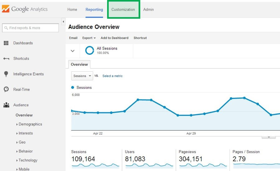
- We start by clicking the Customization button at the top of our window.
-
- We then click the button for a New Custom Report.

-
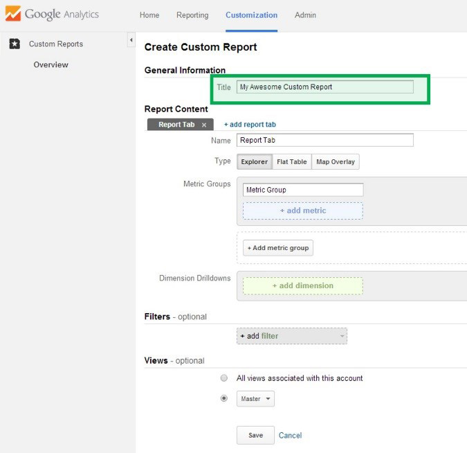
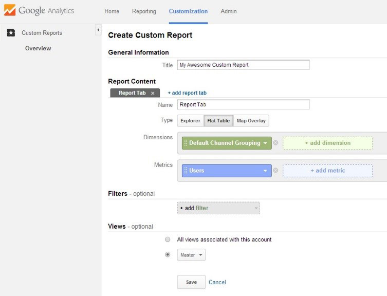
- We then give our report a name.
-
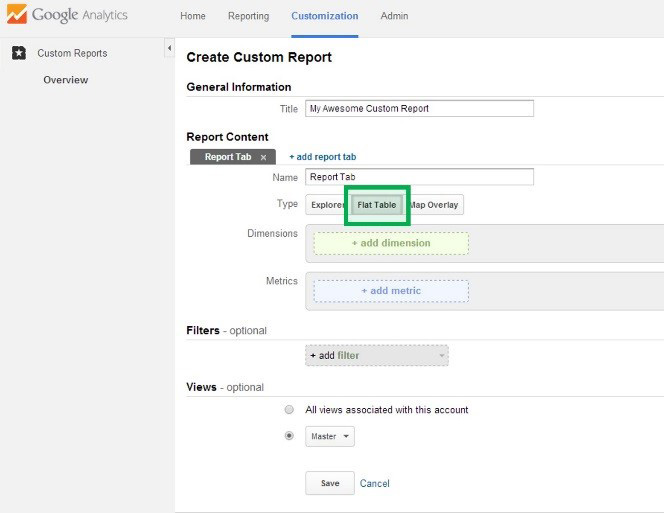
- We then select the type of table we want. We’ll select Flat Table, and talk more about Explorer and Map Overlay tables later on in other posts.
-
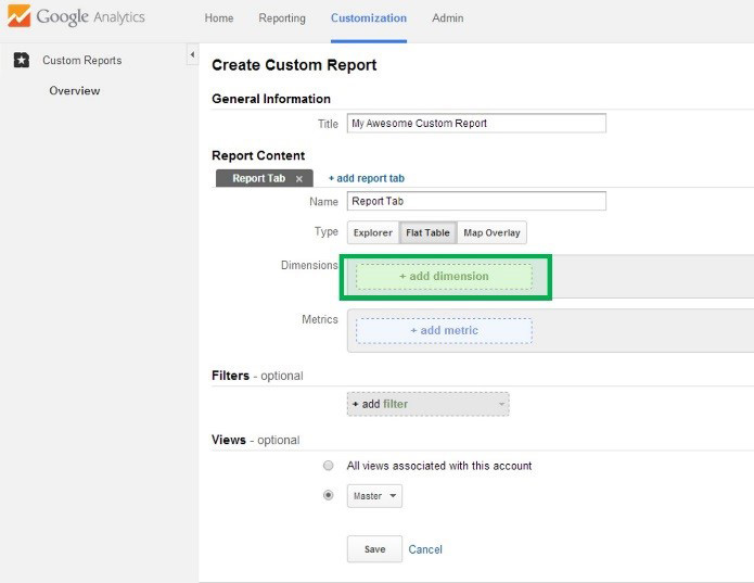
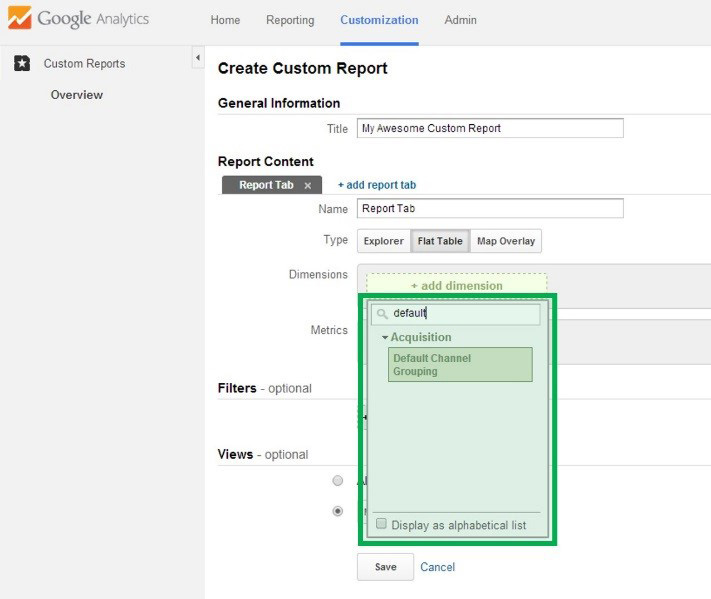
- We will then choose our dimension. Click on the + add dimension button.
-
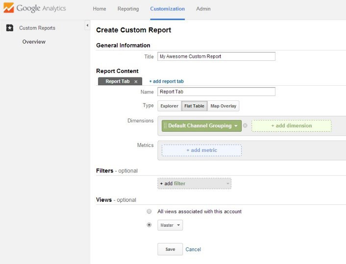
- And since we decided above to use the dimension Default Channel Grouping for this report, start typing in the word “default.” You’ll see the choice appear as follows. Select it.
-
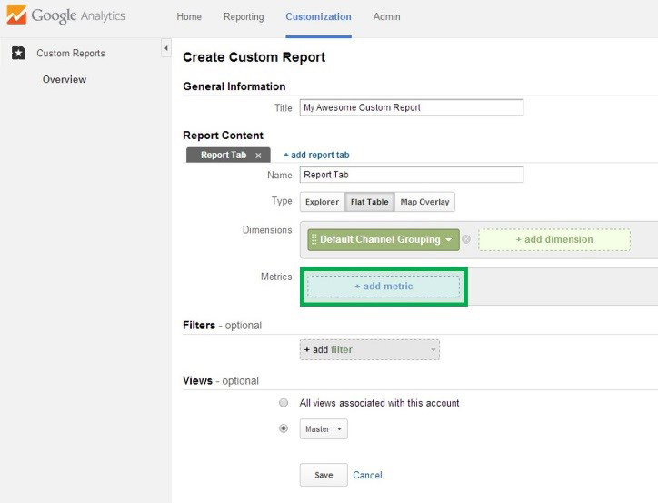
- We will then choose our metric. Click on the + add metric button.
-
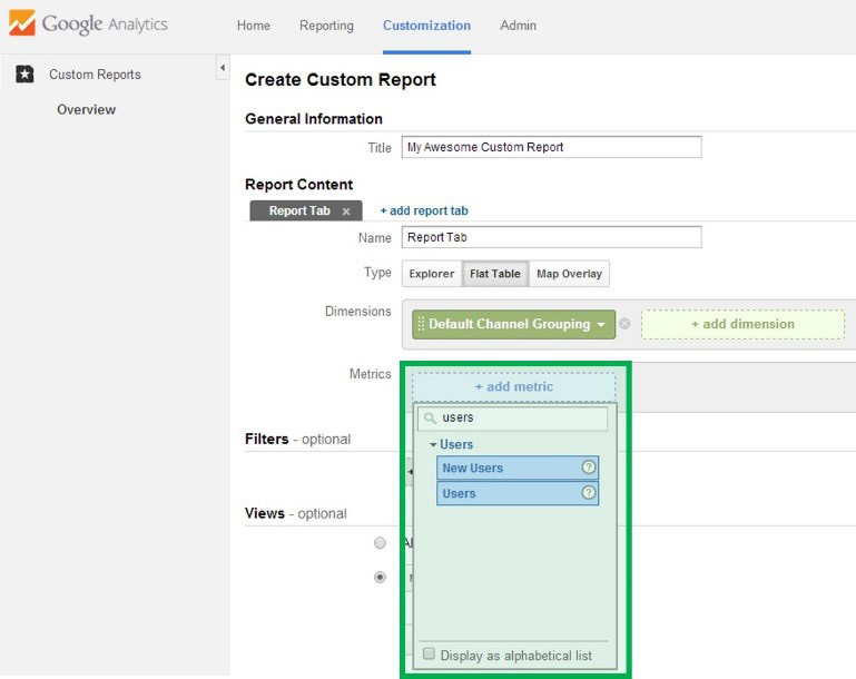
- And since we decided above to use the metric Users for this report, start typing in the word “users.” You’ll see two choices appear as follows. That’s because there are two metrics available that contain the term “users.” Select the Users choice.
-
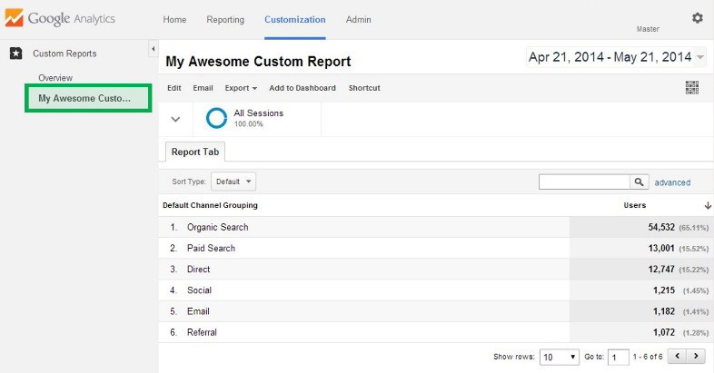
- At this point, you can simply click Save at the bottom, and your report will be run, and it will also be available for your future use under the list of Custom Reports on the left (see screenshot). All you need to do is return to the Customization button at the top at any time to view your list of Custom Reports on the left.
Editing Custom Reports
-
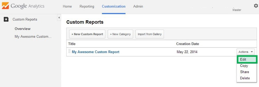
- You have probably already noticed that it would have been easy to add other metrics to this report. Let’s go ahead and do that now. First, we need to edit our custom report. There are two ways to do this.
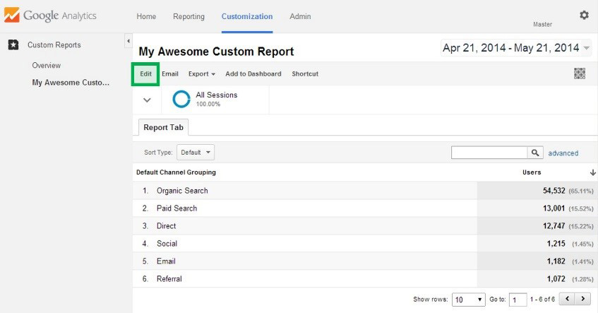
- You can click the Edit button because you are currently already in the custom report you want.
- You have probably already noticed that it would have been easy to add other metrics to this report. Let’s go ahead and do that now. First, we need to edit our custom report. There are two ways to do this.
-
-
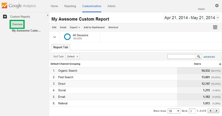
- Or you can go to the Overview section of Custom Reports.
-
-
- And, under Actions, select Edit.
-
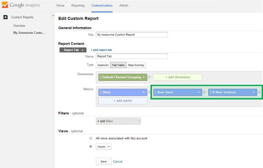
- Now you can click the + add metric button again and add other metrics. Here, we’ve added New Users and % New Sessions.
-
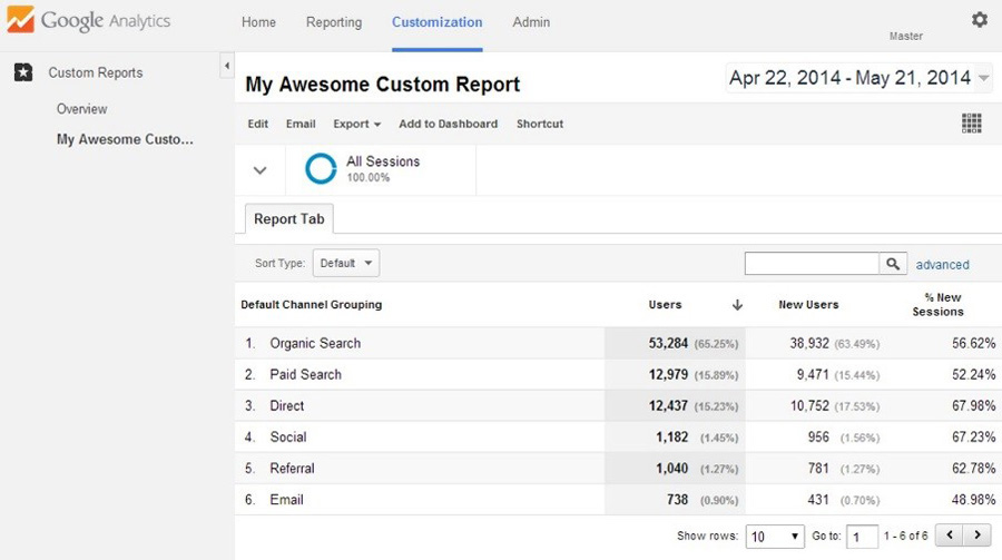
- And, as before, click Save. You’ll see something similar to the following.
-
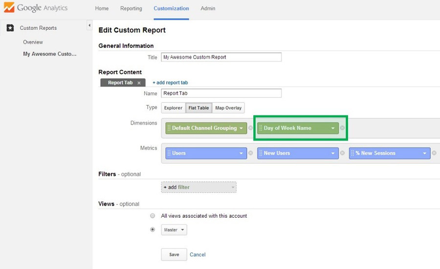
- Now that you’ve seen how to add additional metrics to a custom report and what custom reports with additional metrics look like, let’s go back and add a second dimension to our custom report. As before, you can either click the Edit button or you can go to Overview and click Edit under Actions to get to where you can add another Dimension to your custom report. In this case, let’s add Day of Week Name.
-
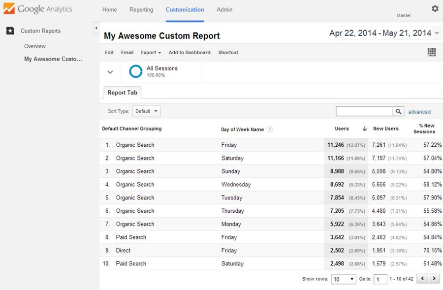
- Once you’ve clicked Save, you’ll see something similar to the following. By default, the report is sorted by the first metric column—in this case, that’s Users.
-
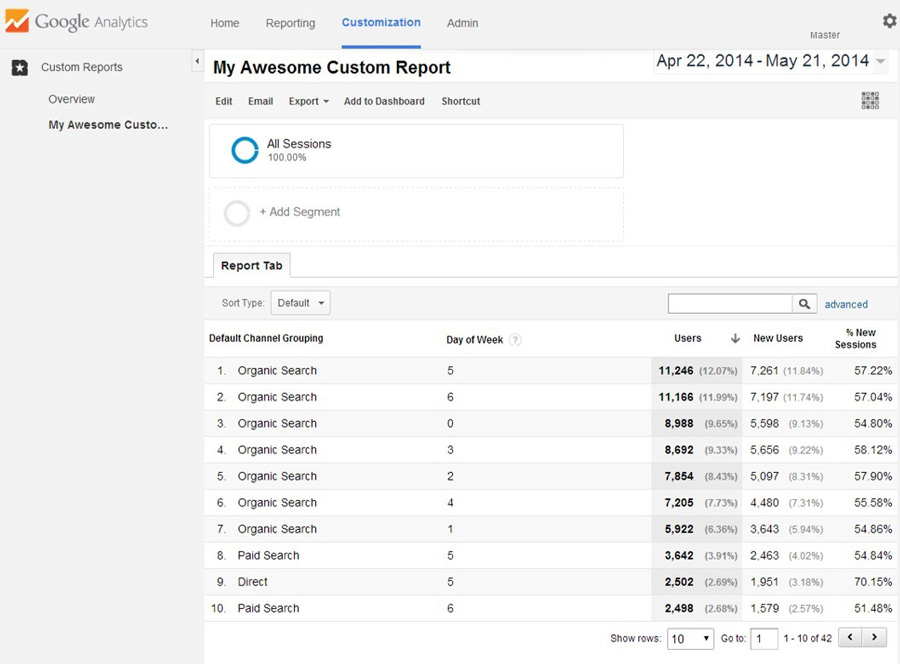
- Note that while there are only 10 rows shown in our screenshot here, if you look at the bottom right of the screenshot, you’ll see that there are actually 42 rows of data. You can of course change the “Show rows” number to see all of the data at one time.It would be natural to say to yourself at this point, that this is really annoying to look at, because even if you sort by Default Channel Group, the Day of Week Name column is not in order, which makes it really hard to look at the data. So here’s a solution to that. Edit your report as we’ve shown you how to do earlier in this post, and change the metric from Day of Week Name to Day of Week. Yes, they are different. The difference is that Day of Week is a number from 0 to 6, where 0 represents Sunday. Once you’ve edited your report, and saved it, you’ll get output similar to this.
-
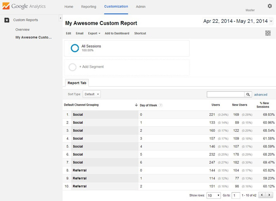
- Now click the header in the Default Channel Grouping column, and you’ll get something like this, where the data has been sorted first by the Default Channel Grouping column, and second by the Day of Week column.
-
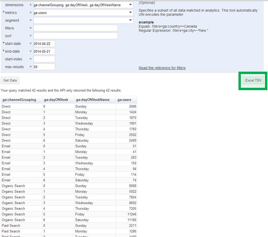
- Much better, right? But, you may now ask yourself, how can I see the Day of Week Name, but also sort by the Day of Week number? You might think that you can just add a third dimension, but with this type of report, you can’t. Try it. Go ahead and attempt to edit your report, and you’ll see that you are not allowed to add a third dimension. So, what are the options? If you download your existing report, using the Export menu at the top of the page, some Microsoft Excel magic would certainly let you use a formula to convert the Day of Week number to a Day of Week Name. But there are a couple of other alternatives. First, you can use the /Google Analytics Query Explorer. Make sure you login under the Google Account that has access to the analytics account whose data you wish to access. Play with the drop downs in the tool for a couple of minutes, and you’ll get a sense of what the tool does. Once you select the Account, Property and View you want to work with, then put the following in the dimensions box:
ga:channelGrouping, ga:dayOfWeek, ga:dayOfWeekName
Put the following in the metrics box: ga:users
-
- Set the data range, and click Get Data. And lo and behold, you have a report with more than two dimensions, which is sorted first by Default Channel Grouping, second by Day of Week (number), third by Day of Week Name. You’ll also notice that you can export the report to Excel.
-
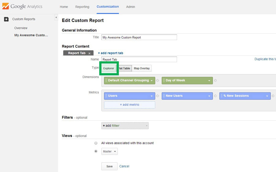
- The query explorer is excellent for generating multidimensional reports. However there is also another way to generate “explorable” multidimensional reports within Google Analytics itself. It is called an Explorer Table.To generate an Explorer Table, go back and Edit your existing report, and click the Explorer button.
-
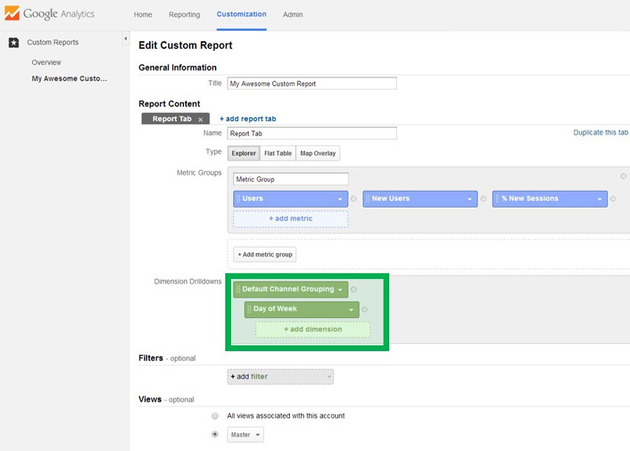
- Once you have clicked the Explorer button, your report will then change to look like this. Notice that the dimensions are still there, but they are now in an area called Dimension Drilldowns, as opposed to just Dimensions.
-
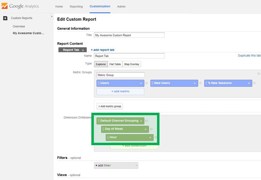
- If you’re sharp, and I know you are, you’re probably thinking to yourself… “ah, I can ‘drilldown’ into each dimension,” and you know what, you’d be right. Now, let’s have some real fun. Click to add another dimension under Day of Week. Let’s add Hour.
-
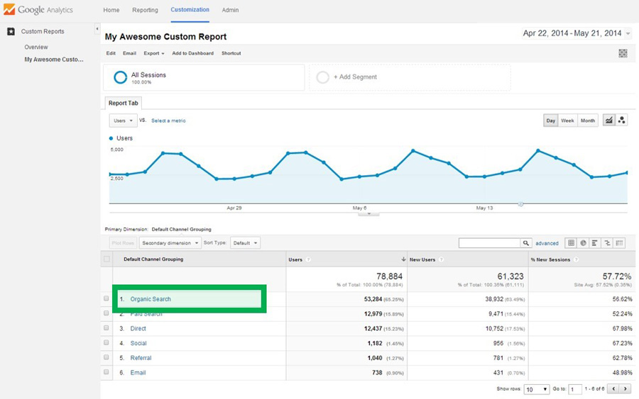
- And when we run the report, we see this. Go ahead and click on Organic Search (or some other row if for some reason you don’t have an Organic Search row in your own report).
-
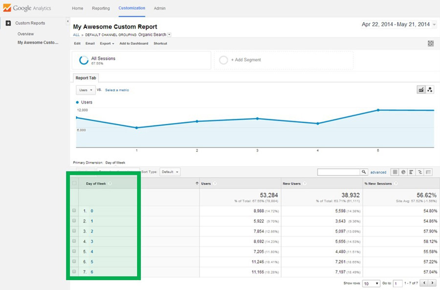
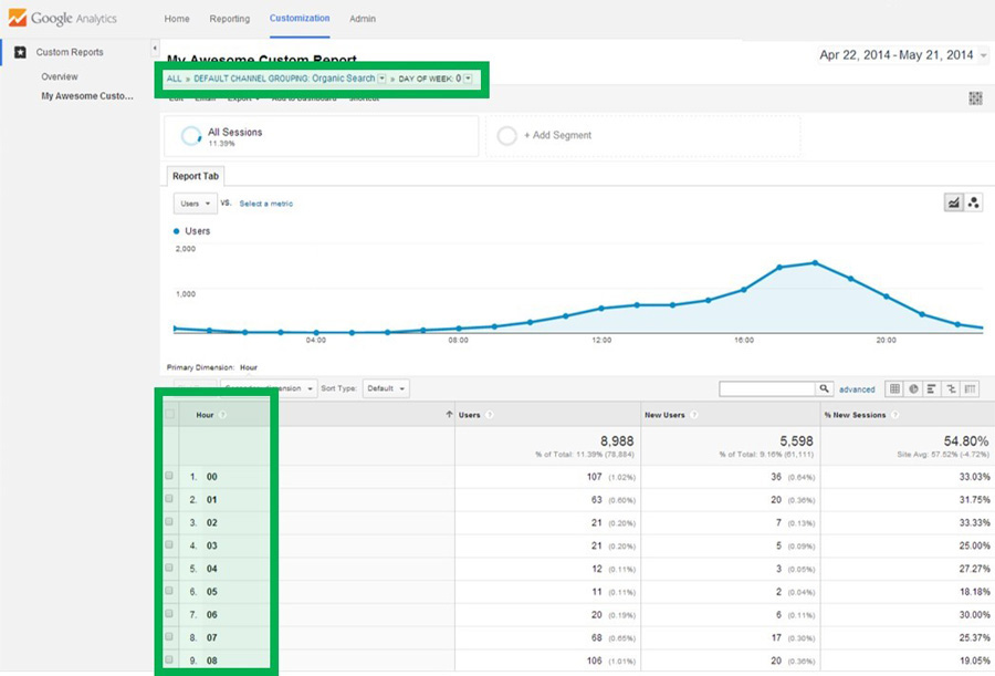
- Having clicked a row, you now see the Day of Week numbers, which you can go ahead and sort by clicking the Day of Week column header. So what you are looking at are the metrics for each day of the week, but only for Organic Search. And if you click a particular Day of Week number (and click to sort them), you’ll then see metrics for each Hour number, for that particular Day of Week number, for Organic Search.
Conclusion
Alright, now you know how to generate a custom report. You know how to add dimensions and metrics. You know the difference between a Flat Table and an Explorer Table and when to use each. You also know about how to use the Google Analytics Query Explorer. Of course, we could go on and on, but this should give you a great start in using some of the more advanced reporting features in Google Analytics. To ensure you use Google Analytics to the best of your ability, read through and follow our Google Analytics: Best Practices guide.
