
10 Best GA Reports for UX Research
User experience is the key to making a successful and easy-to-use website. Without a proper UX in place, your website, while it may have great aesthetic appeal, is probably a pain to navigate and find useful.
This is where we—UX strategists—come into play. We do the extensive research early on to make sure that by the time the website goes into design and development, all of those aspects (things like the information architecture, user journey(s), and functionality) have been thought through and solved.
These decisions can have a big impact on the end user’s experience. That’s why, at Zion & Zion, we don’t take this phase of the web development process lightly. We don’t simply just have graphic designers or web developers do the UX in their spare time. Here, it’s a full-time job with dedicated headcount.
Google Analytics for User Experience
One of the most important tools we use throughout our UX research phase is Google Analytics, which happens to be a free tool! While most people only touch the surface of this tool, its true capabilities are amazing.
From implementing e-commerce tracking in order to optimize your website’s checkout process, to setting up custom events to track user interactions (think: PDF downloads) that would otherwise not be trackable, Google Analytics is an extremely intricate tool. It allows you to really get to know your site’s users, find out what pages and elements are working well, and where there may be room for improvement.
But how exactly do you use Google Analytics during your UX research phase? Keep reading to find out.
1. Bounce Rate
Behavior > Site Content > All Pages
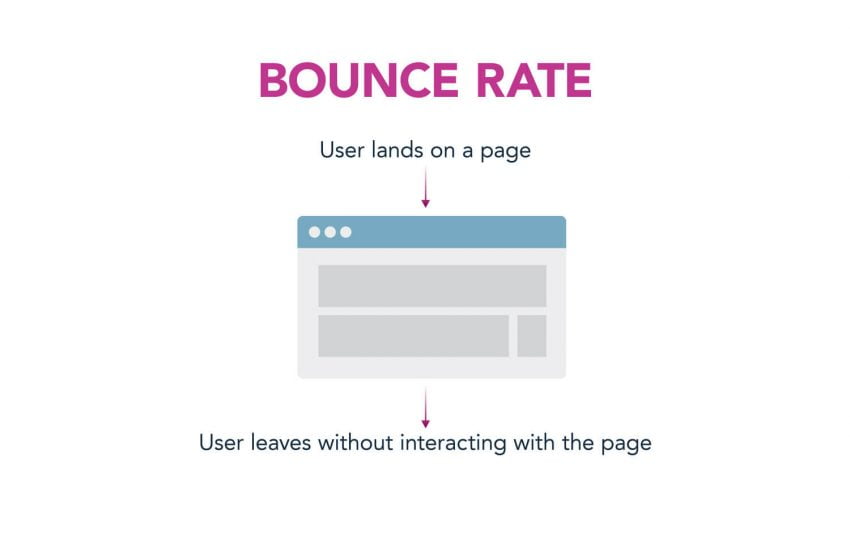
In this Google Analytics report, you can see which pages have the best and worst bounce rates. This is based on the interaction, or lack of interaction(s), occurring on each page. Google Analytics defines Bounce Rate as: “the percentage of single-page visits (i.e. visits in which the person left your site from the entrance page without interacting with the page).”
Through this report you can quickly see which pages may be performing poorly, and where you should invest your time to improve and optimize.
You can also use the weighted sort feature in Google Analytics which computes the Estimated True Value (ETV), and ranks your pages by their “importance” as determined by a combination of not only the bounce rate, but how much data each row of the table is based on. Weighted sort makes it easy to see data with a higher importance first in the list instead of your report being polluted with insignificant (or less significant) data.
Behavior > Site Content > Landing Pages
To dive even further, you can look specifically at the bounce rate of landing pages rather than all pages. Making this change allows you to see what pages users are entering your site from, and then judge their performance.
Disclaimer: A high bounce rate is not always a bad thing.
There are instances where, for example, you have a landing page in which the primary CTA (call-to-action) is to download a PDF. Users may land on a page, download a PDF, and leave. Because downloading a PDF doesn’t take users to a new page on your website, it would be counted as a “Bounce,” thus adding to your site’s Bounce Rate. If this is the case, you’ll want to create a custom event (and make sure to mark it as “interaction” instead of “non-interaction”) for the PDF download button so that whenever users click “Download,” they’re triggering an event. If the event is triggered, it’s no longer considered a bounce because an interaction occurred. By doing this, you’ll have a better understanding of the real bounce rate for your landing page.
There are also instances where having a high bounce rate, even without an event being triggered, is still not a bad thing. For example, a contact page may have a high bounce rate but is actually providing users with the information they need to continue down the sales funnel and convert.
2. Exit Rate
Behavior > Site Content > All Pages
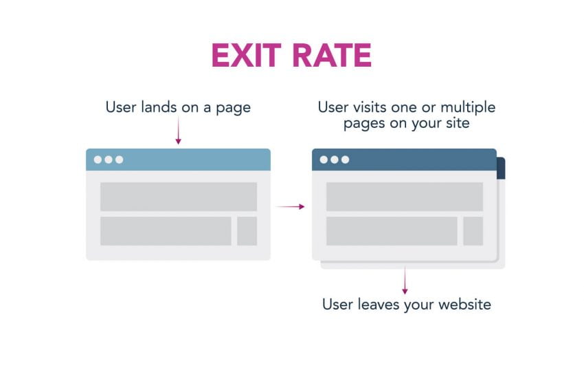
Looking at bounce rate is one thing, but it’s important to note here that bounce rate means the user entered the site through the same page in which he or she left the site, without any interaction in between. GA defines Exit Rate as, “(number of exits) / (number of pageviews) for a page or set of pages. It indicates how often users exit from that page or set of pages when they view the page(s).”
Looking at the Exit Rate metric in the “All Pages” report allows you to see where your users are dropping off, and where they’re engaged enough to continue on throughout your site.
Fact: A bounce can also count as an exit if a user exited the first page they landed on when arriving to the site and did not interact with the page.
3. Average Time on Page
Behavior > Site Content > All Pages
In this report, you can see which pages users are spending their time on, and where they’re dropping off or leaving quickly.
It’s important to note that in some instances, a lower Average Time on Page can mean that your users are actually finding what they need quickly, and then going elsewhere. While this isn’t always the case, it’s important to think about the page as a whole and really understand how your users are interacting with that page before jumping to conclusions.
If you have a content heavy site with long and well-written blog posts, a short average time on page can mean your users aren’t engaging with that content the way you’d expect, or hope, they would. A finding like this can lead to a number of different tests, updates, or optimizations. And those improvements can make a world of difference in your site’s usability.
It’s important to note that if users only visit a single page and don’t wind up triggering any subsequent page loads or events, then Google doesn’t know how long you’ve spent on the page. This is because Google measures how long you’ve spent on a page by marking the end of your visit to a page by the fact that you did “something” next. So, a visit with a single pageview is treated as zero seconds on the page by Google—even if you spent some time on that one page.
Visits that have just one pageview are not included in GA’s calculation of average time on page. They exclude the “zero second” pages from the calculation so that you don’t end up with skewed data.
4. Average Pages per Session
Audience > Overview
In this report, you can get a quick sense of how many pages your users are viewing per session. Remember, a session is defined by Google Analytics as: “A group of interactions that take place on your website within a given timeframe.”
Disclaimer: This information depends heavily on your business, conversion funnel, and the type of website you have. An e-commerce site that sells one product and has a single-page checkout process is going to have a very low page per session average. However, a strictly content and information site, with pages that lead to more unique content, should have a higher page per session average.
Keeping these things in mind, you can tell a lot about your site’s usage by simply comparing the number of pages you have on your site to the average pages per session number you find in this report. Is the number higher or lower than you’d expect? Why do you think this is? Where are your users dropping off from your site? Figuring out the answers to these questions can lead to improvements on your site so that, if engagement is a major goal, you can work to increase your site’s average pages per session.
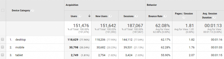
5. Device Usage
This report has been really interesting to watch over the past few years, with the continuous growth in mobile usage and devices. Google Analytics breaks up the data into three categories:
- Desktop
- Mobile
- Tablet
As more devices with new and unique screen sizes are being designed, built, and sold, the line between these three categories continues to blur. However, this is still a good report to look at in order to see how your users are looking at your site.
From this report, you can see how your site’s sessions split up across the three device types. You can look even further to see how these sessions differ (if at all) by looking at the metrics included in the report. For instance, maybe your current mobile sessions have an extremely high bounce rate because your site isn’t mobile friendly. This can help you plead your case for developing a responsive website if you don’t have one already. Or, it can lead you to areas of your site that may need to be optimized for a device category, device, or screen size.
Audience > Mobile > Devices > Set primary dimension as “Screen Resolutions”
Device type is great, but knowing the most popular screen resolutions that are viewing your site is even better. This report allows you to see every screen resolution a session had while viewing your site. It then groups those sessions together so you can see the most popular screen resolutions. You can also see the typical metrics in this report, such as bounce rate, pages/session, and avg. session duration.
If you find that a large percentage of your users are viewing your site on a certain screen resolution, this may be important enough information to base your wireframes and mockups around.
Audience > Mobile > Devices > Set secondary dimension as “Operating System”
Running this report allows you to see if there are any major problems with your website directly related to device and operating system. For instance, maybe you find that your website has an abnormally high bounce rate on the iPhone X using a specific version of iOS. You can investigate further to see first-hand how your site is performing on that device with that version of iOS. Who knows what you’ll find—maybe you see that your site looks just as it should. Or, maybe you’ll see that in fact your site is broken on this exact combination of device and iOS. Knowing this information allows you to fix these problems (hopefully early on) so future users don’t have a bad experience.
6. Behavior Flow Report
Behavior > Behavior Flow
Behavior flows help to visualize the behavior of your users on the site as they travel from one page to the next. This is a great tool to use when rebuilding an existing site because you can compare your ideal user flow(s) to what is actually taking place on the site and make adjustments as necessary. A useful observation such as users toggling back and forth between two pages could mean users are confused and the call-to-actions or links on those specific pages should be reevaluated.
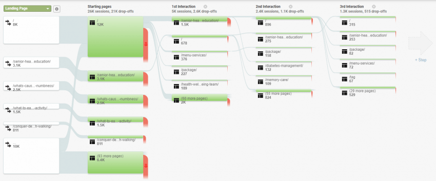
Start building your behavior flow report by choosing your dimension (e.g. browser, city, country, social network, etc.). The report defaults to Landing Page, but you can easily change this to whatever you want by using the dropdown provided. Once you’ve chosen a dimension, you can start to see how your users navigate, or flow, through your site. This report shows you the starting page(s) and the user’s interactions after.
If I’m being completely honest, this report’s user interface (UI) isn’t the best. But when it comes to user experience, it can provide useful insights that may be helpful in driving your future site’s design and architecture.
7. Demographics
Audience > Demographics > Overview
Before jumping into this section, I want to first point out that in order to gather this information, you must get with a site administrator to turn this on. However, first you’ll want to update your website’s privacy policy to include the proper legal information informing users that this has been turned on and this information will be collected.
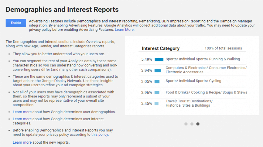
Google Analytics uses a third-party called DoubleClick to gather this demographic information. They place a cookie on the user’s browser which allows them to gain insights such as age, gender, affinity categories, in-market segments, and other categories. For more information on each of these dimensions, read Google Analytics’ support page on the topic.
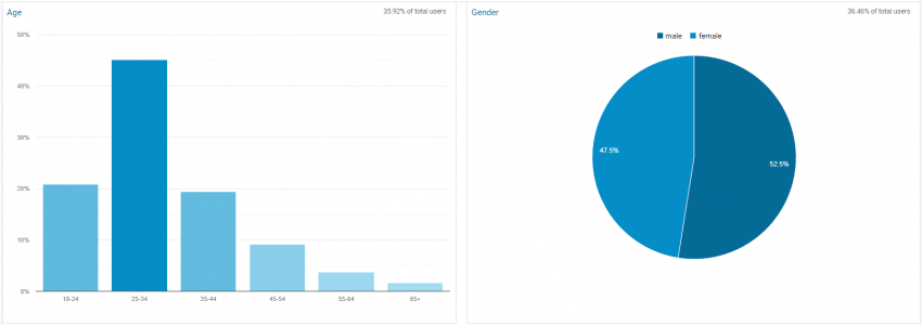
This information can be really helpful in the early stages of UX research, when we’re first working to better understand the specifics behind our users. Sometimes the web demographics can really surprise us, and other times they’re just what would be expected given the business and subject matter. Nonetheless, it’s useful to look at in order to verify age groups and gender of your site’s users.
8. Site Search
Behavior > Site Search > Search Terms
In order for the site search report to show up in Google Analytics, you need to do two things:
- You need to have some sort of search function on your site.
- You need to turn on and enable site search in Google Analytics.
If you haven’t done those two things, you’ll see something like this:
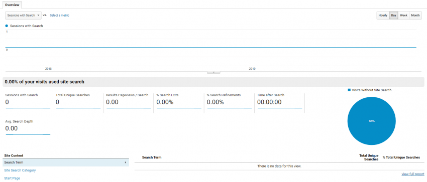
While some users use site search as their default method for navigating a site, there are also users that use site search if they can’t find something they’re looking for. This is where site search comes into play during our UX research. If users can’t find what they’re looking for, that’s a big red flag in the UX department and quickly becomes something addressed in the new site.
Looking through the list of site searches performed can be tedious, but it can also lead to a new and improved website, so it’s definitely worth the time and effort.
9. Custom Events
Behavior > Events > Overview
I briefly touched on events at the beginning of the article, but I want to make sure to really cover how useful setting up custom events in Google Analytics can be. You can use events to track otherwise un-trackable information, and as UX strategists, this is one of the most useful tools we have in Google Analytics.
Have you ever wondered if your users were getting confused by the un-clickable headers in your main navigation and the actual links? What about if anyone was downloading that extremely important PDF you’re driving traffic to? Or how about videos—ever wonder if your users are watching the full video, or pausing or stopping it part of the way through?
Luckily, with custom events, you don’t need to wonder anymore. Now you can get actual answers with real data!
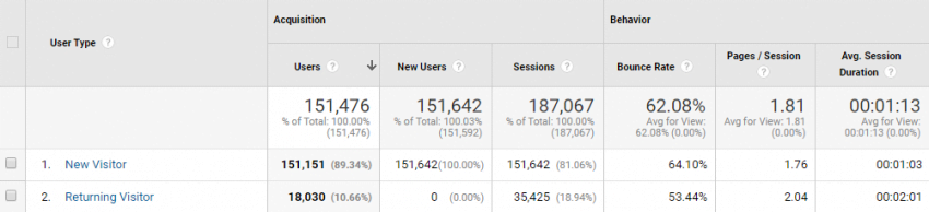
10. New vs. Returning Visitors
Audience > Behavior > New vs. Returning
The new vs. returning report in Google Analytics is great for better understanding what types of users your site and marketing efforts are attracting. Here you can see what percentage of your users are new vs. returning, meaning how many of your site’s users are coming back for something (e.g. additional information, a phone number, to place an order, etc.) and how many of them are first timers on your site.
Disclaimer: Someone can be labeled a “new” visitor in Google Analytics if they’ve since cleared their cookies, so keep in mind that this report’s data may not always be 100% accurate.
Time to get Started
There you have it! The 10 best Google Analytics reports for improving your user experience research process.
As Google Analytics continues to grow and improve, so do the reports available to us. This means that it’s our job as UX strategists and designers to constantly look at these updates for new and useful information. We specialize in this sort of thing. And believe it or not, we actually enjoy looking at these reports and doing this type of deep thinking. The better we can get to know our (or our clients’) users, the better we can plan and build a new site.