Responsive Design, Defined
A responsive web site is designed to adapt its presentation of information to the users’ device portal. Responsive Web Design (RWD) is not a buzzword and it’s not even really optional, as it’s the current standard for web design if you even remotely care about user experience consistency and maximizing your chances of being found on the web. Responsive Design is the most efficient solution for developing your website to be future compatible and optimized for any device. But to really understand what responsive web design is, let’s take a step back and look at the problem it is solving, namely rapidly evolving technology on the web that includes many devices and many portal sizes and the fact that a user’s device and that same user’s purpose are no longer synonymous.

Before Responsive Design
Prior to responsive design, a common solution for dealing with optimizing your website for multiple devices was to create multiple websites and to redirect the user to the correct version of your site based on what device they were on. This process typically involved creating different URLs, so for example if your main site was located at http://example.com, your mobile optimized site would be at http://m.example.com.
Some would say that this worked great when you were dealing with two devices (for example a desktop/laptop and a smartphone), but the truth is that even with only two device portals, it was still labor intensive and inconsistency prone to maintain two separate sites.
And now, as technology keeps evolving at a faster and faster pace, more and more devices are coming out with different screen sizes, making the challenge even more difficult. Continuing to develop a separate site for each device would quickly become a maintenance nightmare. But not only is this challenge more difficult, the need for responsive design is also becoming more relevant as users’ usage patterns evolve.
The History of Website Usage
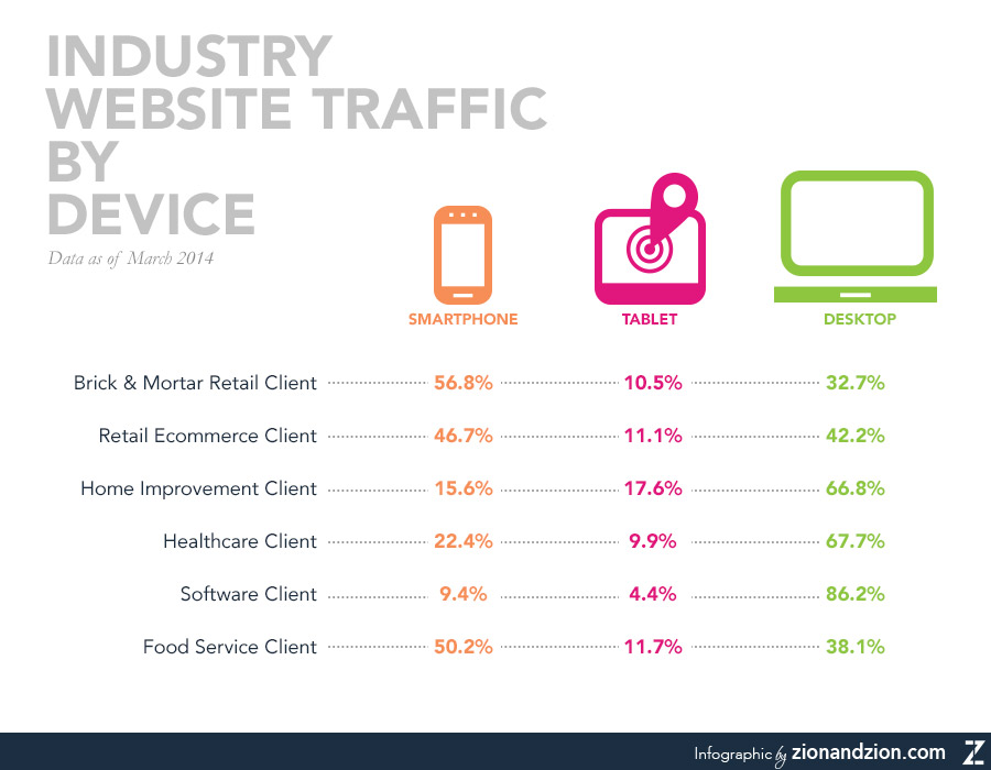
It used to be that a user’s purpose for accessing a given website was almost completely synonymous with the device they were using. Specifically, today’s users are no longer, (for example) simply searching for location and contact information when they access a website from their smartphone. They are often looking for, and quite frankly expecting to be able to access the exact same content on a smartphone, mini-tablet, tablet, laptop, and desktop. Yes, they may have different priorities, but the days of it being acceptable that a user not be able to find the same content from device to device are long gone. And it’s no longer the case that users simply start their journey on one device and finish on another, but instead that they use a series of devices, sometimes even with near simultaneity.
Alternatives to Responsive Design
An alternative to responsive web design would be to have dynamically served content which runs off the same URL and renders out different HTML, content, and CSS, based on what device the user is on. This is ok, but requires more configuration setup to make sure all your SEO items are configured properly, and also requires managing multiple sets of content. However, there is a major pitfall with this strategy; trusting the user agent. With all the new devices, having a user agent not recognize one or misfire and cause incorrect content and design to go out to the user.
Responsive Design for SEO
I started out this post by mentioning that responsive web design isn’t really optional and that not making a website responsive has SEO impacts. In this article by Google, Building Smartphone-Optimized Websites, responsive design is the recommended method for optimizing your website for mobile devices. You have one set of code, one URL, and just one site to maintain. Responsive web design works by adapting or “responding” to the user’s device screen size using media queries and dynamically selecting what styles to apply, thereby optimizing the layout for that device. There is no need to check what user agent the device is on, and you don’t need to redirect the user to a different site, which is what makes responsive web design so powerful.
Additionally, responsive design provides many SEO benefits as all content is viewed from one website, which means all of your tracking data can be viewed with more clarity. One major advantage with this is giving the user the same experience, because as mentioned by my colleague Lisa Murray in her Article “3 Reasons Why You Don’t Need a Mobile Strategy,” screen size is not context.
The Preferred Solution
Responsive web design is today’s preferred solution to rapidly evolving technology and user needs and expectations. Responsive design prepares you for the future by making your site either already optimized or easily optimized for new devices that come out of any screen size, giving you the biggest bang for your buck when it comes to making a website that’s going to last and cater to an optimized user experience.
