
Data visualization simplifies information by building structures and patterns that are easier for human brains to understand. By using color and Gestalt Principles (similarity, continuation, closure, proximity, figure/ground, and symmetry & order) our brain subconsciously arranges information in an organized way instead of isolated elements. When these principles are applied, data becomes much easier for the audience to digest.
Data is the grounding source for decision-making. However, visually communicating all of the information can become complex, causing confusion and misinterpretation. Applying UX design principles such as hierarchy, contrast, proportion and Gestalt, removes the complexity of your data and turns it into a seamless user-friendly experience that will guide users towards meaningful and clear interpretation of the message.
Effectively displaying data can be a tough task whether you want the viewer to draw their own conclusions, or if you want to guide your customers towards a specific outcome or action. The way your data is presented will influence how that information is received and processed. Here are a few UX design tips to help facilitate data visualization.
Understand Your Data
Taking complex data and breaking it down into something that is easier to understand should be one of your top priorities. Collecting the right information is the foundation of visual representation. Start by checking your data sources and get familiar with the content. The more you understand the data, the easier it will be to recreate it visually.
Learn Gestalt Principles
Gestalt is German for “unified whole” and the first principles were seen around 1920 by German psychologists Max Wertheimer, Kurt Koffka and Wolfgang Kohler. The goal was to understand how humans process and select meaningful information given all of the overwhelming stimuli that surrounds us.
According to Kelley Gordon, Digital Design Lead at Nielsen Norman Group, “Gestalt Principles explain how humans simplify and organize complex images that consist of many elements by subconsciously arranging the parts into an organized system that creates a whole, rather than interpreting them as a series of disparate elements. In other words, Gestalt Principles capture our tendency to perceive the whole as opposed to the individual elements.”
Familiarizing yourself with Gestalt Principles will help you understand how to visually present your data.
Use Appropriate Visualizations
Charts are the most popular way to represent data and are an easy way to show time, measurement and comparisons. Bar charts and line graphs can easily tell a story. Other visuals such as bubble charts may overcomplicate your content making it more difficult to understand.
Ensure Useful Scale and Proportion
Effective data visualization should give users quick and accurate information at a glance. Complex datasets should emphasize accuracy and it’s important to make sure your charts aren’t visually busy to ensure the message doesn’t get lost in the visuals. Pie charts are recommended to showcase data when each section is equally important considering the solid blocks of color are easy to compare. Donut charts are great to highlight portions of data while giving an additional opportunity for storytelling at the center of the donut.
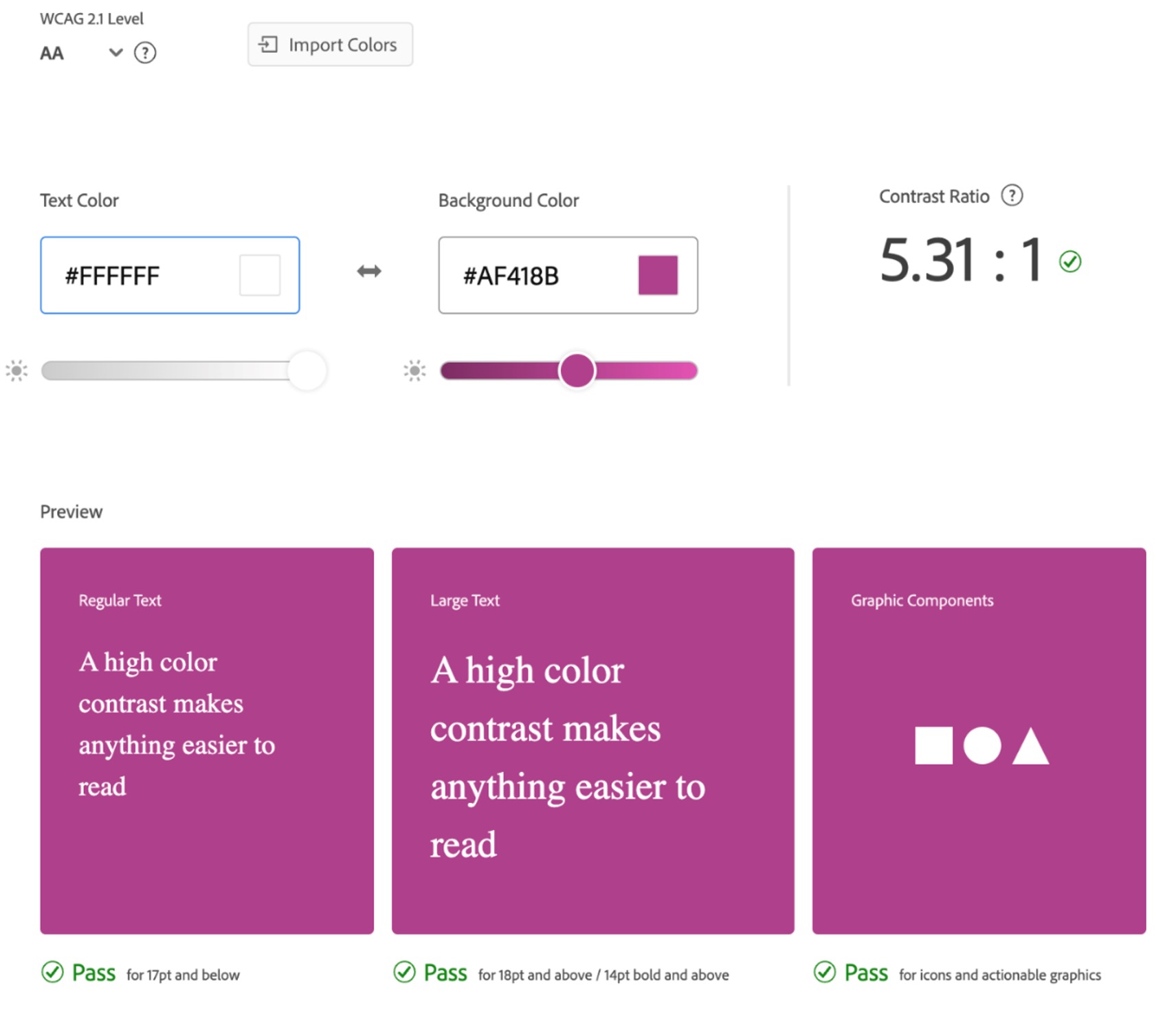
Consider Accessibility
Accessibility of visuals to those with disabilities is commonly overlooked, but there’s a lot you can do to make sure your data is accessible to everyone. Avoid generalities and be descriptive in both titles and labels on your graphs. Use high quality images that won’t get pixelated and pay attention to color choices. Colors are very important in data visualization and providing good contrast is essential for accessibility. WCAG 2.0 level AA requires a contrast ratio of at least 4.5:1 for normal text and 3:1 for large text. WCAG 2.1 requires a contrast ratio of at least 3:1 for graphics and user interface components. WCAG Level AAA requires a contrast ratio of at least 7:1 for normal text and 4.5:1 for large text. Large text is defined as 14 point (typically 18.66px) and bold or larger, or 18 point (typically 24px) or larger. Converting your graphics to grayscale can help you identify how much contrast your color selection has. If you are still unsure about the level of contrast you’re displaying, there are online tools that can help you such as the Adobe Color Contrast Checker and WebAim.
Conclusion
When focusing on representing data, UX design is a powerful tool to make your data visualization stand out and effectively communicate complex information to your audience. Data Visualization expert Edward R. Tufte highlights the functionality of UX combined with data when he states “The essential test of design is how well it assists the understanding of the content, not how stylish it is.”
Data visualization elevates how your data is being presented, allowing users to navigate without confusion or delays.