
When I traveled to Japan in 2019, it was my first time in a non-western country. I was overwhelmed by the Hiragana and Kanji calligraphy and awestruck by the “midnight sun” of the digital billboards. The experience would echo in my mind for the next four years as I continued my advertising career. Returning in May of 2023, I was going with a different perspective. Since my maiden voyage, I have produced numerous advertising campaigns and had a newfound appreciation for the process. As a Sr. Creative Strategist, I saw this trip as an opportunity to discover new advertising trends and collect creative inspiration. But the real souvenir was uncovering the power of universal imagery and visual storytelling.
Advertisers Can Transcend Language Barriers Through Stories
While traveling with a language barrier is always challenging, Japan has an added layer. Beyond the spoken language, Japanese has two writing systems: Hiragana and Kanji. Hiragana is a syllabic alphabet that supplements Kanji, a complex system of word symbols. Hiragana is learned at an early age, like the English Alphabet, allowing readers to “sound out” the word. As scholars progress, they learn how Kanji consolidates these letters into a single symbol. Like spelling tests in English, Japanese students learn 10 Kanji words a week in school. Over the course of 12 years, they will have learned an average of 2,000 Kanji words by the time they graduate. This forces Japanese advertisers to consider non-written communication tactics. Assuming Japanese children aren’t fully literate until they’ve graduated high school, advertisers must be able to communicate their message so a broader audience can understand it. This places an added emphasis on the visual elements of an advertisement or story.
Like millions of Japanese kindergarteners, I can’t read Hiragana or Kanji, so I’m forced to interpret and understand ads on imagery alone. There’s an order of operations when the human brain interprets visual information. First, we intake light; our brain translates the shadows and contrasts into shapes, then colors. The brain then works almost instantaneously to identify the object—the more familiar the shape, the quicker the process. For example, a child might be able to identify a banana quickly. Still, a banana phone would require more time to interpret. The more abstract the information, the more context is needed to interpret it correctly. Although the images are physically the same, they are still interpreted individually. The brain is responsible for creating meaning behind the information it’s interpreting. This means that each person perceives and interprets visuals differently. Several contextual factors, such as personal experience and cultural significance impact this and each of us have our own history to draw from. This creates a challenge for marketers, who are charged with disseminating a brand message that will be interpreted accurately. The best ads eliminate the risk of misinterpretation by tapping into universal stories and emotions.
Koala Sleep’s ‘Keep Sleep’ Campaign Appeals To Broad Audience Through Familiar Faux Pas
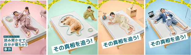
Koala Sleep, an Australian mattress company, created a Japanese advertising campaign entitled “Keep Sleep”. Told through a series of four vignettes, the campaign revolves around an individual sleeping on a bare Koala mattress undisturbed by familiar faux pas: an alarm clock going off, slipping into slumber during story time, a dog hogging the bed, and even sleeping instead of being on a Zoom meeting. Each of these dreamers are outlined like a police body sketch and surrounded by police tape.
By using a blank set to construct a bedroom, the advertisers give themselves complete control over what the audience sees, carefully adding each prop to craft a story. With no stray objects or red herrings, this approach gives the advertiser full control. With limited information, the stripped-down scenery magnifies each visual cue. To make up for the lack of visual information, our minds immediately go into storytelling mode. This gives advertisers the power to construct a narrative that fits the intended message. For instance, while there are no walls in the image, we still know it is a bedroom thanks to the bed and sleeping subject. The police tape and body outline indicate a crime scene as the victims lie dead asleep. The culprit? A comfortable mattress. Together, these still images tell a rich, emotional story.
From the panic induced by an alarm clock to the exhaustion parents feel, stories have the power to evoke an empathetic response. In one scenario a dog is sprawled peacefully across the bed while its owner is relegated to the floor. Although I was nearly 6,000 miles away from home, as a dog-mom, I instantly understood and empathized with the dog owner. Placed next to one another on a train, the four ads worked together to create greater context. If the first ad with the dog didn’t resonate, maybe the woman waking in a panic after oversleeping will. It’s likely that these scenes stir up familiar emotions and create instant associations between deep sleep and Koala.
Wester App’s Homage To Kiki’s Delivery Service Demonstrates The Power Using Cultural Icons In Advertising
While some stories have less universal appeal, they can still tap into a powerful cultural lexicon to connect with audiences. This is the case with Japan Rail’s 2023 Wester app campaign that brings a beloved cartoon character to life: Kiki from Kiki’s Delivery Service. Promoting the train company’s new rewards app, the campaign aligns itself with the iconic Studio Ghibli movie and characters as a vehicle for its message. The full campaign video ad shows a live-action portrayal of Kiki exploring Osaka with her cat, Jiji. With her red bow, black hair, broomstick, and her feline companion, a Japanese audience will instantly recognize the character. By attaching themselves to Kiki, Japan Rail also attaches itself to the values and personality she represents in Japanese culture.
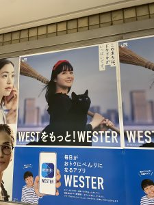
When translated to print, however, the campaign becomes cautionary tale in using cultural symbols to tell a story. Like Koala’s Keep Sleep campaign, Wester plastered posters across train stations. Again, the still images provide much less for interpretation. Stripped of the context a video sequence provides, print campaigns rely on both words and imagery to create a narrative. As a fan of the film, I was quick to recognize Kiki but not the brand. Spotting two words ‘West! Wester!’, I quickly made the association with the U.S. Pony Express. Known for their valiant postal service, I instantly drew a parallel between the American and Japanese stories. What a brilliant concept, I thought, Kiki’s using a courier app to play hooky! It wasn’t until I began research for this article that I realized the advertisement was for a shopping rewards app owned by Japan Rail. Videos can show a sequence of events, while still images must imply the events that happen before and after the image. Without the much-needed context of the video plotline, the poster designs demonstrate how crucial copy can be in making an advertisement whole.
ITO EN’s Oi Ocha ‘Taste Japan’ Campaign Nurtures Global Brand Recognition
Unlike Wester and Koala, ITO EN has broader audience appeal. A Japanese staple since 1968, the tea giant has sold over 35 billion bottles of their popular Oi Ocha iced green tea. Already dominant in Japan, growing awareness for this brand means gaining popularity internationally.
The ‘Taste Japan’ campaign targets foreigners rather than residents. Played on large digital billboards in Tokyo hotspots like Shibuya and Shinjuku, the loud and colorful video commands attention from pedestrians. First, we see green tea fields become actual green tea. Then, we see the actor drink the tea and turn into a Kabuki character. To emphasize its claim as the best green tea in Japan, the video demonstrates the powerful transformative properties of the product. From Mt. Fuji to Tokyo Tower, the video uses iconic sites as a backdrop for their story. The campaign successfully aligns the brand with Japanese heritage by using iconic images.
No words are necessary. The message is clear: Oi Ocha is a Japanese icon in its own right. As foreign tourists return home, they may not remember the advertisement or brand name, but they will remember how much they enjoyed the drink. When they encounter Oi Ocha at their local grocery store, they’re delighted. Supported by robust distribution, the product is ubiquitous in Japan. While this creates an awareness by osmosis, campaigns like ‘Taste Japan’ actively endear the brand to the audience’s lasting impression of the country.
Using Visual Language To Tell A Story Transcends Cultural Barriers
There’s a common advertising trope that “no one ever reads the copy.” My time in Japan gave this a whole new meaning. Regardless of whether audiences don’t read or can’t, it’s the advertiser’s responsibility to communicate the message accurately and effectively. Visual cues allow brands to control messaging by appealing to the audience’s unconscious associations with certain symbols. However, as the Kiki’s Delivery Service campaign proved, symbols only go so far. In the absence of language, visual storytelling communicates its message through action. Whether that’s through a video sequence or single still image, there is an implied narrative audiences automatically interpret. Recognizing how influential visuals can be is the first step to telling a transcendent story. I look forward to putting this to the test and discovering more insights on my next trip.