
When developing digital experiences, it is crucial to follow user experience (UX) heuristics to create an engaging and optimized user experience. Many companies recognize their need to improve their digital experience but struggle to identify where to start when attempting to improve their UX. By establishing key UX heuristics through a standardized framework, you can create a consistent process to audit websites and a structured approach to prioritize improvements.
A UX Heuristics Framework Focuses on Best Practices
Our UX heuristic framework focuses on UX best practices and guidelines that are often lacking in digital experiences. When developing a UX heuristics model, it is important to ensure that the components of the model are both mutually exclusive and collectively exhaustive – also known as MECE. This ensures that practitioners can focus their efforts on high-priority improvements without missing key UX standards. With this in mind, Zion & Zion developed a framework to help brands identify key areas of opportunity to establish a positive user experience. The framework is segmented into eight UX heuristics used to evaluate and improve digital experiences.
Identify Opportunities for Improvement
The first step in evaluating a digital experience, such as a website, landing page, or digital ad is to utilize the framework to pinpoint the opportunities that are not meeting the guidelines of the UX heuristics model. Treating the framework as a checklist ensures you have a holistic list of improvement opportunities to act on. Below is a more detailed description of each UX heuristic with recommendations on how a practitioner may be able to tell if each one is inadequate or unmet.
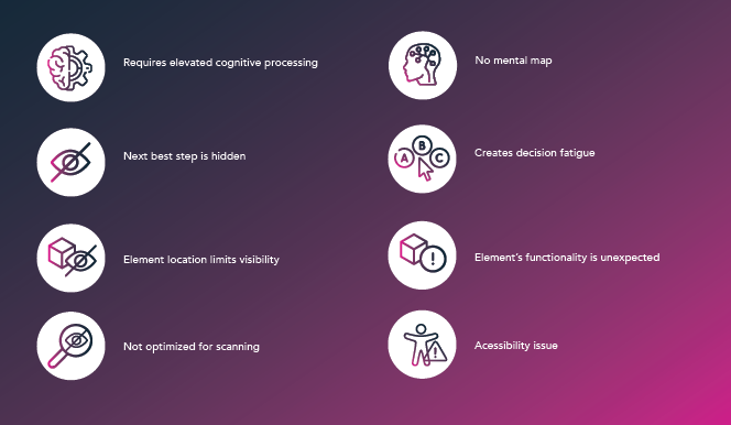
Requires Elevated Cognitive Processing
If information is organized in a way that requires too much brain power, users are more likely to exit the page without taking action. This UX heuristic allows us to identify areas of a website where information could be presented more effectively requiring less effort from the user.
Next Best Step is Hidden
Websites should encourage and push users through a defined user path. It is crucial to identify areas of a website that lack calls-to-action or signals that push the user through a defined path. Not presenting the “next best step” ultimately prevents the continuation of a user journey.
Element Location Limits Visibility
With this UX Heuristic, the hierarchy of information and the relational location of elements play an important role in digital experiences. Identify areas where adjusting the location of a button, text, or other element, will improve visibility and encourage users to take a desired action.
Not Optimized for Scanning
Users are known to preview content on a website in an f-shaped pattern, scanning the content rather than reading full paragraphs of text. Diagnose areas of the website where content can be formatted to make quick scanning easier. Components such as sub headers, bullet points, and iconography can be used to break up content.
No Mental Map
When users visit a new website, they are looking for cues and standards from previous experiences on other websites and the real world. To satisfy this UX heuristic, pinpoint areas where the display or flow elements do not match user expectations based on their preconceived expectations and adjust them to meet user standards. For example, most websites have their “Login” button in the top right corner of the main navigation. When a user enters your website, they will likely be searching for the Login in this location. If you’ve placed it elsewhere, it can create frustration and confusion for the user. Therefore, with this UX Heuristic, it is important to consider common user mental models to satisfy user expectations.
Creates Decision Fatigue
Hick’s Law states that the time it takes for a user to make a decision increases with the number and complexity of choices. Therefore, it’s important to identify areas of your website where the user may have too many options to choose from, preventing them from converting. For example, if you have 10 items in your main navigation, assess the information architecture of your site and see if this can be condensed to 3 or 4 high-value areas navigating users into key defined paths.
Element’s Functionality is Unexpected
This UX Heuristic identifies that there may be specific elements that do not meet user expectations. This may include components with broken functionality or that cue a user to do something, but they are not able to complete the action. For example, an element may have a hover state, but the item is not actually clickable. Classify elements that stump users based on cues versus the intended purpose and define how those cues can be corrected.
Accessibility Issue
Accessibility is usability. With increasing ADA guidelines and legal ramifications at stake, designing for those with disabilities needs to be at the forefront of your digital experience planning. Recognize areas of the website that break ADA standards on both the front and back end and recommend how to execute accessibility compliance.
Utilize the UX Heuristics Framework to Prioritize and Execute
After utilizing the UX heuristics framework to identify areas of opportunity, it’s necessary to establish the most strategic way to capitalize on limited resources such as time, talent, and capital.
Tackling many items at once can prove to be overwhelming and inefficient. Step back, prioritize, and execute by level of effort, ease of implementation, and greatest impact. What items bring the most value with the least number of resources? Score each item accordingly and provide an estimated time of completion.
Next, clarify your goals. Create an area of focus by determining what items are directly related to your organization’s core strategy. This will be your North Star when prioritizing improvements. For instance, if your bottom line is dependent on increasing form fills, consider what UX heuristic may be preventing conversions and focus on that first. Are users able to easily locate the form or CTAs? Do you perhaps serve an older demographic that isn’t able to easily view the size of your text? Are there many opportunities that fall under one UX heuristic? By using the UX heuristic framework as a guideline to identify the largest areas of opportunity, you have an actionable plan to improve the digital experience.
Conclusion
Using our UX heuristic framework offers organizations the ability to quickly identify key pain points in a user’s digital experience. With the correct prioritization, organizations will be able to implement minimal-effort changes that have a high-impact on user experiences. Ultimately, this allows organizations to impact their long- and short-term digital goals and create exceptional user experiences.