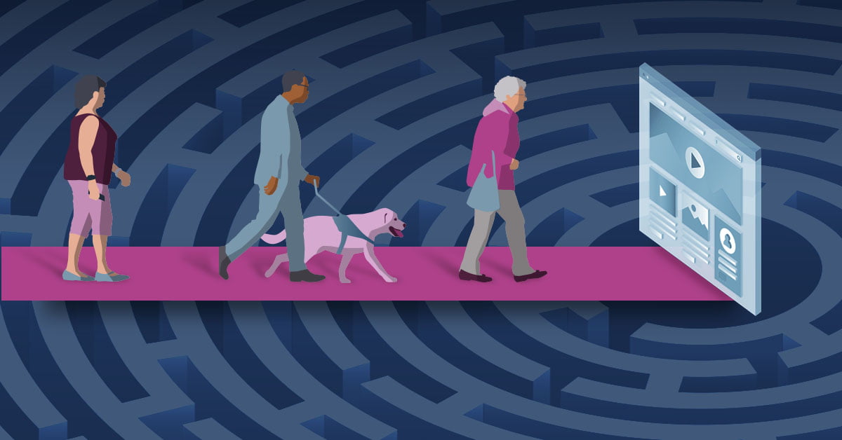
Even with approximately one billion people worldwide living with a disability, most websites and other digital platforms are inaccessible, making them difficult or nearly impossible for users with disabilities to use. Designing with an accessibility-first approach has the potential to benefit not only users with disabilities, but all stakeholders because accessible design typically results in an improved user experience overall.
The most obvious benefit of web accessibility is that it helps people with disabilities enjoy your website’s content, products, and services. However, the advantages of web accessibility are not limited to the immediate impact for people with disabilities—and some of them may surprise you. Often overlooked, ensuring accessibility is an integral part of your website strategy can result in an expanded customer base and inspire innovation through inclusion.
Cognitive Differences
From UX strategist to designers and developers, anyone a part of the web world would agree that accessibility matters. Considering accessibility and creating interfaces that are all inclusive—especially to those with disabilities—should be a part of every project, not something that is dependent upon time or available resources.
Here, we will look at a few examples of designing for accessibility which illustrate why accessibility is great for users and your business. We will also take you through the primary reasons for why you should care about accessibility in the digital world.
We will review what you should know about designing for users and how to give them the best user experience for the following disabilities:
- Vision Impairment
- Hearing Impairment
- Autism
- Dyslexia
- Anxiety
Please note: There isn’t a one-solution-fits-all approach. As you continue reading through the article, you will see that many of the tactics do not stray far from current best practices when designing a website.
Vision Impaired Users
Tons of web experiences rely on visuals, making it nearly impossible for those with visual impairment to use. Vision impairment can range from color blindness, low vision, or complete blindness.
Half of blind and partially sighted people feel cut off from people and things around them, including websites. Despite their visual impairments, many of those people use the internet every day. As more and more people over the age of 50 become comfortable with technology, internet usage among this demographic will only increase in coming years.
Consider the following to ensure users who are vision impaired have a good experience while navigating your website:
- Screen readers—Assistive technology that converts text, buttons, images, and other screen elements into speech or braille. It also allows users to perform more advanced functions, such as locating hyperlinks and identifying where they are hovering in the navigation.
- Keyboard shortcuts—Allows users to navigate the computer without having to follow the cursor of the mouse on the screen. This eliminates frustration as users avoid losing their place within the website and can reduce the cause of eye fatigue.
- Text enlargement support—Allows users to increase the size of the text while maintaining the functionality of the website and its content. This can include a text resizer or screen magnifier.
- Contrast and color—Certain color combinations can help users navigate your site and avoid confusion. You can also think beyond solid color choices and consider adding soft texture or patterns as prominent differences can exclude other disabilities. A monochromatic color viewing option is also a tactic you can implement into your site.
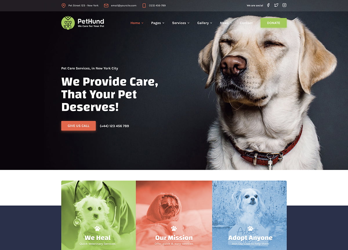
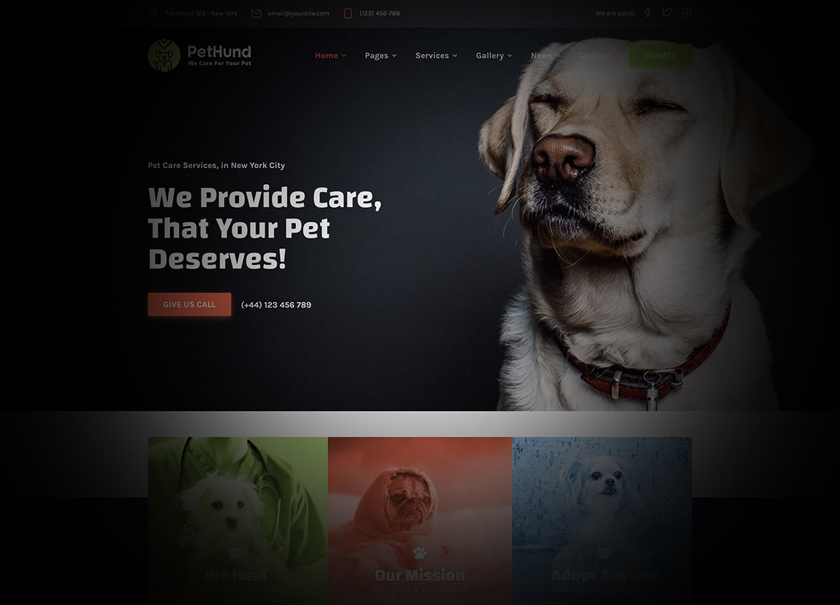
Examples of viewing a website with visual impairments
Not all visual impairments are the same. Here are just a few examples of loss of peripheral vision, blurred vision, and color blindness.

Hearing Impaired Users
Many of today’s websites are accessible to those with a hearing impairment since we typically rely on content and images to provide information or tell a story. But, did you know that more than 5% of the world’s population have a disabling hearing loss and it is estimated that by 2050, 1 in 10 people will have a hearing impairment? This significantly increases the need of spending more time and attention to show that your company is aware and inclusive to those with disabilities outside of copy and imagery.
- Multiple contact options—Provide multiple options for contacting your company. Phone numbers are not favored by those who are hearing impaired and can be discouraging to those wanting to learn more information, book an appointment, or schedule a service.
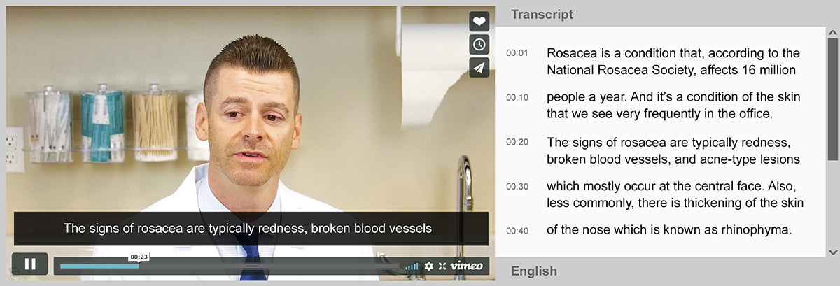
- Transcripts/captions—Providing transcripts or captions encourage users who are hearing impaired consume your content, but there is more that can be done. You can also offer synchronized text or live captions that highlight words as they are being said in the video, making it even easier for user to follow along.
Here is a great example of how captions and transcripts work together to create the best video experience for users who are vision impaired.
Users with Autism
Users on the autistic spectrum can easily get confused or become sidetracked when looking at a website with a complex or cluttered layout that includes large walls of text, images, icons, buttons, etc.
Meet the needs of your autistic users by considering the following tactics:
- Visual processing—Use simple colors, bullet points, a lot of white space, and maintain a simple and consistent layout.
- Clarity in context—Breakdown text into simple sentences and use bullet points. When using icons, try adding descriptive labels and ensure they are intuitive and less symbolic.
- Transcripts/captions—Provide captions or transcripts for videos or images if possible. Also ensure that the sound quality of any audio is clear and undistorted. As mentioned previously, you can also provide synchronized text or live captions that highlight words as they are being said in the video. See section above for an example.
Users with Dyslexia
Contingent on the severity of their circumstance, users with dyslexia typically have difficulties with word recognition which affects reading fluency, spelling, and writing. This can easily become a problem when interacting with web content but can easily be avoided by providing a more accessible experience by implementing the following:
- Typography—Use easy-to-read font, and avoid underlining words, using italics, or all caps on your website. Common fonts that are friendly for those with dyslexia include Sans Serif, Arial, and Verdana. Aim for font sizes above 12 pt. or provide a text resizer.
- Writing style—Write in an active voice rather than a passive voice, meaning write as if you were talking to them directly in front of you. Use short simple sentences but avoid abbreviations by always providing the expanded form when first used.
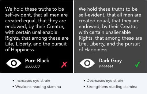
- Contrast and color—Use solid color backgrounds excluding the color white since it can appear extremely bright and blinding. Instead, consider soft white tones such as cream or beige. Use dark colored text on a light non-white background and avoid designing with varying background patterns or pictures as they can be distracting.
Example of good contrast and color
Users with Anxiety
Anxiety is a persistent worry or fear about everyday events and are often triggered by stressful situations. Ironically, there’s not a lot of accessible websites specific to users with anxiety, however many use the internet to distract them when experiencing a panic attack. This makes it more important than ever to not only deliver web experiences that reduce the immense feeling of panic, but that your website offers an experience that eliminates any stress-inducing functionality or design.
The following tactics can help address concerns that are raised by users with anxiety and panic disorders while accessing the web:
- Layout—Use white space to breakup text and copy. Use simple and direct content, breakup your paragraphs, and use descriptive headings when describing new sections of content.
- Aminations—Moving images and text have a time and place, so try to use these as needed or not at all if possible. Looping GIFS, flashy hover states, and fast on-scroll animations are just a few examples of animations that can be distracting to those with a sensitivity to motion.
- Call-to-action—One clear, next step is a best practice in typical web design; however, it is seen as even more of an important consideration for users with anxiety. Avoid having more than two call to actions as any more than that will result in no action being taken at all.
- Timers—Creating a sense of urgency, such as time-limited transactions, is known to be a strategic approach for many websites, but it can be very intense and hectic for those with anxiety. There are sensory timers that can inspire the next design of the timer on your website.
Conclusion
It’s time to get serious about making your website accessible and making all users feel included. For more valuable information about website accessibility, Web Access Initiative (WAI) is the most credible and useful resource available. As we see it, the internet will continue to advance and evolve. Stay ahead of your competition by investing the extra time and money it takes to design a website that feels inclusive and can result in an expanded customer base that will help your business continue to grow and prosper.