
Storytelling through visuals is not a new concept in branding and advertising, as there are many different ways to portray a mood or communicate a specific message. Using images rather than purely relying on text gives us the opportunity to create more value by connecting with a target audience on a deeper level as well as communicate more quickly and effectively. Audiences draw from cultural or personal experience to translate these images, giving a unique meaning to almost everyone that sees them.
What is semiotics?
Before getting into how you can use semiotic storytelling in your design, it’s important to know exactly what semiotics is. Semiotics is the study of signs and symbols and how we represent and interpret them. Semiotic storytelling is how the meaning of semiotics is created, either inherently or learned through your surroundings. You can use the concept of semiotics in branding and advertising to tell a story or directly represent what you’re trying to communicate.
The concept of semiotics is broken down into three categories: iconic, symbolic, and indexical. Depending on how they are used, some can be more impactful while others are more straightforward in nature.
1. Iconic
Iconic images are a literal visual representation of their meaning. A basic example of this is the signs you would see walking through the airport. You know if you want to pick up checked bags, you would follow the sign with the icon of luggage on it. Icons are usually not created through cultural reference, so these images can reach a very broad audience across many cultures depending on the image and how it is used. This is important in the context of airport usage because there are many people that go through the airport that come from vastly different cultures and backgrounds.
This type of visual representation is used for information that needs to be read quickly at a glance. The information must be understood more immediately to a larger range of audiences that come from a variety of backgrounds and experiences.
A common application of iconic representation in branding is the use of iconic images on websites and app design.

iPhone application icons are a good example of this. Not all of the applications fall under this category, some do fall under symbolic representations. The examples above are iconic representations because they’re visuals that show exactly what the application is. Iconic representation in app design is important because it allows a wide range of users to quickly and intuitively understand the apps and what they can be used for.
![]()
This concept can also be applied to logo design. An example is the photo above. There is no explanation needed for who this company is and what they sell. They have chosen to visually show in their logo what their product is. This type of logo design may be a good option for small businesses just starting up so potential customers and clients know exactly what type of company they are what what they will provide.
If you want to use iconic images in your design, here are a few things to keep in mind:
- Keeping it as straight-forward and simple as possible.
- Think about what you’re trying to communicate and what is the best way to show this concept in a context that will make sense across many different cultures and backgrounds.
2. Symbolic
A symbolic visual is a more abstract use of images. This is a visual representation that communicates a concept, but does not look like what it is representing. This includes letters and numbers. Letters make up words, for example, but letters and the words that they make up do not show the direct meaning of what they spell out, our culture has assigned the meaning to these words. Color also falls under this category. There is psychology behind colors and how you interpret them, but these have been assigned by our culture.
A basic example of this is using a red heart that is usually associated with love. The heart symbol can be traced far back into history, although its exact origins is not certain. Some historians theorize that in the Middle Ages, the heart symbol was used to represent love. The shape derived from the form of a Silphium plant seedpod whose medicinal purposes included a form of birth control. Some also theorize that the shape comes from the form of Ivy leaves, which are associated with fidelity. Although the background of the heart shape is a little fuzzy, you see it being used often, commonly applied today in the form of social media emojis, and understand what it means in context to our culture.
The use of symbols can portray a feeling more easily than iconic pieces. Symbols are usually created through cultural reference, so these images are usually constrained to the culture in which they were created.
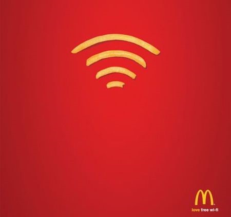
This advertisement for McDonalds is a good example of the clever use of fries to make up the Wi-Fi signal, advertising free Wi-Fi in their restaurants to customers. The Wi-Fi symbol wouldn’t mean anything to us without cultural context. Although this advertisement is mainly symbolic, there is also an iconic element to it through the use of the photograph of fries.
If you want to use symbolic images in your design, here are a few things to keep in mind:
- Think about cultural context. What will connect to your target audience?
- Do research on what different colors mean and be mindful of how they are used.
- Do research on what symbols mean in different cultures when targeting a broad audience. Symbols have different meanings throughout different cultures.
- Consider the use of typography as a major design element to communicate your message.
3. Indexical
Indexical images have the ability to be the most interesting visual representations of the three. An indexical image is a direct connection of two objects or concepts that are related.
A basic example of this is smoke. When you think of smoke, you usually instantly make the connection that there is a fire. This allows us to communicate a message more indirectly and allow the audience to have their own interpretation. When using this type of visual in advertising, it can be as vague as you want it to be. Usually the vaguer the image, the more the audience can connect and apply your visuals and the underlying message to their life and experiences, and,therefore, the more meaningful it is to them.
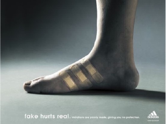
A good example of this is the above Adidas advertisement. “Fake Hurts Real” implies the user was once wearing shoes that were not Adidas brand, resulting in an injured and sore foot. The image of the result implies some story of that person (and their cruddy shoes).
Although we do not see them wearing these “fake” shoes, we understand, and can probably imagine a time in our own lives where we had a similar experience of being uncomfortable in a pair of shoes. This gives Adidas the opportunity to put their shoes in a positive light without even showing their actual product. They are creating a trust in consumers by implying their shoes will not leave their feet hurting. The use of bandages creating the Adidas logo on the foot could possibly be a subliminal message that their shoes will aid or relieve feet.
If you want to use indexical images in your design, here are a few things to keep in mind:
- What are some things that your target audience can almost immediately relate to and what visuals could be linked to them?
- Think of unique and innovative ways to visually communicate your message indirectly. The visual should be interesting enough to catch the audience’s attention in order to give them the desire to apply their own experiences to your advertisement.
- Be careful to not be too vague. If your message is too vague, your design might not be understood. If your audience can’t have his or her “ah ha!” moment, your message wasn’t communicated effectively.
- Images are the quickest and most interesting way to accomplish an indexical advertisement. Too much copy can distract and take away from the message.
Semiotics and brand development
Semiotics closely tie into culture and what is “trendy” at the time. They can also have a big impact on brand development depending on how a company implements semiotics. While the use of these tools can shape a brand, this also gives brands the opportunity to shape culture. Innovative and new ideas can lead trends while the others follow. A good example of this is the Nike swoosh logo. Their logo does not directly show the consumer what Nike sells, but when you see the Nike logo, you instantly think of sports, health, and fitness. This brand has created a culture of athletes through their products and branding. Consumers now have the connection between the Nike logo with being part of a “fit” culture, ultimately, creating brand loyalty over the many industry competitors. This is a sign of a successful brand.
Applying semiotics to advertising
There are many different ways to use each of the three semiotic categories in advertising, each with its own purpose in terms of storytelling as well as connecting with audiences on different levels.
From the more straightforward and clean use of photography to the vague and thought provoking use of imagery (and usually minimal text), all these categories are used separately, as well as in collaboration, to make something interesting and should be considered when thinking about the message you are trying to communicate. The key takeaway is to consider your audience, what they value, and how you can translate those values into a visual that is relevant. Using these categories is a great starting point for understanding how to communicate to different audiences.
Resources
/http://www.uvm.edu/~tstreete/semiotics_and_ads/terminology.html
/http://www.toxel.com/inspiration/2010/01/06/clever-and-creative-mcdonalds-advertising/
/http://www.history.com/news/ask-history/what-is-the-origin-of-the-heart-symbol
https://victorioussurrealism.wordpress.com/2016/02/16/semiotics-and-the-branding-of-design/