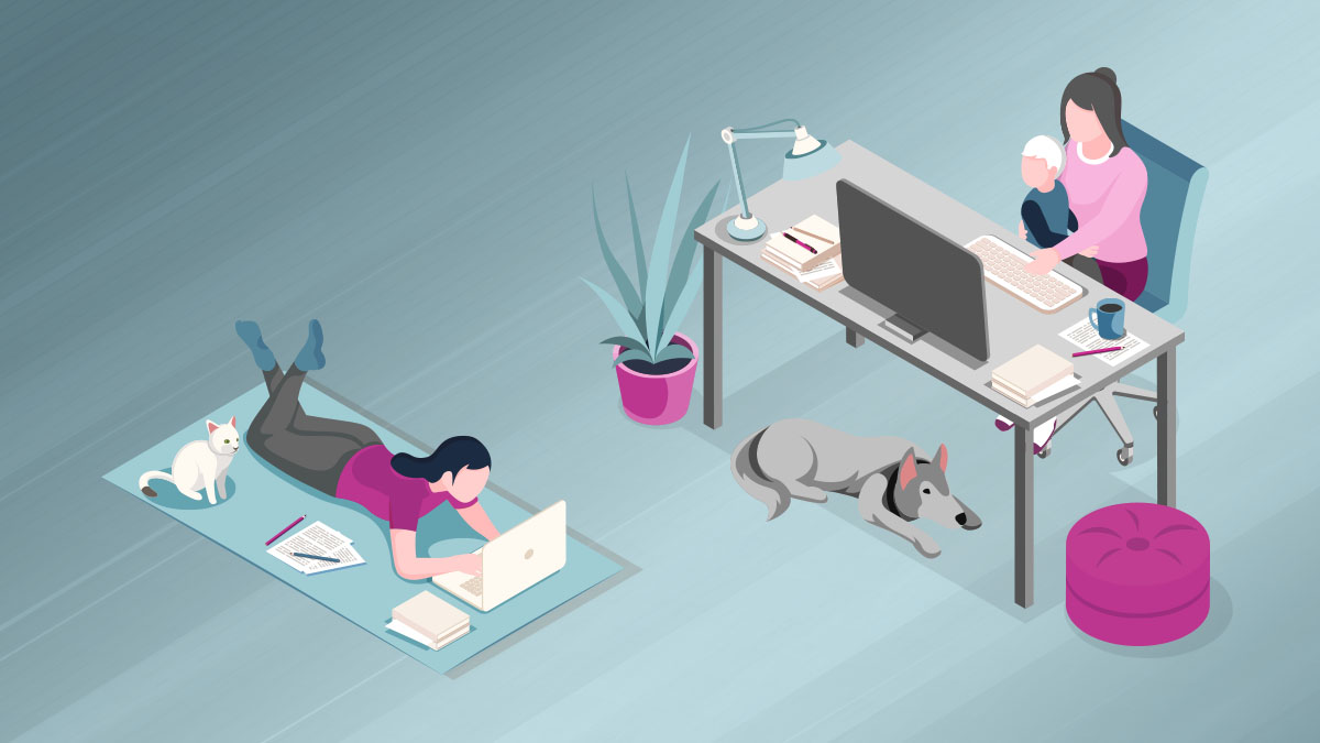
As children’s understanding of technology continues to advance at a rapid pace, keeping them at the forefront during the UX testing period is vital. It is important to remember that you are designing for a child. The tiny critic isn’t afraid to speak their mind and tell you what they do and don’t like.
So, when designing for children, there are a few things to keep in mind during the UX testing phase, and things to be aware of when you do not include children in the user testing phase.
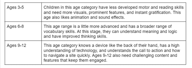
Age
A child’s cognitive development plays a huge role in the UX and design process, including what they need in a design to make it functional for their level of learning.
A few features to include in a design
Color and Shapes
Children need color to keep them engaged. In traditional UX design for adults, we try to limit bright colors to avoid distractions, but children need a light and fun environment. Bright colors and big images keep their attention and help them navigate the site.
Child-Friendly Main Navigation
The navigation needs to be big and bold. Age group also needs to be kept in mind when designing the main navigation, because it needs to be something the child can understand. The main navigation icons should be very literal. In case a child gets lost on the site, there needs to be a clear indicator on how to get back to the homepage. For children ages 6 and older, the main navigation can be more advanced.
The Importance of Interactive Games and Videos
Interactive games and videos teach children how to use technology, while also helping them learn a new skill. Studies have shown that games can increase motivation to learn. Interactive educational games can also bring a child creative awareness, concentration, and memory skills.
Children’s websites that get it right!
Starfall is known as a great learning tool for children. This site is excellent for kindergarteners or children in grades 1-3. There are many categories and interactive games to choose from, including reading, writing, and math. This website is very straightforward, making it easy for the user to navigate. The design is colorful and eye-catching, making it an entertaining and positive space to learn and grow. Right away, the child is given many options, making the design great for instant gratification. This site is a good example of showing less text, with symbols creating meaningful reference.
In addition, the site shows an example of user control and freedom. Large back buttons are shown on every page, so if the user gets lost or wants to leave a page, they can easily do so. A child’s patience level is low, and they could get irritated if they don’t see targets quickly.
National Geographic for Kids targets children in an older age range and promotes learning about the natural world. They can explore different areas, including animals, science, history, space, and more. The site is excellent for children because it is very interactive and includes videos and games, keeping them engaged. It also has a handy and easy navigation, making it a substantial website for the younger population. Still, it is more advanced in that it is for children who grasp in-depth content; it also keeps a simple layout to avoid overwhelming the young user.
ABC Mouse is a subscription-based program that focuses on the curriculum for ages 2-8 with a focus on reading, math, science, and art. They also have an Adventure Academy for ages 8-13. The website has 10,000 plus activities, including 850 lessons and 10 levels for a child to grasp their cognitive and reading skills. The site is easy to navigate, and is an excellent example of an aesthetically pleasing layout with room to explore. ABC Mouse also gives great visuals that are pleasing to the eye and offer instant gratification.
Nickjr has a very interactive and colorful site which is excellent for a child’s mind and increases exploration. Each character from their television shows has a dedicated circle in the main navigation. This is useful when a child can’t yet read, but can recognize their favorite TV character. The videos and games are all located in an easy-to-see square, making it simple for the child to see and click. The clickable category blocks, including videos, are big enough for the child to see and grasp. This is a great example of a call-to-action showing the user what they need to do to get the feature to work. In addition, Nickjr uses tap, click, and drag interactions, keeping the interface simple.
What happens when you don’t include a child in the user testing process?
The child may not like the design. They will get frustrated at not being able to use the product correctly. Without UX research involving children, the website may not be helpful or keep the child’s attention. Without UX research, the format could end up being too advanced for a child to use. Adequate user testing involving the children in the age range you are creating the program/website helps to avoid wasted time, research, and money.
Conclusion
UX for kids should be based on children’s psychology and rely on solid user research. It is crucial to get children’s feedback when creating a design for a child. They are the ones using it; therefore, they need to understand the design.
Designing for kids with proper interactions, including colors and shapes, easy-to-see targets, and easy-to-use navigation, is vital. In a design, there should also be the right amount of reward with the correct amount of information in place to create a successful website for the smallest, but brightest, users.