Everything You Need to Know About Responsive Email Design
Have you ever opened an email from your favorite brand on your mobile phone or tablet and deleted it immediately because it was unreadable and looked hideous? You’re not alone. With the continued steady rise in mobile and tablet use, it’s more important than ever to provide your customers with a consistent, user friendly experience across all platforms. Web designers, developers, and user experience strategists are constantly working to create a better customer experience, and email marketers and designers should also be working toward this same goal. Responsive email design is a step that all brands and marketers must take in order to keep working towards bettering the user experience.
Why Responsive Email Design is Important

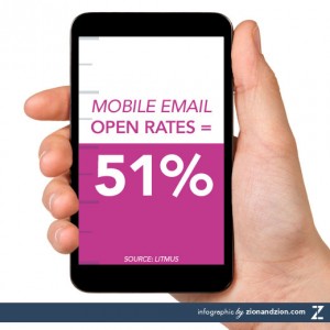
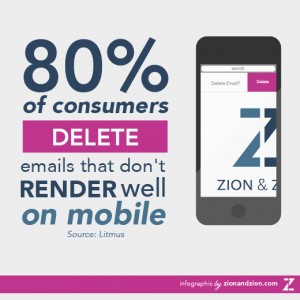
With mobile email opens at 51%, and the fact that 80% of consumers delete emails that don’t render well on a mobile device, it’s time to face the cold, hard truth: you need to improve your email campaigns for mobile. Many brands and marketers may not want to face these facts, but the numbers don’t lie. By not optimizing your email campaigns for mobile, you run the risk of presenting your subscribers with small, unreadable fonts, links too small for their fingers to tap, and even worse, broken layouts.
Know Your Email Audience

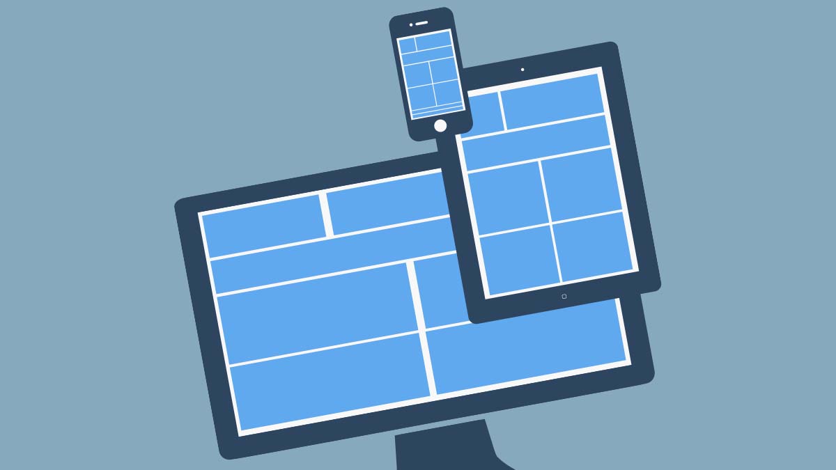
Assessing your email audience with tools like Litmus and Email On Acid will give you a deeper look into how engaged your readers are, their reading environment (desktop vs. mobile vs. tablet), rendering engines, and browsers your subscribers are using when viewing your email campaigns. In addition to this priceless data, these tools also allow you to view and optimize your emails across every /email client you can imagine. Long gone are the days of sending your email campaign to every email address you ever created across multiple desktop, mobile and web-based clients to see if any of your code is broken. With responsive email design, the emails will “respond” to whatever screen size the user opens it on. Score!
Scalable Design vs. Responsive Design

If you don’t have the resources available to implement responsive design in your email campaigns, scalable design is a step in the right direction. Scalable design allows your subscribers to easily read and click in any environment, but the layout does not change or adapt to the user’s screen size like responsive design does. Scalable design is easy to implement because it requires little to no extended HTML knowledge. Scalable design is highly recommended for anyone that is not able to implement responsive design into their email campaigns. While it’s not as ideal as responsive, it’s a great step in the right direction and will provide your subscribers with a much better experience.
Mobile-Friendly Design Techniques
Some important scalable design techniques include:
- Single column layout
- Larger fonts (14px or bigger)
- Touch-friendly buttons
- High-res images
By making these simple, easy changes to your email campaigns, you should begin seeing positive results immediately. Your subscribers will no longer accidentally click on a link stacked on top of another because there will be a button there instead. The new single column design will have them scrolling and actually reading your content instead of deleting your previously nightmarish email design. They’ll be jumping for joy that they can actually read that important article or offer you put in front of them without zooming in or out on their screen.
How to Implement Responsive Design
According to Direct Marketing News, /71% of marketers have started implementing responsive email design. Diving into learning and understanding responsive design techniques may seem daunting, but there are a ton of great resources out there to help you get started.
Similar to responsive web design, responsive email design uses /CSS media queries to change the layout of emails by stacking content, adjusting text, image, and button sizes, and hiding or swapping content depending on the device it’s being viewed on.
Responsive Email Design Resources
Many email providers such as Campaign Monitor, /MailChimp and /Emma offer free responsive design templates, which are great for businesses without developer resources. /Mashable recently released a list of /32 responsive email templates for brands and businesses to use, many of which are free. If you’re part of an integrated team with in-house designers and developers, bringing them up to speed on responsive email design and creating custom templates for your brand or your clients should be high on your priority list. There are many blog posts, tutorials and other resources that give great insight on how to learn and implement responsive email design, including:
- /Responsive Email Resources
- /Easy Responsive Design Tutorial in 7 Steps by Email On Acid
- /Responsive Email Development by MailChimp
Crafting an Action Plan
Assemble a plan that lays out which of your team members are responsible for learning more about design, development, content, etc. Provide them with online resources (like the ones listed above), send them to conferences or trainings, and work together to implement responsive email designs. Working as a team will help to alleviate the pressure of just one person learning everything and attempting to teach people in other departments when they may not completely understand every aspect. Once everyone is comfortable with what they’ve learned, put together a sample responsive email template and test, test, test. Don’t get frustrated if you can’t figure something out – go back and re-visit the resources you learned from, or post your questions in a forum, such as the Litmus Community.
Email Marketing Best Practices

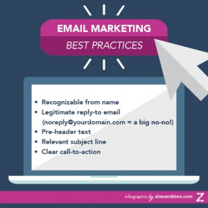
In addition to implementing responsive design in your email campaigns, it’s important to stay on top of industry best practices and trends. Many of the companies mentioned above put out excellent resources such as email newsletters, blogs, case studies, and whitepapers that are all great to read and subscribe to. A few of these best practices, in addition to the ones mentioned above for scalable design, include:
- Recognizable from name
- This is pretty simple and straight-forward, but I’ve seen brands abuse it. Using your brand name, or the name of someone from your company, will let your subscriber know who your email is coming from, which in turn creates more trust.
- Legitimate reply-to email (noreply@yourdomain.com = a big no-no!)
- Think of your email campaign as a conversation with your customer. Using a noreply email address as your reply-to email is essentially saying “I don’t want to hear from you.” Give your subscribers an easy way to engage with your brand, no matter what the reason is.
- Pre-header text
- This is a no-brainer and a super easy way to further tease the content of your email. Pre-header text appears after the subject line when an email is viewed in the inbox before opening.
- Relevant subject line
- Avoid gimmicky, false subject lines by giving your subscriber a clear idea of what they can expect when they open your email. You can still be creative, but don’t lie about what’s inside.
- Clear call-to-action
- Multiple calls-to-action will overwhelm your subscribers and more likely than not, prevent them from clicking altogether. Cut the fluff and stick to what’s important. Make sure your CTA is clear and stands out by using a bulletproof button.
Conclusion
Don’t let responsive email design scare you! If you aren’t ready to take the leap, start with implementing scalable design, then work your way up to responsive. Utilize the resources listed in this blog post and do your own research to familiarize yourself with best practices and responsive HTML/CSS media queries. Once you begin making changes, you should see an immediate improvement in the click through rates and open rates of your email campaigns. Although responsive emails require more time, skill, and resources, making the switch will allow you to give your subscribers the best possible user experience you can offer.
