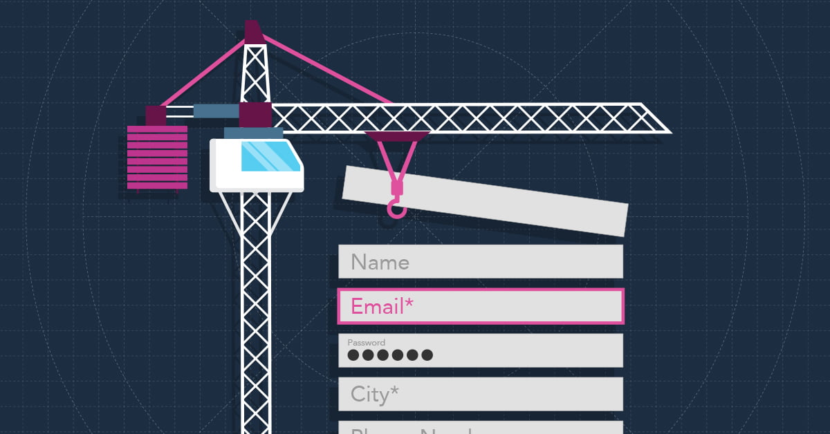
Well-designed forms are just one of the many aspects of your website that contribute to an overall great user experience. However, their importance should rank high in your long list of considerations for creating a great website. Forms help you collect data about potential customers and start engagement. So, as an online communication tool that can significantly impact your conversion rate, creating an organized and accessible form that avoids user frustrations is crucial.
Here are seven considerations for web form usability that UX designers should think about, along with the reasons why.
1. Error Messages
When it comes to error messages, you want to ensure they’re clearly visible, provide helpful feedback, and reduce the amount of effort it takes to correct the error.
Consider displaying error messages next to the invalid field, as opposed to the top or bottom of the form. Ideally, the error message should be displayed to the right or below the form field, which follows a user’s reading pattern. By displaying the error message at a shorter distance from the incorrect field, users can correct their mistake using less brain power and in less time.
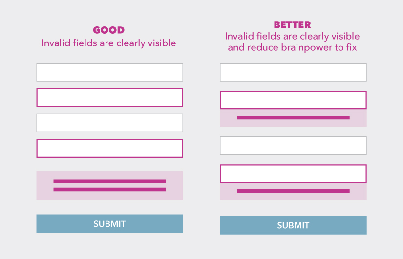
In addition to the placement of your error message, consider if your error message is effective. When writing an error message, ensure the copy uses polite phrasing and avoids vagueness.
2. Placeholder Text
Placeholder text is located inside the form field and acts as the field label, a helpful description, or an example of what the user should enter. Once the cursor is placed in the field or the user begins typing, the placeholder text typically disappears.
The problem with placeholder text, especially when used as the field label, is that it puts a strain on users’ short-term memory. Once the placeholder text disappears, users can forget or second-guess if what they are typing is correct—which happens more often than you think. This makes users have to click out of the field, or delete what they have already typed, in order to reveal the placeholder text and begin again. It also makes it difficult for users to check their work once the entire form is completed, or fix an invalid field after hitting submit.
Consider using floating labels as a modified approach to placeholder text. Floating labels are placed within the form field until the form becomes active. Once active, the placeholder text floats to the top of the field and always remains visible. This serves as a better memory aide and also saves space on your form.
3. Tool Tips
Tool tips are helpful messages that appear when the cursor hovers over an icon or another graphical element. When it comes to forms, tool tips are used to provide additional information that may not have been clear by reading the field label alone.
While tool tips are typically easy to display on desktop because of the large screen size, how they appear on mobile can be tricky. We recommend making the tool tip icon easy to find and tap, by including it in the form field. Once tapped, the tool tip copy should span the width of the screen for easy readability. Once a user taps anywhere outside the tool tip copy, the copy should disappear.
Tool tips are just one of many elements you may want to approach differently when it comes to modifying your form for smaller screen sizes. Learn how you can overcome other unique challenges when scaling from desktop to mobile before starting your next web project.
4. Credit Card Fields
When it comes to credit card entries on your website, reducing the number of form fields is your first step. Consider only having four fields maximum for your credit card information: Cardholder name, card number, expiration date, and security code (CVC or CVV). If necessary, companies such as Amazon provide users with the option to save a card, making it easier to purchase a product next time with a simple click.
Ideally, your form will detect which type of credit card users are paying with based on the card number that was entered. We recommend displaying visual cues to the user as they fill out the form, such as displaying a credit card that pulls through the information you are entering in the form fields. This makes it extremely easy for users to find, enter, and check the information they need to complete a purchase on your site.
5. Field Requirements
Before considering which fields are required and how to go about signaling that to users, you want to first reduce optional fields and eliminate unnecessary ones. If the information in the field can be collected in some other way, or more appropriately at a later date, consider removing it. If for some reason you cannot remove your optional fields, try limiting yourself to two optional fields maximum.
“Every time you cut a field or question from a form, you increase its conversion rate — the business case for this guideline is that simple.”
Nielson Norman Group, UX Research and Consulting Firm
After reducing the number of fields in your forms by eliminating those that are unnecessary, you then want to distinguish which fields are required and which are optional. We recommend doing this by marking fields as optional and leaving required fields note-free. Consider using the phrase “optional” as its clearer than any visual cue or symbol. It also uses friendlier language than something like an asterisk, which requires the brain to process additional information.
6. Birthdate Fields
When it comes to forms, asking users to enter their birthdate can easily cause user frustration. Why? There are many different birthdate formats used throughout websites when asking for the same three data strings—month, day, and year.
Asking users to enter their birthday using a dropdown menu or calendar may not be confusing, but they both require more effort than other options. Consider separating each birthday string into three fields with corresponding labels. This allows users to enter their birthday without having to switch from the keyboard to the mouse, and eliminates the need to scroll or click through numerous options.
7. First and Last Name Fields
If you create two separate fields for first and last name, you may be making it harder for certain users to fill out your form right from the start.
Consider combining split name fields into a single name field for cultural reasons. When you create a split name field, you’re assuming every user can easily follow the same first and last name format. When in reality, the naming structure is not the same across cultures. Many people in various cultures have multiple first, middle, or last names, which can vary in the order in which they’re said. By creating a single name field, you can make your form culturally inclusive and user-friendly to everyone.
Conclusion
Not all forms are the same, so we know that some of these considerations may work better in some instances than others. However, keep these considerations in mind and begin thinking about every aspect of your form to ensure it’s formatted the best way possible for your users.