Do you know the last time your landing pages were tested? You know, the pages people see after they click an ad, the pages responsible for turning prospects into paying customers? Unfortunately, many paid search marketers don’t have a formal process to determine whether the landing pages associated with their campaigns are any good.
Let’s pause for a moment to appreciate the irony. One could easily make a case that landing pages have the most important role to play in paid search, and yet some rarely receive any quality assurance. They’re just kind of … there. Imagine ordering sushi at a restaurant that was never inspected by the local health department. Imagine skydiving with a company that had no formal process for inspecting the integrity of their parachutes. Yikes.
There’s no overstating the importance of an effective landing page, despite the obvious challenges. If you really want to separate yourself from your competitors, it’s time to add some structure and routine to landing page analysis.
Why Landing Page Testing is Important
There’s a lot riding on landing pages. PPC ads are merely enticing people to click, whereas a landing page has the more difficult job of convincing searchers to make a purchase, book an appointment, or sign up for an email subscription list. That’s a big ask in a world of increasingly diminishing attention spans, so the page better have a first-rate sales pitch. If your landing page isn’t performing, you need to fix it, and user testing tells you how.
Landing Page Testing: Preference Tests
Running a preference test is easy and gives you a lot of ammunition for optimizing your landing pages. For those unfamiliar with the benefits, UsabilityHub says, “Preference tests can help you choose between design variations, by simply asking users which one they prefer.”
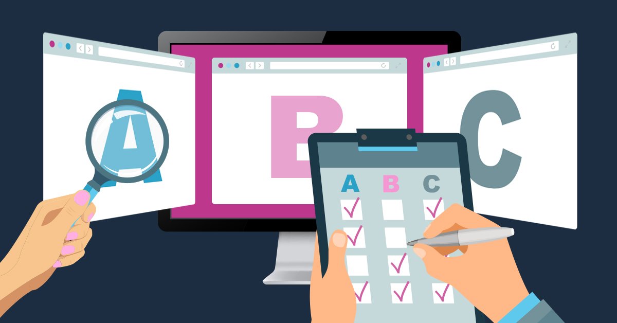
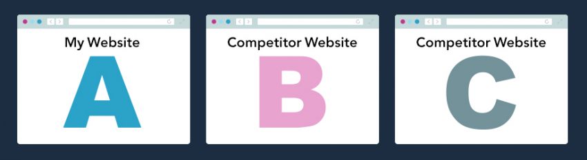
In a traditional preference test, you instruct participants to review different landing pages, three to five works best, and answer a few basic questions. Users then provide quantitative feedback, a total number of participants who preferred a specific design, and qualitative feedback, the reasoning behind why participants preferred a specific design. In the example below, participants are asked which landing page they prefer between my website and those of our closest competitors.
Instructions
Please review the following landing pages and answer the follow-up questions to the best of your ability.
Mindset
Imagine you are a homeowner in Dallas and discover you have a clogged drain. You need a quick solution and decide to contact a plumber you found online.
Follow-Up Questions
- Which page do you prefer? Why?
- Which page looks the most trustworthy? Why?
- Which page looks easiest to use? Why?
The feedback you receive is invaluable in terms of framing your future testing scenarios.
Acting on Your Feedback
The feedback you receive from a preference test can be incredibly eye-opening. Let’s say participants overwhelmingly prefer your competitor’s landing page, citing an enticing offer. Or, maybe testers prefer your landing page but point out how easy it was to schedule service on a competitor’s page. No matter the results, the findings give you some valuable context on how to optimize your landing page and create the framework for subsequent user tests down the road.
In addition to preference testing, general user testing can highlight many areas of need for your landing page. Check out these additional resources on user testing when you’re ready to go beyond a simple preference test:
Dealing with Doubt & Eliminating Bias
When reporting your finding to clients, it’s likely that you’ll encounter some resistance, especially if your findings highlight anything negative about the client’s brand/website.
The truth hurts and sometimes people naturally become defensive. Imagine how you might feel if some random stranger made negative comments about your child over the internet—it’s not a lot different when it comes to business owners and their brand. The brand is often an extension of themselves, the thing they’ve invested years of blood and sweat into, the thing they must protect. You don’t need to sugarcoat anything, you just need to be tactful in your approach.
Clients are more receptive to unbiased feedback, so your job is to eliminate bias wherever possible. If you want truly honest feedback, don’t enlist someone you know, especially those who have worked on the project/website that you’re testing. If you don’t believe me, try asking your mom to critique you—see what kind of feedback you receive.
Paid user testing tools are a worthy investment as they provide efficient options to create user tests with minimal bias. You can enlist testers from all over the world and ensure they fit your target demographic. Feedback is a lot more powerful when it comes from people that might actually buy your product.
The way you frame a user test also makes a difference. You have a responsibility to avoid experimenter bias with your testing questions. Asking things like, “Why do you feel this page is outdated?” or “What’s wrong with the color scheme of this page?” leads your user to an answer. Let users point out any flaws within your landing page organically, it’s much more powerful.
Brace For Impact
Regardless of your approach, make sure your client knows what to expect beforehand. Educate them about the testing process and make sure they understand (and agree) why the results are useful. Addressing any questions/doubts they have early on will save you several headaches down the road.
For more information on cutting down on biased feedback, read How to Respond to Skepticism of Testing Small Groups of Users from the Nielson Norman Group.
UX Principles to Apply for Better Landing Pages
You’ll find plenty of ammunition for landing page optimization through repeated user testing, but these general UX principles can be applied anytime.
Sync Ads to Landing Pages
A great user experience starts with a clear message, and ads that harmonize with their respective landing pages. Above all else, a landing page needs to fulfill the value proposition of the ad copy. Anything less is misleading to your prospects and undermines their experience. If someone clicks on your expanded text ad for Discount Nike Running Shoes, you better deliver exactly that. A landing page that shows a variety of shoes from various brands is a lousy experience.
Great UX also provides an efficient message. Your landing page should anticipate what users care most about on the page (usually what brought them there in the first place) and make that information easy to find, i.e. above the fold. If I click your ad for $9.95 per room carpet cleaning, I don’t want to wade through a dozen other irrelevant offers on your page. Don’t make me work for the value you promised.
If you want to improve the UX of your landing pages with better messaging, start by asking yourself these questions:
- How well does my ad reflect the content of the landing page?
- How visible is the information users care about?
- Is my landing page trying to do too much?
- Is this ad better served by its own unique landing page?
Create Efficient Form Fills
Your landing page plays an important role in terms of qualifying leads. You have a much better chance enticing prospects into becoming paying customers if you can meet them at their level and understand what makes them tick. Essentially, you’re looking to answer:
- Who are they?
- What do they want?
- How do you get in touch?
Answers to these kinds of questions are worth their weight in gold, but there’s a limit. Excessively long form fills turn people away in droves. Imagine you’re shopping at a store when one of the employees asks if you need help—and your name, date of birth, residential address, country of origin, occupation, and email address.
Don’t overdo it with your form fills. Seriously. Get in and get out.
Different businesses will require different kinds of information to qualify their leads, but always err on the side of conservative intel gathering. Ask for the information you need and don’t harass your customer.
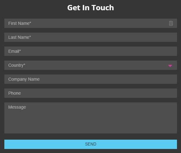
Here’s an example of what a good form fill looks like:
Keep It Simple
Simplicity doesn’t just apply to form fills. Less is more when it comes to your landing page overall. Nobody has time for your shenanigans, so don’t bog people down with a bunch of fluff that causes friction on the path to conversion. Your landing page should be an express elevator that takes people where they want to go—no detours.
At the risk of sounding excruciatingly English major-y, there’s a certain poetry involved in creating effective advertisements. Rita Dovev, once an appointed Poet Laureate of the United States, said, “Poetry is language at its most distilled and most powerful.” Poetry has an ability to convey a lot with very little. Its effect is striking. Condensing a big idea into its simplest form makes our brain smile, delights us. You can achieve the same effect with your landing pages with a little practice.
Check out the example below:
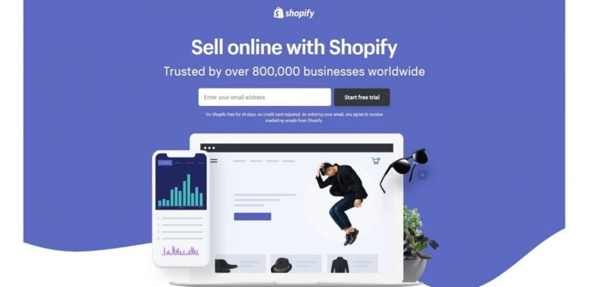
It’s clean, it’s tidy, and it describes the value upfront. I don’t get bogged down with a novel describing the benefits of the platform. My eyeballs aren’t assaulted with an onslaught of visuals, stealing my attention. No, sir—this is an express elevator that takes me exactly where I want to go, no detours.
Check out these other great landing page examples and bask in their simplicity. Perhaps it’ll inspire you.
Conclusion
Landing pages matter, and implementing a disciplined approach to ongoing landing page testing can transform them into a lean, mean, well-converting machines.